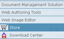
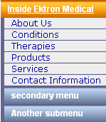
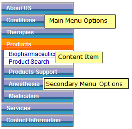
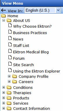
Ektron’s Menu feature lets users create and maintain a drop-down menu system for your Web site. The menu options can link to content, library assets, external hyperlinks, and submenus. Below is a sample menu.
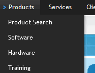
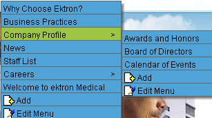
In this example (delivered with Ektron OnTrek sample site), the menu appears when a site visitor moves the cursor over Products on the home page. If a content contributor with permission to edit menus signs in to Ektron then views the menu, it has options for editing the menu and adding content.
WARNING! If you choose to hide the border that surrounds content when you are logged in, the Add and Edit options are also hidden. This lets you view the page as it appears when not logged in. If the page is set to show borders and you still do not see Add and Edit, the feature may be turned off. Ask your administrator or Web site Developer for more information.
Managing menus is a two-step process. The first sections in this chapter describe the first step: how Ektron users create and update menus. In the second step, a developer places a menu server control on a Web form. The control manages how the menu displays on your Web site.
The Structure of Menus and Menu Items
Accessing the Menus Feature
There are 3 ways to access the Menus feature:
- the Workarea, by choosing the associated content folder then clicking View > Menu
- the Workarea, by choosing Content > Menus
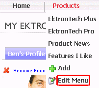
- from the Web site's the Edit Menu option, as shown below
If you choose the first or second option, you select a specific menu. Then, it appears on the View Menu screen. For the third option, the selected menu appears on the View Menu screen.
From the View Menu screen, you can perform the following actions on a menu.
- Create a new menu
- Edit its information (for example, the URL and template link)
- Translate it
- Delete it
- Add or remove items
- Change the sequence of menu items
- Edit menu items
- For submenus
- add /remove items
- change sequence of menu items
- edit menu information
- edit menu items
Permission to Use Menus
To work with menus, a user must be one of the following.
- a member of the Administrators user group
- assigned the Collection and Menu Admin role See Also: Defining Roles
- assigned the Menu Admin role
Adding a Menu
You can create a menu by navigating to a folder or by choosing Content > Menus from the Workarea’s left frame. If you choose Content > Menus, it is automatically assigned to the root folder. In contrast, if you choose a content folder then create a menu, it is assigned to that folder.
 Adding a menu via content folder
Adding a Menu via Content Folder
- Navigate to a content folder.
- The current language appears as a flag next to the screen title. To create the menu in this language, proceed to the next step. To change the new menu's language, click View > Language and select the new language.
- Click New > Menu. The Add Menu screen appears.
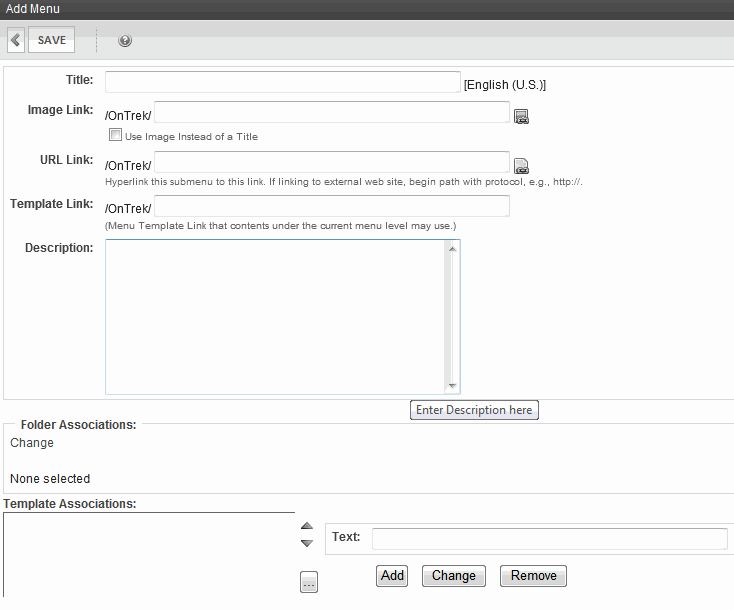
- Use the following information to complete the screen.—Fields—
Fields on the Add/Edit Menu Screen
Field
Description
The name given to the menu by its creator. It appears on the Web page to indicate the kind of information on the menu.
You can have an image appear next to or instead of the menu title. For example:
To do this:
Prerequisite: The image must reside in the library. If it does not, add it before proceeding. For more information, see Copying a File to the Library.
- Click the icon to the right of the ImageLink field (
 ).
). - The library window opens.
- Navigate to the folder that contains the image you want to use.
- Click Insert.
Using Image to Replace Title Text
Alternatively, you can replace menu text with an image, so that only the image appears on the menu. To do this, check the Use image instead of a title box.
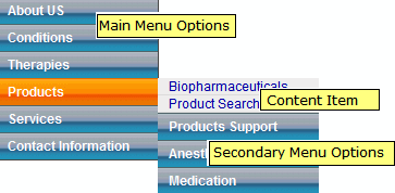
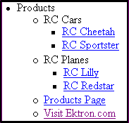
After you create a menu, your developer links it to text or an image on a Web page by modifying a page template. When a site visitor moves the cursor over the text or image, the menu appears. In the example below, the menu appears when the site visitor moves the cursor over Products.
You can also assign a URL link to a menu using this field. If you do, and the user clicks the link text or image, he jumps to the specified page.
For example, in this field, you assign the product landing page,
siteroot/products.aspx. In the illustration above, if the user moves the cursor over Products, the assigned menu appears. However, if the user clicksProducts , he jumps tositeroot/products.aspx.Entering the Path to the Landing Page
The path may be
- relative to site root, such as
siteroot/jobs.aspx - a static template path or a dynamic path, such as
wellness.aspx?id=40&wellness=Hemophilia - an external hyperlink, such as
http://www.example.com.
NOTE: This field applies to content only. It has no effect on other types of menu items (such as images). Also, this field only affects content that dynamically references a content block, such as
/CMS400Min/therapies.aspx?id=84. If the menu option is a template that includes content (for example,/CMS400Min/news.aspx), the template identified here is ignored.If you want to apply a template to this menu, enter it here. If you do, content on this menu uses this template when selected from the menu.
If you do not, this menu's content uses the template specified in its Quicklink.
Add a more detailed description for the menu.
Folder Associations
Template Associations
- Click the icon to the right of the ImageLink field (
- Click Save.
After creating the menu, you may assign items to it. See Adding a Menu Item.
Adding a menu via the menus tab
Adding a Menu via the Menus Tab
If you choose a content folder then create a menu, it is assigned to that folder.
- From the Workarea, click Content > Menus > Menus.
- The current language appears in the View field. To create the menu in this language, proceed to the next step. To change the new menu's language, select one from the View field drop-down.
- Click Add. The Add Menu screen appears.
- To complete the fields on the Add Menu screen, see Working with Menus.
After creating the menu, you may assign items to it. See Adding a Menu Item.
Adding a Menu Item
There are 3 ways to add a menu item.
Adding a menu item via content folder
Adding a Menu Item via Content Folder
To add a menu item via a content folder:
- Navigate to the content folder that contains the menu to which you want to add items.
- Click View > Menu.
- In the View Language drop-down, select the menu's language.
- Click the menu.
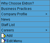
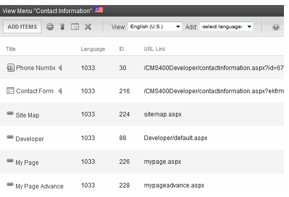
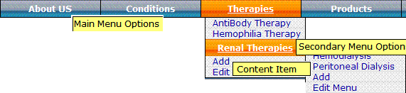
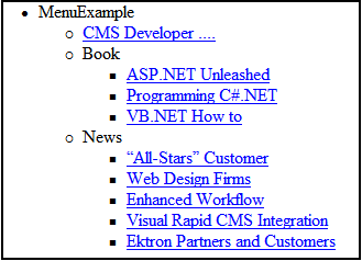
The View Menu screen opens, displaying the menu's items. Submenus look like this:
 .
. - To add a new item to the menu, click Add Items.
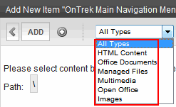
The Add New Item screen displays a list of items you can add to the menu. Use to the table below to select a type of menu item, and follow the steps to add it.

Menu item type
For more information, see
Content
Any library asset: image, file, Quicklink, hyperlink to the menu
External hyperlink
Submenu
- After you insert menu items, you can view and modify information about them. To do that, click the item's title. Use the following information to complete the fields on the Edit Menu Item screen.—Fields—
Fields on the Add/Edit Menu Item Screen
Title—The name of the menu item. It appears on the Web page to indicate the item.
Image Link—You can have an image appear next to or instead of the menu title. For example:
To do this:
NOTE: Before beginning these steps, the image must reside in the library. If it does not, add it before proceeding. For more information, see Copying a File to the Library.
- Click image ().
- The library window opens.
- Navigate to the folder that contains the image you want to use.
- Click Insert (
 ) to insert it.
Replacing Title Text with Image
Alternatively, you can have the image replace the menu text, so that only the image appears on the menu. To do this, check the Use image instead of a title checkbox.

URL Link—After you create a menu, your developer links it to text or an image on a Web page by modifying a page template. When a site visitor moves the cursor over the text or image, the menu appears. In the example below, the menu appears when the site visitor moves the cursor over Products.
You can also assign a URL link to a menu using this field. If you do, and the user clicks the link text or image, he jumps to the specified page.
For example, in this field, you assign the product landing page,
siteroot/products.aspx. In the illustration above, if the user moves the cursor over Products, the assigned menu appears. However, if the user clicks Products , he jumps tositeroot/products.aspx.Entering the Path to the Landing Page
The path may be
- relative to site root, such as
siteroot/jobs.aspx - a static template path or a dynamic path, such as
wellness.aspx?id=40&wellness=Hemophilia - an external hyperlink, such as
http://www.example.com.
Description—Add a more detailed description for the menu.
Target—
Determines the type of window that appears when you click a link in the server control.
- _Self (default)—opens in same window.
- _Top—opens in parent window.
- _Blank—opens in new window.
- _Parent—opens in the parent frame.
Link—Use this field if you want to override this content's menu template by using the template specified in its Quicklink.
- Click image (
Adding a menu item via menus tab
Adding a Menu Item via Menus Tab
- From the Workarea, click Content > Menus.
- Click the menu to which want to add a menu item.
- In the View Language drop-down list, select the menu's language.
- Click AddItems. The Add New Item screen displays a list of items you can add to the menu. Select a type of menu item, and follow the steps to add it.
- Content—Adding Content as a Menu Item
- Any library asset: image, file, Quicklink, hyperlink to the menu—Adding a Library Asset as a Menu Item
- External hyperlink—Adding an External Hyperlink as a Menu Item
- Submenu—Adding a Submenu as a Menu Item
- After you insert menu items, you can view and modify information about them. To do that, click the item's title. See Also: Working with Menus
Adding a menu item via navigation link on a Web page
Adding a Menu Item via Navigation Link on a Web Page
- Log in.
- Access the Web page that contains the link to display the menu.
- Place the cursor on the hyperlink that causes the menu to appear. The menu appears.
- Click Add. The Add Menu screen displays a list of items you can add to the menu.
- Select the type of menu item and follow the steps to add it.
- Content—Adding Content as a Menu Item
- Any library asset: image, file, Quicklink, hyperlink to the menu—Adding a Library Asset as a Menu Item
- External hyperlink—Adding an External Hyperlink as a Menu Item
- Submenu—Adding a Submenu as a Menu Item
- After you insert menu items, you can view and modify information about them. To do that, click the item's title. See Also: Working with Menus
Adding content as a menu item
Adding Content as a Menu Item
- Follow the directions in Adding a Menu Item via Content Folder, Adding a Menu Item via Menus Tab, or Adding a Menu Item via Navigation Link on a Web Page.
- Click the radio button next to Content Item.
- Click Next... The Add New Item screen appears, listing all content folders.
- By default, all content types are available. To limit your selection (for example, Word documents), click the content types drop-down and select a type.
- Content items in a folder appears below any subfolders. Click any subfolder to display its content.
- Check all content you want to add from any single screen to the menu.
WARNING! If you check items then proceed to another screen before clicking Add, the items on the first screen are not added to the menu.
- Click Add.
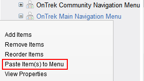
As an alternative, navigate to a content folder, click items to be assigned, right click the mouse and select Copy. Then, locate the menu, right click the mouse, and select Paste Items to Menu.
The View Menu screen reappears, showing the new content.
- To access the Edit Menu Item screen for the new content, hover the cursor over the title, then click. The Edit Menu Item screen lets you assign additional information to the menu item, such as the target window. See Working with Menus.
- Continue to add menu items as needed.
Adding a library asset as a menu item
Adding a Library Asset as a Menu Item
To add a library asset as a menu item via a content folder or menus tab:
- Follow the directions in Adding a Menu Item via Content Folder, Adding a Menu Item via Menus Tab, or Adding a Menu Item via Navigation Link on a Web Page.
- Click the radio button next to Library Asset.
- Click Next. The Add New Item screen appears. Enter a title for the library asset that will appear on the menu.
- Click Browse Library. The library screen opens.
- In the right frame, select the type of asset to insert (image, hyperlink, and so on).
NOTE: To insert assets, the menu’s folder must contain library assets. However, you can insert library assets from other folders for which you have permission.
- Select a library asset and click Insert. The Add New Item screen reappears.
- Click Save.
Adding an external hyperlink as a menu item
Adding an External Hyperlink as a Menu Item
To add an external hyperlink as a menu item via a content folder or the Menus tab:
- Follow the directions in Adding a Menu Item via Content Folder, Adding a Menu Item via Menus Tab, or Adding a Menu Item via Navigation Link on a Web Page.
- Click External Hyperlink.
- Click Next. The Add New Item screen appears.
- Complete the fields as needed.
- Title—Title of the new menu item.
- URL Link—The external hyperlink's URL. For example,
www.example.com.
- Click Save.
NOTE: When you add an external hyperlink menu item, the URL does not get added to the library nor is an ID assigned to it. So, when you save the menu item, it is not added to the Ektron database nor can it be retrieved for future use.
Adding a submenu as a menu item
Adding a Submenu as a Menu Item
- Follow the directions in Adding a Menu Item via Content Folder, Adding a Menu Item via Menus Tab, or Adding a Menu Item via Navigation Link on a Web Page.
- Click Sub menu. The Add Menu screen appears.
- Complete the fields using Working with Menus as a reference.
- Click Save.
Adding new content to a menu via navigation link on a Web page
Adding New Content to a Menu via Navigation Link on a Web Page
NOTE: You can only use this feature after your Web developer has modified a page template to display the menu. For more information, see Introduction to Menu Server Controls.
- Access the Web page that contains the link to display the menu.
- Place the mouse on the hyperlink that causes the menu to appear. A menu appears.
- Click Add. The Add Menu screen opens, displaying items you can add.
- Refer to the table below for selecting a menu item and follow the steps to add it.
- Content—Adding Content as a Menu Item
- Any library asset: image, file, Quicklink, hyperlink to the menu—Adding a Library Asset as a Menu Item
- External hyperlink—Adding an External Hyperlink as a Menu Item
- Submenu—Adding a Submenu as a Menu Item
Editing a Menu's Properties
This section describes each option for editing a menu's properties.
Editing a menu's properties via its content folder
Editing a Menu's Properties via its Content Folder
- From the Workarea, navigate to the content folder that contains the menu.
- Click View > Menu.
- Click the menu you want to edit.
- If appropriate, click the submenu that you want to edit.
- Click Properties (
 ). The View Menu screen appears.
 - Click Edit Menu.
- Update the fields on the screen by referencing Working with Menus.
- Click Save.
Editing a menu's properties via menus tab
Editing a Menu's Properties via Menus Tab
- From the Workarea, click Content > Menus.
- Click the menu you want to edit.
- Click Properties (). The View Menu screen appears.
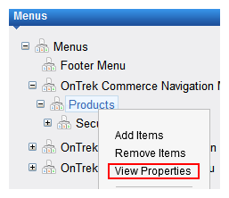
Alternatively, hover the cursor over the menu in the left panel, right click the mouse, and click View Properties.
- Click EditMenu.
- Update the fields on the screen by referencing Working with Menus.
- Click Save.
Editing a menu's properties via navigation link on a Web page
Editing a Menu's Properties via Navigation Link on a Web Page
- Navigate to the Web page that contains the menu link.
- Click the link. The menu appears.
- Click Edit Menu. The menu's View Menu screen appears.
- Click Properties ().
- Click Edit Menu.
- Update the fields by referencing Working with Menus.
- Click Save.
Viewing a Menu
Just like editing a menu, you can view a menu via...
- its content folder
- menus tab
- navigation link on a Web page
When viewing a menu via the content or menu folder, you get an internal view of information entered by menu creator. When viewing via a navigation link on a Web page, you get an external view of the menu, as seen by anyone navigating Web site.
Viewing a menu via its content folder
Viewing a menu via the menus tab
Viewing a Menu via the Menus Tab
- From the Workarea, click Content > Menus. The View All Menus screen appears.
- Click the menu you want to view. The menu’s options appear.
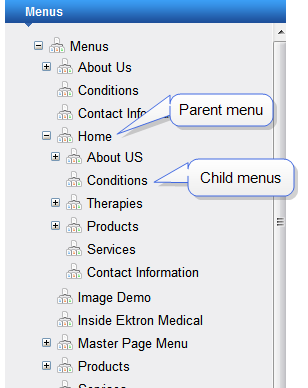
NOTE: If your Workarea language is set to all languages, you cannot view child menus—only parent menus. To view a child menu, select its parent menu's language, using the View > Language menu option.
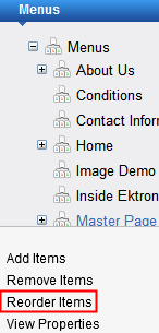
Reordering Menu Items
- Navigate to the View Menu screen for the menu that you want to rearrange. See Viewing a Menu.
- From the toolbar, click Reorder (
 ).
).Alternatively, hover the cursor over the menu in the left panel, right click the mouse, and click Reorder Items.
The Reorder Items screen appears.
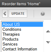
- Click the item you want to move.
- Click the up arrow to move it up, or the down arrow to move it down.
- When finished, click Save.
Deleting a Menu
- Access the View Menu screen, as described in Viewing a Menu via its Content Folder or Viewing a Menu via the Menus Tab.
- Click the menu you want to delete.
- Click Delete (
 ). A confirmation message appears.
 - Click OK to delete the menu.
NOTE: Deleting a menu automatically deletes all menu items associated with it. Do not confuse the menu link with the item itself. For example, deleting a menu deletes its links to content but has no effect on the content.
Deleting a Menu Item
- Access the View Menu screen, as described in Viewing a Menu via its Content Folder or Viewing a Menu via the Menus Tab.
- Click Remove Items (
 ).
). - Check the box next to items that you want to remove.
- Click Remove.
Working with Menus in a Multi-Language System
NOTE: For background information about supporting multiple languages on your Web site, see Working with Menus in a Multi-Language System.
You can create an edition of any menu in every supported language. When a site visitor selects a language and clicks a menu link, Ektron displays the menu in that language if it is available. If it is not available, nothing appears.
Before creating or translating a menu, it’s a good idea to create or translate all content that will be on the menu. In this way, you can link this content to the new menu. However, after creating a menu, you can add new items to it.
Translating a menu
Translating a Menu
To translate a menu into any supported language: You can navigate to the menu via the Web site or from the Workarea. Each procedure is described below.
By navigating the site
By Navigating the Site
- Sign on to an Ektron Web site.
- Select the menu’s current language.
- Navigate to the page that has the menu you want to translate.
- Click the menu and the Edit Menu option.
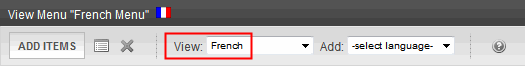
The View Menu screen appears for the selected menu.
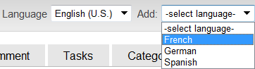
- From the Add drop-down list, select the language into which you want to translate the menu.
The Add Menu screen appears.
- Complete the screen for the menu in the selected language. See Working with Menus.
- Click Save. The View Menu screen reappears. Now, the View drop-down displays the menu’s new language.
- Add items to the menu. See Adding a Menu Item. If adding content, you can only insert an item in the selected language. Later, you can add more menu items, edit them, delete them, view them, and so on.
By accessing the menus report screen
By Accessing the Menus Report Screen
- From the Workarea screen, click Content > Menus.
- Click the menu you want to translate. The View Menu screen appears for the selected menu.
- From the Add drop-down list, select the language into which you want to translate the menu.
The Add Menu screen appears.
- Complete the screen for the menu in the selected language. See Working with Menus.
- Click Save. The View Menu screen reappears. Now, the View drop-down displays the menu’s new language.
- Add items to the menu. See Adding a Menu Item. If adding content, you can only insert an item in the selected language. Later, you can add more menu items, edit them, delete them, view them, and so on.
Creating a menu in any language
Creating a Menu in Any Language
- From the Workarea screen, click Content > Menus > Menus.
- From the language drop-down list, select the new menu’s language.
- Create the menu. See Adding a Menu via the Menus Tab.
Assigning Folders or Templates to a Menu
Effect of assigning a folder to a menuEffect of Assigning a Folder to a Menu
If all of the following conditions apply...
- you assign a folder to a menu
- a user navigates to any content item that resides in the folder
- a Flex Menu whose
EnableSmartOpenproperty is true appears on the screen
...the Flex Menu automatically displays the items on the associated submenu.
NOTE: Navigation to the content can consist of clicking a quicklink, a menu option, a list summary item, the result of a search, and so on.
In effect, you are instructing Ektron to expose a menu whenever a content item that resides in a selected folder appears. As a result, a user looking for a specific item sees similar items.
As an example, assume your Web site sells books, and folders are organized by genre. One of your folders is “Teen Fiction.” You create a submenu that contains the top 5 sellers in “Teen Fiction.” You then associate the Teen Fiction folder with that submenu. When a site visitor finds views a book in that category, a Flex Menu in the page’s left column displays the top 5 Teen Fiction titles.
Using the Select Folder Screen
Using the Select Folder Screen
The Select Folder screen lets you assign new folders to a menu, reorder folders, and delete folders from the menu association. These tasks are described below.
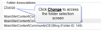
When you click Change below Folder Associations on the Edit menu screen, the Select Folder screen appears.
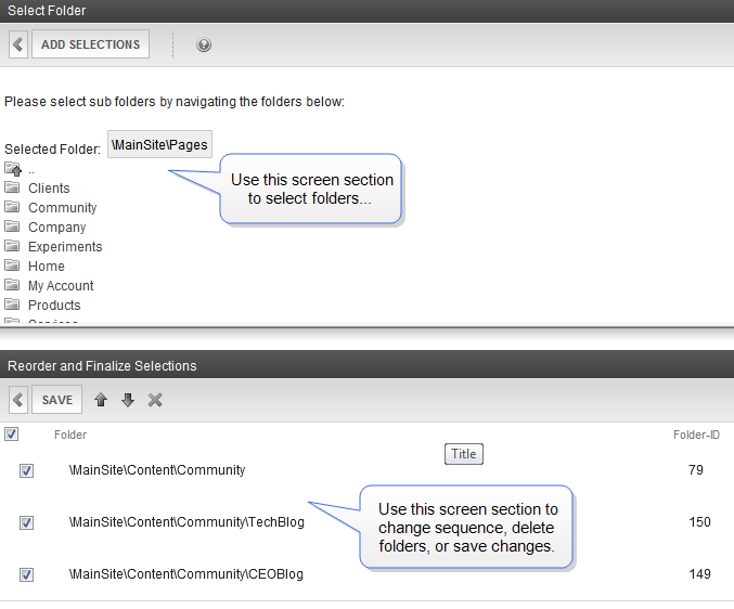
The following table describes tasks you can perform on these screens.
|
Task |
Instructions |
|
Add folder to list |
|
|
Remove folder from list |
|
|
Remove all folders from list |
|
|
Move a folder up or down on the list NOTE: The folders' sequence has no impact on how they are used. It only affects the appearance of the Select Folders screen. |
|
|
Save changes and return to Edit Menu screen |
Click Save. |
|
Exit screen; do not save changes |
Click Exit ( |
 ). Effect of assigning a template to a menu
Effect of Assigning a Template to a Menu
If all of the following conditions apply....
- you assign a template to a menu
- a user navigates to any content item that uses the template
- a Flex Menu whose
EnableSmartOpenproperty is true appears on the screen
...the Flex Menu automatically displays the items on the associated submenu.
NOTE: Navigation to the content item can consist of clicking a quicklink, a menu option, a list summary item, the result of a search, and so on.
In effect, you are instructing Ektron to expose a menu whenever a content item that uses one or more selected templates appears on the screen. As a result, a user who begins looking for a specific content item sees similar items.
As an example, assume your Web site sells books, and your templates are organized by genre. One of your templates is “Teen Fiction.” You create a submenu that contains the top 5 sellers in “Teen Fiction.” You then associate the Teen Fiction template with that submenu. If a site visitor visit a page describing the book, the Flex Menu in the page’s left column displays the 5 top Teen Fiction titles.
Assigning a template to a menu
Assigning a Template to a Menu
- Move to the Template Associations area of the Edit menu screen.
- In the box on the right, enter the template that you are assigning to this menu. It can be an Ektron template, or any file that you wish.
- Click Add.
To later change or remove the template, select it then click Change or Remove.
Introduction to Menu Server Controls
Managing menus is a two-step process. The previous section describes the first step, which is how Ektron users create and update menus. The second step involves a developer placing a menu server control on a Web form. The server control manages the display of the menu on your Web site. This section introduces concepts that affect all of them, and explains the differences between them.
NOTE: The DHTML Menu server control has been deprecated. Ektron recommends using the Flex Menu control instead.
Ektron provides 2 menu server controls.
Contrasting menu server controls
Contrasting Menu Server Controls
 or
or 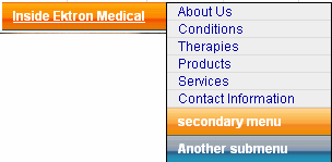
Properties
|
Property |
Flex Menus |
Menu |
|
508 compliant |
|
|
|
Shutter menu (When you click a menu, it opens directly below the menu title) |
|
|
|
Secondary menu opens when cursor hovers over it |
(alternative: secondary menu opens when clicked) |
|
|
Starts out collapsed; expands as site visitor selects secondary menu |
|
|
|
All menu levels open when page displays |
|
|
|
Can display secondary menu to the right of the root menu, instead of directly below it |
|
|
|
How appearance is modified |
Server control properties and style sheet |
Xslt and style sheet |
|
How behavior is modified |
Xslt |
Xslt and style sheet |
|
Option to launch menu links in a new window |
|
|
 Flexible Menu server control
Flexible Menu Server Control
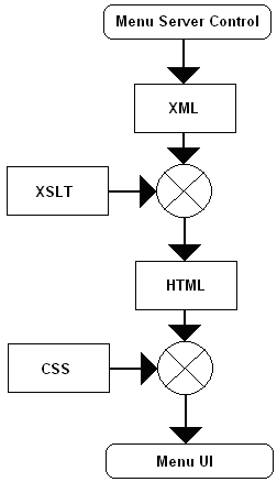
The Flex Menu server control displays a menu on a Web form. A Flex Menu creates XML, so you can modify its behavior using an XSLT file, and change its appearance using a cascading style sheet (.css) file.
NOTE: Before you can use this server control, you must create one or more menus in the Ektron Workarea. See Also: Working with Menus.
See Also: Contrasting Menu Server Controls
Sample Menus
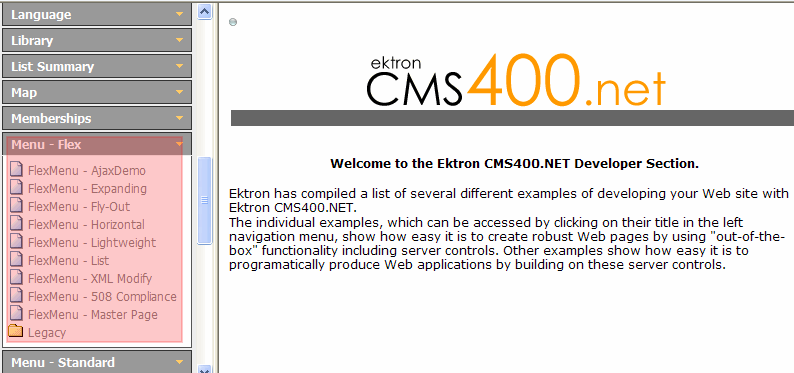
To facilitate the deployment of Flex menus, Ektron provides several sample menus that show their capabilities. You can use whichever sample meets your needs, then modify it for your site.
The sample menus can be viewed from the Developer Sample Page (siteroot/Developer/default.aspx) > Menu—Flex.
Description of sample menus
Description of the Sample Menus
NOTE: The Flex Menu server control generates the same XML for all samples, and identical copies of the Demo.xsl create identical markup for all samples. The different manifestations in the samples are due to the CSS styling rules in the related files.
|
Sample |
Description |
Location on Server |
|
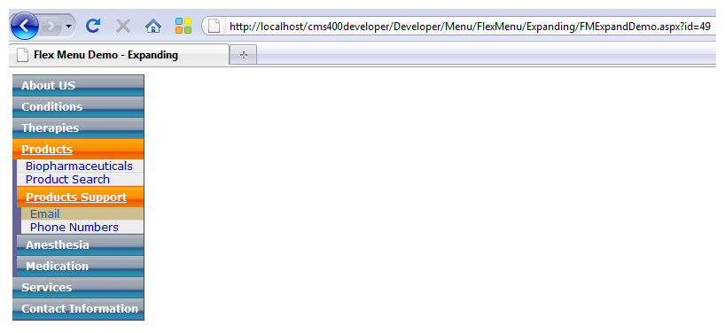
The only sample menu for which Ajax is enabled by You may not notice the speed on small menus, but with large menus, the speed improvement is significant. NOTE: The first time an Ajax-enabled menu is invoked, it is slow because the server is building it. After that, its response time should be quicker than non-Ajax menus. How the Menu Works
WARNING! This sample is meant to visually display a menu being populated via an Ajax call, as a user drills into it. This demo is not meant to be part of a public site. Rather, it demonstrates how a Flex Menu with Ajax improves performance. WARNING! When using Ajax with the Flex Menu (by setting |
|
|
|
/Menu /FMExpandDemo.aspx |
|
|
|
|
| Horizontal |
Site navigation often requires the placement of a horizontal menu in the upper part of the page. The Horizontal Flex Menu sample is a working menu with XSLT and CSS (as well as Flex Menu configuration settings) that provides a basis for this design. The sample's CSS file dramatically alters the appearance and behavior of this Flex Menu. You will typically edit that file to accommodate your site's design (colors, background images, and so on).
|
|
| Lightweight |
This menu generates much simpler markup (consisting of The jQuery code is located on the sample page:
|
|
|
|
|
| XML Modify |
This menu demonstrates how to significantly modify a menu's behavior by adding custom code in the code-behind file. In particular, it demonstrates use of the control's
|
siteroot/Developer/Menu
|
| 508 compliance |
This sample demonstrates a Section 508 compliant menu. The markup provides site navigation clues to web-page readers, including Braille-readers and text-to-speech. NOTE: To truly be 508-compliant, you must also implement a color scheme that provides the intended information to blind or visually-impaired users. Because color selection is determined by the site design, this task is left to the site designer.
|
siteroot/Developer/Menu
|
| Master Page | See ASP.NET Master-Pages Flex Menu | |
 ASP.NET Master-Pages Flex Menu
ASP.NET Master-Pages Flex Menu
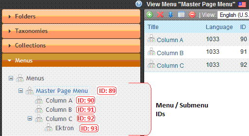
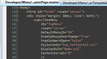
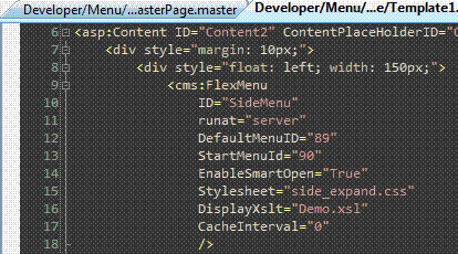
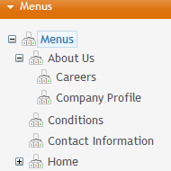
The Ektron Master Page sample leverages the ASP.NET master page concept with Ektron folder-templates to simplify the design and maintenance of site pages with multiple menus. The top menu is contained by the master page, while each side menu is contained in a corresponding child-content template page.
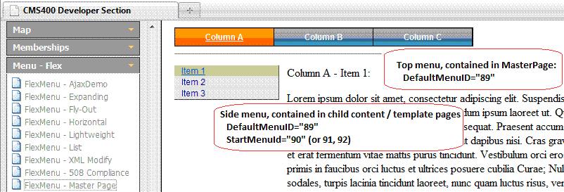
Note that all menus use the same root menu, in this example DefaultMenuID="89". Each side menu also has a particular starting child-node: StartMenuId="90" (or 91, 92).
The master page menu
The First (Child Content) Template Menu
The First (Child Content) Template Menu
To ensure that the proper (child-content) template page is loaded, each folder specifies the corresponding target ASPX page as its default template, and the content's quicklink specifies the template URL. Therefore, whenever a particular content item is shown, the referenced template is loaded, and the proper side menu appears.
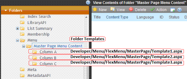
Folder templates
Files included with the master page sample
Files Included with the Master Page Sample
The sample's files include the following:
Demo.xsl—this single XSLT generates markup for all menus (top and side). If desired, you may specify different XSLTs.- JPGs—background image files.
side_expand.css—contains the style rules applied to the side menus.Template1.aspx—the first child-content template; contains a side menu that starts at submenu ID 90. The corresponding code-behind CS file is basically empty.Template2.aspx—the second child-content template; contains a side menu that starts at submenu ID 91.Template3.aspx—the third child-content template; contains a side menu that starts at submenu ID 92.top_horizontal.css—contains the style rules for the top menu.TopMenuMasterPage.master—holds the top menu and is a container for the previously mentioned templates.
Because side menus are contained in template pages, which are specified in the content's quicklink, all menu display actions are automatic. While customization options are available, these can quickly complicate matters, making maintenance more difficult and possibly resulting in unintended consequences. For example, a desired action is overridden by a customization added for another purpose.
Customization options include:
- The use of folder associations (set in the workarea, submenu properties).
- The use of template associations (workarea, submenu properties).
- In code-behind, possibly using the API as well as the Flex Menus’ PreProcessXml event (which fires after the XML has been loaded into the control's XmlDoc—just before the XSLT is run. This allows inspection and/or modification of the XML before it generates the menus' markup).
Copying and editing sample menus
Copying and Editing Sample Menus
To create a menu based on a sample:
- Examine the sample menus and decide which one best meets your needs for a particular page. See Description of the Sample Menus.
- If you want to create a new template (.aspx page) for the menu, place the new template in a new folder. Then, copy all files in the sample menu folder to the new folder and rename each file. For example, change
Ajaxdemo.aspxtomyflexmenu.aspx,AjaxDemo.csstomyflexmenu.css, anddemo.xsltomyflexmenu.xsl. - To insert a Flex Menu server control onto an existing template, copy the .css and .xsl file into the folder that contains the template.
WARNING! If you specify an external file, do not store it in your site's Workarea folder to prevent it from being overwritten when you upgrade.
IMPORTANT: The renamed .css file name must be all lowercase.
- Open the .aspx page. Update the
stylesheetandDisplayXsltproperties to refer to the new .css and .xsl files.If the files do not reside in the template’s folder, indicate their relative path using the syntax where slash (/) indicates the site root.
- Open the .css file. Update the parent class name to match the new file name. For example, if you copied the AjaxDemo.css file, the top of it looks like this.
.ajaxdemo .ekflexmenu
        {
        /* DIV; wraps the entire menu */
        /* (the outer-most non-user container element) */
        color: rgb(0, 0, 255);
        /*width: 148px;*/
        font-size: 12px;
        font-family: Sans-Serif;
        }
        .ajaxdemo .ekflexmenu_submenu,
        .ajaxdemo .ekflexmenu_submenu_hover,
        .ajaxdemo .ekflexmenu_submenu_parent,
        .ajaxdemo .ekflexmenu_submenu_parent_hover
        {
        /* DIV; holds submenu items, such as a submenu title and links. */
        top: 0px;
        left: 0px;
        }
        .ajaxdemo UL
        {
        /* UL; a container for menu list items (useful for non-graphical browsers). */
        /*list-style: none;
        /*margin: 0px;
        padding: 0px;*/
        }
Notice that every class begins with the file name, .AjaxDemo. Replace all occurrences of this with the new file name. To continue the above example, begin all classes with .myflexmenu.
Working with the Flex Menu Xslt file
Working with the Flex Menu Xslt File
This section explains some non-intuitive elements of the *.xslt file.
|
Element |
Context |
Description |
|
MenuFragment |
|
A flag that indicates the XML data is not complete. Instead, it’s a fragment that begins deeper than the top level (for example, a submenu fragment). Because the data is incomplete, the XSLT processes the fragment differently. For example, don’t generate JavaScript startup code. |
|
menuConst |
|
Each menu generates several elements, which the client code (JavaScript) accesses via a unique ID. For example, JavaScript needs to identify the selected submenu or item when a user clicks on an element.
|
|
#NoScroll |
|
|
|
event |
|
To make the xslt cross-browser compatible, it must support different methods of obtaining/passing the event object. In this example, the global event object is passed to the handling function. NOTE: |
How the Flex Menu Server Control Determines Which Item is Selected
How the Flex Menu Server Control Determines Which Item is Selected
The Flex Menu server control has the ability to select (highlight) options in a Flex menu as site visitors navigate around the Web site. For example, a site visitor arrives at a Web page through a link in an email. If the QueryString matches the an item in a Flex menu, the item is shown as selected.
Below is the logic the Flex menu uses to decide when a menu item should show as selected. The list is presented in the order in which the code checks to see if an item should be highlighted.
If any menu item is selected, its parent menu is marked selected. If any menu is selected, all ancestor menus are selected. When all tests have been performed and no matches are found, the Flex menu is rendered with no items selected.
WARNING! As soon as one condition is satisfied, the item is shown as selected and the testing stops.
NOTE: Steps 2 through 8 are each repeated recursively throughout the menu data hierarchy until either a match is found or the end is reached. If there are no matches for a test, the control continues with the next one.
- Inspects the QueryString to see if the
ekxmenselparameter is present with a matching menu node ID. This parameter is used to specify the exact node a user clicked. The node, its parent, and ancestor menus are all marked as selected. - Inspects the QueryString to see if a Content ID parameter value matches a menu item. If the Content ID in the QueryString matches a menu item, it is highlighted. For example, the QueryString includes
ExamplePage.aspx?id=123, and a menu item links to Content ID 123. - Inspects the QueryString to see if a Form ID parameter value matches a menu item. If the Form ID passed in the QueryString matches a Flex menu item, it is highlighted. For example, the QueryString includes
ExamplePage.aspx?ekfrm=456, and a menu item links to Form ID of 456. - Inspects the QueryString for a direct match with a menu item link. If there is a match, the menu item is selected. For example, if the QueryString has
ExamplePage.aspxand there is an item on the menu that matches, the menu item is shown as selected. - Inspects the QueryString for a
id,ekfrmorpageidparameter. If one is found, the control looks for a folder association between submenus and the folder that contains the object with the given ID. If the association exists, the menu item is shown as selected. - Inspects the QueryString to see if there is a direct match with a menu button link. If there is a match, the menu button is selected. For example, the QueryString has
ExamplePage.aspxand there is a button on the menu that matches. - Inspects the QueryString to see if there’s a template association with the filename. If there’s a match, the menu item is shown as selected.
- Inspects the QueryString for the
idorekfrmparameter and whether a value greater than zero is associated with it. If so, the control checks menu buttons for use ofLinkIt.aspx. If a button is usingLinkIt.aspxand eitheridorekfrmparameter matches, the menu button is selected.
Analyzing the Flex Menu's selection of menu items
Analyzing the Flex Menu's Selection of Menu Items
As you can see, the Flex Menu server control performs a complex sequence of tasks to determine which menu option to select. If you are unsure of a Flex Menu's behavior, you can view a log that lists the reasons for a menu selection. Use the log to troubleshoot issues with a Flex Menu.
Setting up a log of Flex Menu information
Setting Up Log of Flex Menu Information
Follow these steps to set up the ability to view a log of Flex Menu display information.
- Open your
site root/web.configfile. - Under
system.diagnostics, setLogLevelto 4. Save and close web.config.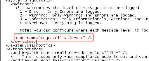
- Edit the .aspx or .ascx page that hosts the Flex Menu control.
- Set the control's
LogInfoproperty to true and save the page.<CMS:FlexMenu ID="FlexMenu1" LogInfo="True" runat="server" />NOTE: It may be helpful to temporarily disable the menu's cache by setting
CacheInterval="0". - Refresh the browser that contains the Flex Menu you edited in the Step 4.
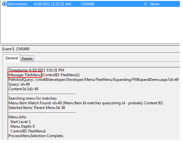
- Using the Windows Event Viewer, look for the newest information-level event that contains Message: Flex Menu (under the timestamp line).
The event message identifies the reason the menu node was selected. Or, if no matches were found, the message indicates that nothing is selected.
Flex Menu Server Control Properties
The following are Ektron-specific server control properties. You can find information about native .NET properties such as font, height, width and border style in Visual Studio® help.
- Authenticated (Boolean)
Indicates if you are logged into the CMS Explorer and can use it to browse to content, collections, and so on. See Also: Browsing Your Ektron Site Using CMS Explorer.
- AutoCollapseBranches (Boolean)
- True—whenever a new submenu opens, all other submenus close.
- False—other submenus remain open when a new one opens.
- CacheInterval (Double)
The number of seconds that the server control’s data is cached. The default is 0 (zero). For example, if you want to cache the data for 5 minutes, set to 300. See Also: Caching with Server Controls.
- DefaultMenuID (Long)
The ID of a menu that appears where you insert this server control if no other menu is identified or available. If you don’t know the ID number of the menu, use the CMS Explorer to browse to it. See Also: Browsing Your Ektron Site Using CMS Explorer
NOTE: If you want to change the Default menu's Starting menu, use the StartMenuID property.
- DisplayXslt (String)
If desired, enter a relative or absolute path to an Xslt that determines the display of the page. If nothing is specified, the menu is output as raw XML. Flex menus are designed to use the xsl file to control the menu’s behavior, and the .css file to control its display. Ektron provides several sample menus, and each has an xslt file. If this is a new menu, you may find it easier to copy and edit an xslt file provided with a sample menu. See Also: Sample Menus
WARNING! If you specify an external file, do not store this file in the Workarea folder. If you store this file in the Workarea folder, the file will be lost when you upgrade.
- DoInitFill (Boolean)
By default, Fill occurs during the Page_Init event. Set to false if you want to postpone the fill-action until later. In this case, Fill is automatically called during the Page Render event. You might do this if you need to set or change a property on the control in code-behind and have it render with your changes shown.
- EnableAjax (Boolean)
Set to True to enable Ajax, which only downloads sub-menus as needed. See Also: AjaxDemo
- EnableMouseOverPopup (Boolean)
- True—submenus appear as soon as the cursor moves over them.
- False—submenus only appear if a site visitor clicks them or a keyboard equivalent.
- EnableSmartOpen (Boolean)
Lets you prevent submenus from opening by default. Under some circumstances, such submenus look cluttered.
- True—any submenu can be set to open automatically. To learn about how to do this, see Assigning Folders or Templates to a Menu
- False—even if all required conditions are present, submenus on a Flex Menu do not automatically open.
- IncludeJS (Boolean)
- True—load the menu's JavaScript.
- False—ignore the menu's JavaScript. This would be useful if you redefine the menu's output with an XSLT.
- MasterControlId (String)
Only use this property if you are setting up a master/slave menu relationship, and this menu is the slave. If both are true, enter the ID of the master menu.
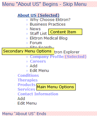
- MenuDepth (Integer)
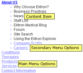
To let site visitors browse through all menu levels, enter zero (0). To restrict site visitors to a menu level, enter the number of the lowest level. In the following example, if you set this property to 1, a site visitor can browse through the About Us menu options but would not see the level 2 options (Company Profile and Careers).
- StartCollapsed (Boolean)
If you set to True, when the menu first appears, all submenus are closed.
- StartLevel (Integer)
Enter a number to indicate the level at which you want this menu to display when it first appears. To begin the menu display at the root level, enter zero (0). In the following example, the Home folder is level 0. The others are level 1.
A site visitor can click a menu option to navigate to folders below the displayed level.
NOTE: If you set a StartMenuID, the StartLevel property is ignored.
- StartMenuId (Integer)
Use this property to have the default menu begin somewhere other than its root.That is, at any submenu under the default menu. For example, menu ID 46 (Products) is the default menu. However when that menu displays, you only want to show its submenus, beginning with Products Support (ID 58). In this case, enter 46 into the
DefaultMenuIDproperty and 58 into theStartMenuIDproperty.NOTE: If you set a StartMenuID, the StartLevel property is ignored.
- Stylesheet (String)
Enter the style sheet that will determine the appearance of the menus. Flex menus use an .xsl file to control their behavior, and a .css file to control their display. Ektron provides several sample menus, and each has a .css file. If this is a new menu, you may find it easier to copy and edit a .css file provided with a sample menu. See Also: Sample Menus
- SuppressAddEdit (Boolean)
When set to True, suppress the Add and Edit buttons on the menu when a user is logged in to Ektron. The default is False.
- True—suppress the Add and Edit button when a user is logged in to Ektron.
- False—show the Add and Edit buttons when a user is logged in to Ektron.
- SuppressWrapperTags (Boolean)
This property is set to
falsebecause Ajax uses<div>tags to rewrite the region around the tag. You cannot change the value totrue. - WrapTag (String)
Lets a developer specify a server control’s tag.
- Span (default)—designate an inline portion of an HTML document as a span element.
- Div—apply attributes to a block of code.
- Custom—Lets you use a custom tag.
Menu server control
Menu Server Control
The Menu server control calls a menu to be displayed on a page. Using the Menu server control, you can manipulate a menu by using the DisplayXslt property. Below is a menu display with the SampleMenu XSLT.
Before you can use the Menu server control, you must create a menu in the Ektron Workarea. To learn about creating menus, Working with Menus.
See Also: Contrasting Menu Server Controls
Menu server control properties
Menu Server Control Properties
The following are Ektron-specific server control properties. You can find information about native .NET properties such as font, height, width and border style in Visual Studio® help.
- Authenticated (String)
Indicates if you are logged into the CMS Explorer and can use it to browse to content, collections, and so on. See Also: Browsing Your Ektron Site Using CMS Explorer.
- CacheInterval (Double)
The number of seconds that the server control’s data is cached. The default is 0 (zero). For example, if you want to cache the data for 5 minutes, set to 300. See Also: Caching with Server Controls.
- DefaultMenuID (Long)
The ID of a menu that appears where you insert this server control if no other menu is identified or available. If you don’t know the ID number of the menu, use the CMS Explorer to browse to it. See Also: Browsing Your Ektron Site Using CMS Explorer
- DisplayXslt (String)
The XSLT to use to render the menu.
- None—databind only
- SampleMenu—A sample display, formatted as a bulleted menu list
- TreeMenu—A sample display, formatted as a folder tree. You can expand the tree by clicking on the folder icon.
- Path to Custom Xslt—If desired, enter a relative or absolute path to an Xslt that determines the display of the page.
For more information on using the SampleMenu and TreeMenu DisplayXslt, see Using DisplayXslt Samples.
WARNING! If you specify an external file, do not store this file in the Workarea folder. If you store this file in the Workarea folder, the file will be lost when you upgrade.
- DoInitFill (Boolean)
By default, Fill occurs during the Page_Init event. Set to false if you want to postpone the fill-action until later. In this case, Fill is automatically called during the Page Render event. You might do this if you need to set or change a property on the control in code-behind and have it render with your changes shown.
- DynamicParameter (String)
Select menu_id. When you do, this server control uses the menu passed as a URL parameter.
- Hide (Boolean)
Hides or displays the output of the control in design time and run time.
- True—Hide the control output.
- False—Display the control output.
- Language (Integer)
Set a language for viewing content; shows results in design-time (in Visual Studio) and at run-time (in a browser).
For more information, see Working with Menus in a Multi-Language System.
- Stylesheet (String)
Specify the location and style sheet for the menu. For example:
\Workarea\csslib\mytest.css.Leave blank to use the default.global.cssis the default style sheet. It is located in\webroot\siteroot\Workarea\csslib. - SuppressAddEdit (Boolean)
When set to True, suppress the Add and Edit buttons on the menu when a user is logged in to Ektron. The default is False.
- True—suppress the Add and Edit button when a user is logged in to Ektron.
- False—show the Add and Edit buttons when a user is logged in to Ektron.
- SuppressWrapperTags (Boolean)
Suppresses the output of the span/div tags around the control.
- True—Suppress wrap tags.
- False (default)—Allow wrap tags.
- WrapTag (String)
Lets a developer specify a server control’s tag.
- Span (default)—designate an inline portion of an HTML document as a span element.
- Div—apply attributes to a block of code.
- Custom—Lets you use a custom tag.
Using DisplayXslt samples
Using DisplayXslt Samples
Two DisplayXslt samples are provided with the Menu server control, SampleMenu and TreeMenu. This section explains how to use them.
WARNING! If you specify an external file, do not store this file in the Workarea folder. If you store this file in the Workarea folder, the file will be lost when you upgrade.
SampleMenu
SampleMenu
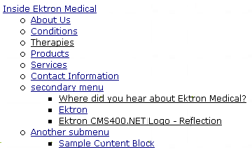
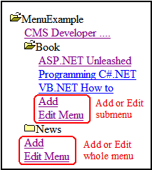
The SampleMenu DisplayXslt lets you display an Ektron menu as a bulleted item list. See below for an example.
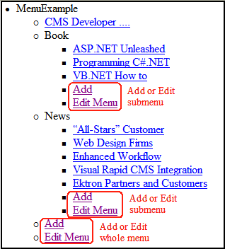
When you are logged in to your Ektron site, 2 menu items are added to each section of the menu: Add and Edit Menu. The user can use these to add a new menu item or edit an existing one. See example below.
For information on a adding a menu item, see Adding New Content to a Menu via Navigation Link on a Web Page.
For information on a editing a menu, see Editing a Menu's Properties via Navigation Link on a Web Page.
SampleMenu XSL code
For an example of the XSL code used in the SampleMenu, click the following link and choose the appropriate version.
TreeMenu
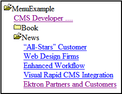
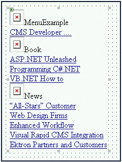
TreeMenu
The TreeMenu DisplayXslt lets you display an Ektron menu as a clickable folder list. You can expand and collapse the menu by clicking on the folder icons.
When you are logged in to your Ektron site, 2 menu items are added to each section of the menu: Add and Edit Menu. The user can use these to add a new menu item, or edit an existing menu item. See example below.
For information on a adding a menu item, see Adding New Content to a Menu via Navigation Link on a Web Page.
For information on a editing a menu, see Editing a Menu's Properties via Navigation Link on a Web Page.
NOTE: When using the TreeMenu server control with Visual Studio and Windows 2003, the folder images do not display during design-time. They do, however, display correctly during run-time.
TreeMenu XSL Code
For an example of the XSL code used in the MenuTree, click the following link and choose the appropriate version.
Retrieving the XML structure of a menu
Retrieving the XML Structure of a Menu
Retrieving a menu's XML structure provides greater control over developing XSLs. The following is an example of how to retrieve the XML structure:
- Open a new Web form.
- Drag and drop a Menu server control onto it.
- Set the
DefaultMenuIDproperties. - Drag and drop a textbox on the Web form.
- Set the
TextModeproperty to MultiLine. - Set the width of the text box to at least 400px.
- On the code-behind page, add the following line.
Textbox1.Text = Menu1.XmlDoc.InnerXml
- Build the project.
- View the Web form in a browser.
- The XML structure of the menu appears in the textbox.
For an additional example, see the Menu XML page on the CMS400Developer samples page. It is located at:
In a browser:
http://siteroot/CMS400Developer/Developer/Menu/MenuAsXML.aspx
In the source code:
siteroot/CMS400Developer/Developer/Menu/MenuAsXML.aspx and MenuAsXML.aspx.vb