Using the Collection Server Control
The Collection server control displays a collection that you create in the Ektron Workarea. The control lets you customize the display of the collection on a Web page.
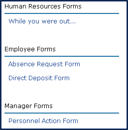
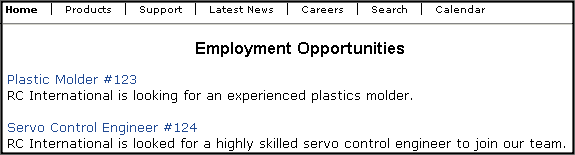
When added to a template and visited, collections can look like the following illustration, which shows 3 collections on the same page of a sample site. You can modify the display by editing its server control properties.
NOTE: On a PageBuilder page, you can insert a collection using the Collection widget. See Also: Collection—Displays a collection. You select a Collection ID.See Also: Working with Collections
Collection Server Control Properties
The following are Ektron-specific server control properties. You can find information about native .NET properties such as font, height, width and border style in Visual Studio® help.
- AddText (String)
Override the control’s default text for the Add Content menu item. For example, If you have a News Web site, you could change Add Content to Add News Item.
- Authenticated (String)
Indicates if you are logged into the CMS Explorer and can use it to browse to content, collections, and so on. See Also: Browsing Your Ektron Site Using CMS Explorer.
- CacheInterval (Double)
-
The number of seconds that the server control’s data is cached. The default is 0 (zero). For example, if you want to cache the data for 5 minutes, set to 300. See Also: Caching with Server Controls.
WARNING! If the
EnablePagingproperty is set to True, theCacheIntervalproperty is disabled. - ContentParameter (String)
Checks the QueryString for this value and replaces the collection with a content block when specified. Leave blank to always display the Collection.
- DefaultCollectionID (Long)
The ID of a collection that appears where you insert this server control if no other collection is identified, or is not available. If you don’t know the ID number of the collection, use the CMS Explorer to browse to it. See Also: Browsing Your Ektron Site Using CMS Explorer
- DisplayXslt (String)
Determines how the information on the page appears.
- None—databind only
- ecmNavigation—lists the title of every content block in the collection
See Also: Using the Collection Server Control
- ecmTeaser—lists the title of every content block in the collection plus the content summary
See Also: ecmTeaser Display Example
- Path to Custom Xslt—If desired, enter a relative or absolute path to an Xslt that determines the display of the page.
WARNING! If you specify an external file, do not store this file in the Workarea folder. If you store this file in the Workarea folder, the file will be lost when you upgrade.
If you enter a valid EkML file at the MarkupLanguage property, the Displayxslt property value is ignored. - DoInitFill (Boolean)
By default, Fill occurs during the Page_Init event. Set to false if you want to postpone the fill-action until later. In this case, Fill is automatically called during the Page Render event. You might do this if you need to set or change a property on the control in code-behind and have it render with your changes shown.
- DynamicParameter (String)
To make this collection dynamic, select coll_id. When you do, this server control uses the collection passed as a URL parameter.
- EnablePaging (Boolean)
This property, in conjunction with the MaxNumber property, lets site visitors view an unlimited number of items while controlling the amount of screen space. The MaxNumber property limits the number of items displayed. If you set this property to True, and the number of items exceeds MaxNumber, navigation aids appear below the last item, allowing the visitor to go to the next screen.See the following example.
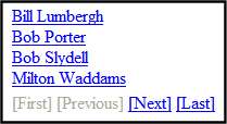
For example, if a collection has 9 items and the
MaxResultsproperty is set to 4, the screen displays only the first 4 items. When the site visitor clicks [Next], he sees items 5, 6, 7 and 8, and so on.WARNING! If the
EnablePagingproperty is set to True, theCacheIntervalproperty is disabled. - GetAnalyticsData (Boolean)
Set this property to True if you want the following information for each content in the list. Returns Content View Count, Content Rating, Content Rating Average. Create your own XSLT styles to display this data. This property only provides reliable data when the Business Analytics Feature is on. Business Analytics.
- GetHtml (Boolean)
Set to True if you want to retrieve and display content (html body) for all content blocks in the collection. For example, to display content inside a Web server control such as a GridView.
- Hide (Boolean)
Hides or displays the output of the control in design time and run time.
- True—Hide the control output.
- False—Display the control output.
- IncludeIcons (Boolean)
Choose whether to display icons next to the collection list’s links.
WARNING! This property only works when ecmSummary or ecmTeaser are used in the
DisplayXsltproperty. If the[$ImageIcon]variable is used in an EkML file and that file is assigned to theMarkupLanguageproperty, this property acts as True.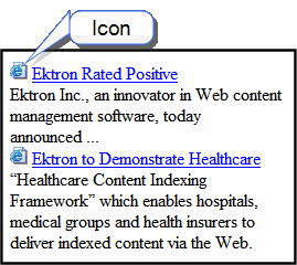
- Language (Integer)
Set a language for viewing content; shows results in design-time (in Visual Studio) and at run-time (in a browser).
- LinkTarget (ItemLinkTargets)
Determines the type of window that appears when you click a link in the server control.
- _Self (default)—opens in same window.
- _Top—opens in parent window.
- _Blank—opens in new window.
- _Parent—opens in the parent frame.
- MarkupLanguage (String)
Identify the template markup file that controls the display of the server control. For example,
mymarkup.ekml. If the EkML file is located in the same folder as the Web form containing the server control, just enter its name. Otherwise, the path to the file can be relative or absolute. See also: Controlling Output with Ektron Markup LanguageSee Also: collection.ekml
NOTE: If you enter a valid EkML file at the MarkupLanguage property, the Displayxslt property value is ignored. If the EkML file contains the
[$ImageIcon]variable, theIncludeIconsproperty acts as True. - MaxResults (Integer)
Enter the maximum number of items to appear in the initial display of this server control. To set no maximum, enter zero (0). To let site visitors view more than the maximum but limit the amount of space, enter the maximum number of results per page here. Then, set the EnablePaging property to True. If you do and more than the number of MaxResults are available, navigation aids help the site visitor view additional items. See example below.
- MemberMenuActive (Boolean)
Set this property to True to hide the drop-down menu next to a content item when a membership user is logged-in.
- True—Hide the drop-down next to a content item from membership users.
- False—Membership users can have access to the drop-down menu next to content item.
NOTE: This only affects membership users. Ektron users always see the drop-down menu when they are logged-in.
- Random (Boolean)
Set to True if you want to randomly display one collection item. The item changes each time a site visitor views the page.
NOTE: If you use a custom XSLT or EkML file, the type of content displayed can be manipulated. For example, if you use an EkML file that has the
[$Html]variable in it, the actual content appears instead of a link. See Also: Controlling Output with Ektron Markup Language and [$Html]. - SelTaxonomyID (Integer)
Set the ID of the taxonomy with which content is associated if a logged-in site visitor uses the Silver Access Point’s Add HTML Content option to add content to a Collection server control.
- SuppressWrapperTags (Boolean)
This property is set to
falsebecause Ajax uses<div>tags to rewrite the region around the tag. You cannot change the value totrue. - WrapTag (String)
Lets a developer specify a server control’s tag.
- Span (default)—designate an inline portion of an HTML document as a span element.
- Div—apply attributes to a block of code.
- Custom—Lets you use a custom tag.
ecmNavigation Display Example
The following figure shows a collection being used as a navigation menu.

ecmNavigation XSL code
The following XSL code creates the ecmNavigation Display. You can use this code as the basis to design your own XSLT.
WARNING! If you create a custom file, do not store it in the Workarea folder. If you do, the file will be overwritten when you upgrade.
<?xml version="1.0" encoding="ISO-8859-1"?>
<xsl:stylesheet version="1.0" xmlns:xsl="http://www.w3.org/1999/XSL/Transform">
<xsl:template match="/">
  <table border="0" cellspacing="0" cellpadding="0" width="100%">
   <xsl:for-each select="Collection/Content">
   <tr>
      <td>
         <a>
            <xsl:attribute name="href">
                <xsl:value-of select="QuickLink"/>
            </xsl:attribute>
                <xsl:value-of select="Title"/>
         </a>
     </td>
   </tr>
   </xsl:for-each>
  </table>
</xsl:template>
</xsl:stylesheet>
ecmTeaser Display Example
The following example shows a collection using the ecmTeaser display style.
ecmTeaser XSL code
The following XSL code creates the ecmTeaser Display. You can use this code as the basis to design your own XSLT.
WARNING! If you create a custom file, it is strongly recommended to not store the file in the Workarea folder. If you do, the file will be overwritten when you upgrade.
<?xml version="1.0" encoding="ISO-8859-1"?> <xsl:stylesheet version="1.0" xmlns:xsl="http://www.w3.org/1999/XSL/Transform"> <xsl:template match="/"> <table border="0" cellspacing="0" cellpadding="0" width="100%"> <xsl:for-each select="Collection/Content"> <tr> <td> <a> <xsl:attribute name="href"> <xsl:value-of select="QuickLink"/> </xsl:attribute> <xsl:value-of select="Title"/> </a>  </td> </tr> <tr> <td> <xsl:value-of select="Teaser" /> </td> </tr> <tr> <td> </td> </tr> </xsl:for-each> </table> </xsl:template></xsl:stylesheet>
Using the Collection Server Control Programmatically Example
The following is an example of using code-behind, and a drag and drop Collection server control to display random content from a collection.
- Drag and drop a Collection server control on your Web form.
- Set the properties in the properties window.
NOTE: In this example, the
RandomandGetHtmlproperties must be set to True. 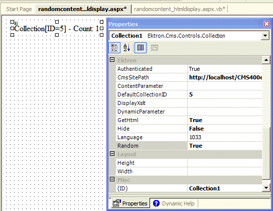
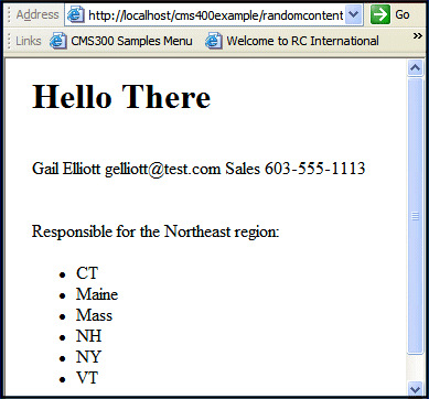
- Add the following code to the code-behind.
Dim str As String
str = "<h1>Hello There</h1><br>"
str &= Collection1.EkItems(0).Html
Collection1.Text = str
- Build and browse your Web form.
Retrieving the XML Structure of a Collection
Retrieving the XML structure of a collection allows for greater control over developing XSLs. The following is an example of how to do that.
- Open a new Web form.
- Drag and drop a Collection server control onto it.
- Set the
DefaultCollectionIDproperty. - Drag and drop a textbox on the Web form.
- Set the
TextModeproperty to MultiLine.NOTE: Set the text box width to at least 400px.
- On the code-behind page, add the following line.
Textbox1.Text = Collection1.XmlDoc.InnerXml
- Build the project.
- View the Web form in a browser.
- The XML structure of the collection appears in the textbox.
For an additional example, see the Collection XML page on the Developer samples page. It is located at:
- In a browser:
http://sitroot/CMS400Developer/Developer/Collection/CollectionXML.aspx
- In the source code:
siteroot/CMS400Developer/Developer/Collection/CollectionXML.aspx and CollectionXML.aspx.vb