Inserting Custom Functions
CMS Function
The CMS Function commands let you insert standard Ektron CMS400.NET display functions into your template.
The following sections explain how to insert each function.
ActiveTopics
For a description of the ActiveTopics function, see ActiveTopics Server Control .
This tag appears on the following menu(s):
Commands > Ektron CMS400.NET (Server Controls) > Community Controls... > Forums
To insert the ActiveTopics function:
1. Move the blinking cursor to the area that you want to place it.
2. From the list of Ektron CMS400.NET functions, click ActiveTopics.
3. The Insert Ektron CMS400.NET ActiveTopics box appears.

4. Use the following table to assist you with inserting the ActiveTopics function.
|
Field |
Description |
|
Control ID |
A unique name for the function you are inserting. |
|
BoardID |
The ID of the Discussion Board. If you do not know the board ID, you can navigate to it using the Select folder drop down box. |
|
DisplayMode |
Choose between Active or Recent. In Active mode, the server control displays the most active topics. In Recent mode, the server control displays the topics with the most recent posts. The default is Active. |
|
MaxNumber |
The maximum number of topics listed. |
|
CacheInterval |
Sets the amount of time the server control’s data is cached. The default is 0 (zero). This is the amount of time, in seconds, a control’s data is cached. For example, if you want to cache the data for five minutes, set this property to 300 (three hundred). See Also: Caching with Server Controls |
|
Hide |
Used to hide the function at run time. Checked—Hide function Unchecked—Show function Note: Note: If Hide and Visible are both checked, the property is hidden. |
|
Visible |
Used to show or hide the function at run time. Checked—Show function Unchecked—Hide function Note: Note: If Hide and Visible are both checked, the property is hidden. |
|
Style (Positioning Info—GridLayout) |
Set position information of a control as absolute, when using a GridLayout Web page. For example: style="Z-INDEX: 101; LEFT: 328px; POSITION: absolute; TOP: 240px" |
|
Wrap Tag |
Allows a developer to specify a server control’s tag. The default is Span. Span—The <span> tag is used to designate an in-line portion of an HTML document as a span element. Div—The <div> tag is used when you want to apply attributes to a block of code. |
|
SuppressWrapper |
Suppresses the output of the span/div tags around the control. The default is Unchecked. Checked—Suppress wrapper tags Unchecked—Do not suppress wrapper tags |
5. Click insert.
An ActiveTopics icon appears to indicate the location of the active topics list.

Shown below is an example of the code that is inserted:
|
Platform |
Code View |
|
.NET |
<cms:ActiveTopics BoardID="106" id="ActiveTopics1" runat="server"></cms:ActiveTopics> |
|
ASP |
This function is not available as an Ektron Dreamweaver Extension for ASP. |
|
ColdFusion |
This function is not available as an Ektron Dreamweaver Extension for ColdFusion. |
|
JSP |
This function is not available as an Ektron Dreamweaver Extension for JSP. |
|
PHP |
This function is not available as an Ektron Dreamweaver Extension for PHP. |
Analytics
This tag appears on the following menu:
Commands > Ektron CMS400.NET (Server Controls) > CMS Module Controls...
To insert the Analytics function:
1. Move the blinking cursor to the area that you want to place it.
2. From the list of Ektron CMS400.NET functions, click Analytics.
3. The Insert Ektron CMS400.NET Analytics box appears.

4. Use the following table to assist you with inserting the Analytics function.
|
Field |
Description |
|
Control ID |
A unique name for the function you are inserting. |
|
Content ID |
Specify the ID number of a content item being tracked by this function. If you do not know the Content ID, you can navigate to it using the Select Category and Select Content drop down boxes. |
|
Dynamic Content Parameter |
To make this content analytic control dynamic, select id. When you do, this server control is attached to the content block passed as a URL parameter. |
|
Hide |
Used to hide the function at run time. Checked—Hide function Unchecked—Show function Note: Note: If Hide and Visible are both checked, the property is hidden. |
|
Visible |
Used to show or hide the function at run time. Checked—Show function Unchecked—Hide function Note: Note: If Hide and Visible are both checked, the property is hidden. |
|
Style (Positioning Info—GridLayout) |
Set position information of a control as absolute, when using a GridLayout Web page. For example: style="Z-INDEX: 101; LEFT: 328px; POSITION: absolute; TOP: 240px" |
|
Wrap Tag |
Allows a developer to specify a server control’s tag. The default is Span. Span—The <span> tag is used to designate an in-line portion of an HTML document as a span element. Div—The <div> tag is used when you want to apply attributes to a block of code. |
|
SuppressWrapper |
Suppresses the output of the span/div tags around the control. The default is Unchecked.
|


5. Click insert.
An Analytic icon appears to indicate that content is being tracked. If you are logged in as a CMS user and visit the web page, you see the Analytic information. If you are not logged in, you see nothing.

Shown below is an example of the code that is inserted:
|
Platform |
Code View |
|
.NET |
<cms:AnalyticsTracker id="AnalyticsTracker1" DefaultContentID="30" runat="server"></cms:AnalyticsTracker> |
|
ASP |
This function is not available as an Ektron Dreamweaver Extension for ASP. |
|
ColdFusion |
This function is not available as an Ektron Dreamweaver Extension for ColdFusion. |
|
JSP |
This function is not available as an Ektron Dreamweaver Extension for JSP. |
|
PHP |
This function is not available as an Ektron Dreamweaver Extension for PHP. |
AssetControl
For a description of the AssetControl function, see AssetControl Server Control.
This tag appears on the following menu(s):
Commands > Ektron CMS400.NET (Server Controls) > Community Controls...
To insert the AssetControl function:
1. Move the blinking cursor to the area that you want to place it.
2. From the list of Ektron CMS400.NET functions, click AssetControl.
3. The Insert Ektron CMS400.NET AssetControl box appears.

4. Use the following table to assist you with inserting the AssetControl function.
|
Field |
Description |
|
Control ID |
A unique name for the function you are inserting. |
|
The ID of the folder where assets are added. This property is used when the UploadType property is set to Add. See Also: UploadType If you do not know the Folder ID, you can navigate to it using the Select Folder drop down box. |
|
|
The ID of the asset you want to update. This property is use when the UploadType property is set to Update. See Also: UploadTypeUploadType |
|
|
Select whether the control adds new assets or update existing ones. Select Add to add assets and use the FolderID property. See Also: FolderID. Select Update to update assets and use the DefaultAssetID. See Also: DefaultAssetID. The default is None. |
|
|
Hide |
Used to hide a function at run time. Checked—Hide function Unchecked—Show function Note: Note: If Hide and Visible are both checked, the property is hidden. |
|
Visible |
Used to show or hide the function at run time. Checked—Show function Unchecked—Hide function Note: Note: If Hide and Visible are both checked, the property is hidden. |
|
Style (Positioning Info—GridLayout) |
Set position information of a control as absolute, when using a GridLayout Web page. For example: style="Z-INDEX: 101; LEFT: 328px; POSITION: absolute; TOP: 240px" |
|
Wrap Tag |
Allows a developer to specify a server control’s tag. The default is Span. Span—The <span> tag is used to designate an in-line portion of an HTML document as a span element. Div—The <div> tag is used when you want to apply attributes to a block of code. |
|
SuppressWrapper |
Suppresses the output of the span/div tags around the control. The default is Unchecked.
|
5. Click insert.
An AssetControl icon appears and indicates the AssetControl’s location on the template.

Shown below is an example of the code that is inserted:
|
Platform |
Code View |
|
.NET |
<cms:AssetControl id="AssetControl1" DefaultFolderID="0" runat="server"></cms:AssetControl> |
|
ASP |
This function is not available as an Ektron Dreamweaver Extension for ASP. |
|
ColdFusion |
This function is not available as an Ektron Dreamweaver Extension for ColdFusion. |
|
JSP |
This function is not available as an Ektron Dreamweaver Extension for JSP. |
|
PHP |
This function is not available as an Ektron Dreamweaver Extension for PHP. |
Blog
For a description of the Blog function, see Blog Server Control and Introduction to Blog Server Controls.
This tag appears on the following menu(s):
Commands > Ektron CMS400.NET (Server Controls) > Community Controls... > Blogs
To insert the Blog function:
1. Move the blinking cursor to the area that you want to place it.
2. From the list of Ektron CMS400.NET functions, click Blog.
3. The Insert Ektron CMS400.NET Blog box appears.

4. Use the following table to assist you with inserting the Blog function.
|
Field |
Description |
|
Control ID |
A unique name for the function you are inserting. |
|
Blog ID |
The ID of the blog in Ektron CMS400.NET. If you do not know the Blog ID, you can choose it from the Select Folder drop down box. |
|
ShowRSS |
Displays the icon for the RSS feed (
|
|
ArchiveMode |
Select whether the archive appears in month format or year format. The default is month.
|
|
MaxResults |
Set the maximum number of posts to display. If set to 0 (zero), there is no limit. If set to -1, all posts for the day are shown. If set to -2, the all post for the month are shown, If set to -3, the control uses the # of Post Visible setting in the Workarea. The default is -3. For information on the Workarea setting # of post visible, see Blog Properties. |
|
DateToStart |
The date of the last blog entries you want to appear. For example, if you want to display blog entries for January 1, 2006 and before, you enter 1/1/2006. Clicking the dropdown box provides you with a calendar. |
|
EditorHeight |
Sets the height of the blog editor in pixels. |
|
EditorWidth |
Sets the width of the blog editor in pixels. |
|
RecentPosts |
The number of post links contained in the Recent Posts list. The default is 5 (five). |
|
PostParameter |
Works like the DynamicParameter for content blocks. When id is selected, this server control passes the blog post ID as a URL parameter. The default setting is id. Blank—the list of blog posts is static. The links in the blog posts are inactive. id—the id of the blog post is passed to the URL as a parameter. None use default—the list of blog posts is static. The links in the blog posts are inactive. |
|
ShowHeader |
Shows the title and tagline when this box is checked. The default is Checked. Checked—show title and tagline Unchecked—do not show header and tagline |
|
# of seconds—CacheInterval |
Sets the amount of time the server control’s data is cached. The default is 0 (zero). This is the amount of time, in seconds, a control’s data is cached. For example, if you want to cache the data for five minutes, set this property to 300 (three hundred). See Also: Caching with Server Controls. |
|
Hide |
Used to hide a function at run time. Checked—Hide function Unchecked—Show function Note: Note: If Hide and Visible are both checked, the property is hidden. |
|
Visible |
Used to show or hide the function at run time. Checked—Show function Unchecked—Hide function Note: Note: If Hide and Visible are both checked, the property is hidden. |
|
Style (Positioning Info—GridLayout) |
Set position information of a control as absolute, when using a GridLayout Web page. For example: style="Z-INDEX: 101; LEFT: 328px; POSITION: absolute; TOP: 240px" |
|
Wrap Tag |
Allows a developer to specify a server control’s tag. The default is Span. Span—The <span> tag is used to designate an in-line portion of an HTML document as a span element. Div—The <div> tag is used when you want to apply attributes to a block of code. |
|
SuppressWrapper |
Suppresses the output of the span/div tags around the control. The default is Unchecked.
|
 ) when the box is checked. The default is
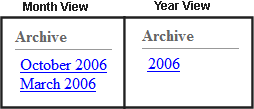
5. Click insert.
A Blog icon appears and indicates the Blog’s location on the template.

Shown below is an example of the code that is inserted:
|
Platform |
Code View |
|
.NET |
<cms:Blog id="Blog1" BlogID="41" runat="server"></cms:Blog> |
|
ASP |
This function is not available as an Ektron Dreamweaver Extension for ASP. |
|
ColdFusion |
This function is not available as an Ektron Dreamweaver Extension for ColdFusion. |
|
JSP |
This function is not available as an Ektron Dreamweaver Extension for JSP. |
|
PHP |
This function is not available as an Ektron Dreamweaver Extension for PHP. |
Blog Archive
For a description of the Blog Archive function, see BlogArchive Server Control.
This tag appears on the following menu(s):
Commands > Ektron CMS400.NET (Server Controls) > Community Controls... > Blogs
To insert the Blog Archive function:
1. Move the blinking cursor to the area that you want to place it.
2. From the list of Ektron CMS400.NET functions, click Blog Archive.
3. The Insert Ektron CMS400.NET Blog Archive box appears.

4. Use the following table to assist you with inserting the Blog Archive function.
|
Field |
Description |
|
Control ID |
A unique name for the function you are inserting. |
|
Blog ID |
The ID of the blog in Ektron CMS400.NET. If you do not know the Blog ID, you can choose it from the Select Folder drop down box. |
|
# of seconds—CacheInterval |
Sets the amount of time the server control’s data is cached. The default is 0 (zero). This is the amount of time, in seconds, a control’s data is cached. For example, if you want to cache the data for five minutes, set this property to 300 (three hundred). See Also: Caching with Server Controls |
|
Hide |
Used to hide a function at run time. Checked—Hide function Unchecked—Show function Note: Note: If Hide and Visible are both checked, the property is hidden. |
|
Visible |
Used to show or hide the function at run time. Checked—Show function Unchecked—Hide function Note: Note: If Hide and Visible are both checked, the property is hidden. |
|
Style (Positioning Info—GridLayout) |
Set position information of a control as absolute, when using a GridLayout Web page. For example: style="Z-INDEX: 101; LEFT: 328px; POSITION: absolute; TOP: 240px" |
|
Wrap Tag |
Allows a developer to specify a server control’s tag. The default is Span. Span—The <span> tag is used to designate an in-line portion of an HTML document as a span element. Div—The <div> tag is used when you want to apply attributes to a block of code. |
|
SuppressWrapper |
Suppresses the output of the span/div tags around the control. The default is Unchecked. Checked—Suppress wrapper tags Unchecked—Do not suppress wrapper tags |
5. Click insert.
A BlogArchive icon appears and indicates the Blog Archive’s location on the template.

Shown below is an example of the code that is inserted:
|
Platform |
Code View |
|
.NET |
<cms:BlogArchive id="Blogarchive1" BlogID="41" runat="server"></cms:BlogArchive> |
|
ASP |
This function is not available as an Ektron Dreamweaver Extension for ASP. |
|
ColdFusion |
This function is not available as an Ektron Dreamweaver Extension for ColdFusion. |
|
JSP |
This function is not available as an Ektron Dreamweaver Extension for JSP. |
|
PHP |
This function is not available as an Ektron Dreamweaver Extension for PHP. |
Blog Calendar
For a description of the Blog Calendar function, see BlogCalendar Server Control.
This tag appears on the following menu(s):
Commands > Ektron CMS400.NET (Server Controls) > Community Controls... > Blogs
To insert the Blog Calendar function:
1. Move the blinking cursor to the area that you want to place it.
2. From the list of Ektron CMS400.NET functions, click Blog Calendar.
3. The Insert Ektron CMS400.NET Blog Calendar box appears.

4. Use the following table to assist you with inserting the Blog Calendar function.
|
Field |
Description |
|
Control ID |
A unique name for the function you are inserting. |
|
Blog ID |
The ID of the blog in Ektron CMS400.NET. If you do not know the Blog ID, you can choose it from the Select Folder drop down box. |
|
# of seconds—CacheInterval |
Sets the amount of time the server control’s data is cached. The default is 0 (zero). This is the amount of time, in seconds, a control’s data is cached. For example, if you want to cache the data for five minutes, set this property to 300 (three hundred). See Also: Caching with Server Controls |
|
Hide |
Used to hide a function at run time. Checked—Hide function Unchecked—Show function Note: Note: If Hide and Visible are both checked, the property is hidden. |
|
Visible |
Used to show or hide the function at run time. Checked—Show function Unchecked—Hide function Note: Note: If Hide and Visible are both checked, the property is hidden. |
|
Style (Positioning Info—GridLayout) |
Set position information of a control as absolute, when using a GridLayout Web page. For example: style="Z-INDEX: 101; LEFT: 328px; POSITION: absolute; TOP: 240px" |
|
Wrap Tag |
Allows a developer to specify a server control’s tag. The default is Span. Span—The <span> tag is used to designate an in-line portion of an HTML document as a span element. Div—The <div> tag is used when you want to apply attributes to a block of code. |
|
SuppressWrapper |
Suppresses the output of the span/div tags around the control. The default is Unchecked. Checked—Suppress wrapper tags Unchecked—Do not suppress wrapper tags |
5. Click insert.
A Blog Calendar icon appears and indicates the Blog Calendar's location on the template.

Shown below is an example of the code that is inserted:
|
Platform |
Code View |
|
.NET |
<cms:blogcalendar id="blogcalendar1" BlogID="41" runat="server"></cms:blogcalendar> |
|
ASP |
This function is not available as an Ektron Dreamweaver Extension for ASP. |
|
ColdFusion |
This function is not available as an Ektron Dreamweaver Extension for ColdFusion. |
|
JSP |
This function is not available as an Ektron Dreamweaver Extension for JSP. |
|
PHP |
This function is not available as an Ektron Dreamweaver Extension for PHP. |
Blog Categories
For a description of the Blog Categories function, see BlogCategories Server Control.
This tag appears on the following menu(s):
Commands > Ektron CMS400.NET (Server Controls) > Community Controls... > Blogs
To insert the Blog Categories function:
1. Move the blinking cursor to the area that you want to place it.
2. From the list of Ektron CMS400.NET functions, click Blog Categories.
3. The Insert Ektron CMS400.NET Blog Categories box appears.

4. Use the following table to assist you with inserting the Blog Categories function.
|
Field |
Description |
|
Control ID |
A unique name for the function you are inserting. |
|
Blog ID |
The ID of the blog in Ektron CMS400.NET. If you do not know the Blog ID, you can choose it from the Select Folder drop down box. |
|
# of seconds—CacheInterval |
Sets the amount of time the server control’s data is cached. The default is 0 (zero). This is the amount of time, in seconds, a control’s data is cached. For example, if you want to cache the data for five minutes, set this property to 300 (three hundred). See Also: Caching with Server Controls |
|
Hide |
Used to hide a function at run time. Checked—Hide function Unchecked—Show function Note: Note: If Hide and Visible are both checked, the property is hidden. |
|
Visible |
Used to show or hide the function at run time. Checked—Show function Unchecked—Hide function Note: Note: If Hide and Visible are both checked, the property is hidden. |
|
Style (Positioning Info—GridLayout) |
Set position information of a control as absolute, when using a GridLayout Web page. For example: style="Z-INDEX: 101; LEFT: 328px; POSITION: absolute; TOP: 240px" |
|
Wrap Tag |
Allows a developer to specify a server control’s tag. The default is Span. Span—The <span> tag is used to designate an in-line portion of an HTML document as a span element. Div—The <div> tag is used when you want to apply attributes to a block of code. |
|
SuppressWrapper |
Suppresses the output of the span/div tags around the control. The default is Unchecked. Checked—Suppress wrapper tags Unchecked—Do not suppress wrapper tags |
5. Click insert.
A Blog Categories icon appears and indicates the Blog Categories’ location on the template.

Shown below is an example of the code that is inserted:
|
Platform |
Code View |
|
.NET |
<cms:BlogCategories id="BlogCategories1" BlogID="41" runat="server"></cms:BlogCategories> |
|
ASP |
This function is not available as an Ektron Dreamweaver Extension for ASP. |
|
ColdFusion |
This function is not available as an Ektron Dreamweaver Extension for ColdFusion. |
|
JSP |
This function is not available as an Ektron Dreamweaver Extension for JSP. |
|
PHP |
This function is not available as an Ektron Dreamweaver Extension for PHP. |
Blog Entries
For a description of the Blog Entries function, see BlogEntries Server Control.
This tag appears on the following menu(s):
Commands > Ektron CMS400.NET (Server Controls) > Community Controls... > Blogs
To insert the Blog Entries function:
1. Move the blinking cursor to the area that you want to place it.
2. From the list of Ektron CMS400.NET functions, click Blog Entries.
3. The Insert Ektron CMS400.NET Blog Entries box appears.

4. Use the following table to assist you with inserting the Blog Entries function.
|
Field |
Description |
|
Control ID |
A unique name for the function you are inserting. |
|
Blog ID |
The ID of the blog in Ektron CMS400.NET. If you do not know the Blog ID, you can choose it from the Select Folder drop down box. |
|
DateToStart |
The date of the last blog entries you want to appear. For example, if you want to display blog entries for January 1, 2006 and before, you enter 1/1/2006. Clicking the dropdown box provides you with a calendar. |
|
PostParameter |
Works like the DynamicParameter for content blocks. When id is selected, this server control passes the blog post ID as a URL parameter. If you do not set this parameter to id, you will not be forwarded to the blog post’s page when you click on any links in the post. The default setting is id. Blank—the list of blog posts is static. The links in the blog posts are inactive. id—the id of the blog post is passed to the URL as a parameter and None use default—the list of blog posts is static. The links in the blog posts are inactive. |
|
MaxResults |
Set the maximum number of posts to display. If set to 0 (zero), there is no limit. If set to -1, all posts for the day are shown. If set to -2, the all post for the month are shown, If set to -3, the control uses the # of Post Visible setting in the Workarea. The default is -3. For information on the Workarea setting # of post visible, see ”# of Visible Posts” on page 648. |
|
# of seconds—CacheInterval |
Sets the amount of time the server control’s data is cached. The default is 0 (zero). This is the amount of time, in seconds, a control’s data is cached. For example, if you want to cache the data for five minutes, set this property to 300 (three hundred). See Also: Caching with Server Controls |
|
DisplayXslt |
Specify an external XSLT file. See Also: The OverrideXslt and DisplayXslt Properties. Warning! If you specify an external file, it is strongly recommended that you do not store this file in your site's Workarea folder. If you store this file in the Workarea folder, the file will be lost when you upgrade. |
|
Hide |
Used to hide a function at run time. Checked—Hide function Unchecked—Show function Note: Note: If Hide and Visible are both checked, the property is hidden. |
|
Visible |
Used to show or hide the function at run time. Checked—Show function Unchecked—Hide function Note: Note: If Hide and Visible are both checked, the property is hidden. |
|
Style (Positioning Info—GridLayout) |
Set position information of a control as absolute, when using a GridLayout Web page. For example: style="Z-INDEX: 101; LEFT: 328px; POSITION: absolute; TOP: 240px" |
|
Wrap Tag |
Allows a developer to specify a server control’s tag. The default is Span. Span—The <span> tag is used to designate an in-line portion of an HTML document as a span element. Div—The <div> tag is used when you want to apply attributes to a block of code. |
|
SuppressWrapper |
Suppresses the output of the span/div tags around the control. The default is Unchecked. Checked—Suppress wrapper tags Unchecked—Do not suppress wrapper tags |
5. Click insert.
A Blog Entries icon appears and indicates the Blog Entries’ location on the template.

Shown below is an example of the code that is inserted:
|
Platform |
Code View |
|
.NET |
<cms:BlogEntries id="BlogEntries1" BlogID="41" runat="server"></cms:BlogEntries> |
|
ASP |
This function is not available as an Ektron Dreamweaver Extension for ASP. |
|
ColdFusion |
This function is not available as an Ektron Dreamweaver Extension for ColdFusion. |
|
JSP |
This function is not available as an Ektron Dreamweaver Extension for JSP. |
|
PHP |
This function is not available as an Ektron Dreamweaver Extension for PHP. |
Blog Post
For a description of the Blog Post function, see BlogPost Server Control.
This tag appears on the following menu(s):
Commands > Ektron CMS400.NET (Server Controls) > Community Controls... > Blogs
To insert the Blog Post function:
1. Move the blinking cursor to the area that you want to place it.
2. From the list of Ektron CMS400.NET functions, click Blog Post.
3. The Insert Ektron CMS400.NET Blog Post box appears.

4. Use the following table to assist you with inserting the Blog Post function.
|
Field |
Description |
|
Control ID |
A unique name for the function you are inserting. |
|
DefaultContent ID |
The ID of a blog post in Ektron CMS400.NET. If you do not know the Blog Post’s ID, you can navigate to it using the Select Category and Select Content drop down boxes. |
|
DynamicParameter |
To make this blog post dynamic, select id. When you do, this server control uses the blog post passed as a URL parameter. |
|
ShowType |
Shows a blog post’s content and its comments or just the comments. The default is Content. Content—Show a blogpost’s content and its comments. Description—Show a blogpost’s comments only. |
|
DisplayXslt |
Specify an external XSLT file. See Also: The OverrideXslt and DisplayXslt Properties Warning! If you specify an external file, it is strongly recommended that you do not store this file in your site's Workarea folder. If you store this file in the Workarea folder, the file will be lost when you upgrade. |
|
Hide |
Used to hide a function at run time. Checked—Hide function Unchecked—Show function Note: Note: If Hide and Visible are both checked, the property is hidden. |
|
Visible |
Used to show or hide the function at run time. Checked—Show function Unchecked—Hide function Note: Note: If Hide and Visible are both checked, the property is hidden. |
|
# of seconds—CacheInterval |
Sets the amount of time the server control’s data is cached. The default is 0 (zero). This is the amount of time, in seconds, a control’s data is cached. For example, if you want to cache the data for five minutes, set this property to 300 (three hundred). See Also: ”Caching with Server Controls” on page 43. |
|
Style (Positioning Info—GridLayout) |
Set position information of a control as absolute, when using a GridLayout Web page. For example: style="Z-INDEX: 101; LEFT: 328px; POSITION: absolute; TOP: 240px" |
|
Wrap Tag |
Allows a developer to specify a server control’s tag. The default is Span. Span—The <span> tag is used to designate an in-line portion of an HTML document as a span element. Div—The <div> tag is used when you want to apply attributes to a block of code. |
|
SuppressWrapper |
Suppresses the output of the span/div tags around the control. The default is Unchecked. Checked—Suppress wrapper tags Unchecked—Do not suppress wrapper tags |
5. Click insert.
A Blog Post icon appears and indicates the Blog Post’s location on the template.

Shown below is an example of the code that is inserted:
|
Platform |
Code View |
|
.NET |
<cms:BlogPost id="BlogPost1" DefaultContentID="370" runat="server"></cms:BlogPost> |
|
ASP |
This function is not available as an Ektron Dreamweaver Extension for ASP. |
|
ColdFusion |
This function is not available as an Ektron Dreamweaver Extension for ColdFusion. |
|
JSP |
This function is not available as an Ektron Dreamweaver Extension for JSP. |
|
PHP |
This function is not available as an Ektron Dreamweaver Extension for PHP. |
Blog Recent Posts
For a description of the Blog Recent Posts function, see BlogRecentPosts Server Control.
This tag appears on the following menu(s):
Commands > Ektron CMS400.NET (Server Controls) > Community Controls... > Blogs
To insert the Blog Recent Posts function:
1. Move the blinking cursor to the area that you want to place it.
2. From the list of Ektron CMS400.NET functions, click Blog Recent Posts.
3. The Insert Ektron CMS400.NET Blog Recent Posts box appears.

4. Use the following table to assist you with inserting the Blog Recent Posts function.
|
Field |
Description |
|
Control ID |
A unique name for the function you are inserting. |
|
Blog ID |
The ID of the blog in Ektron CMS400.NET. If you do not know the Blog ID, you can choose it from the Select Folder drop down box. |
|
NumberofPosts |
Sets the number of post links to display. |
|
# of seconds—CacheInterval |
Sets the amount of time the server control’s data is cached. The default is 0 (zero). This is the amount of time, in seconds, a control’s data is cached. For example, if you want to cache the data for five minutes, set this property to 300 (three hundred). See Also: Caching with Server Controls |
|
Hide |
Used to hide a function at run time. Checked—Hide function Unchecked—Show function Note: Note: If Hide and Visible are both checked, the property is hidden. |
|
Visible |
Used to show or hide the function at run time. Checked—Show function Unchecked—Hide function Note: Note: If Hide and Visible are both checked, the property is hidden. |
|
Style (Positioning Info—GridLayout) |
Set position information of a control as absolute, when using a GridLayout Web page. For example: style="Z-INDEX: 101; LEFT: 328px; POSITION: absolute; TOP: 240px" |
|
Wrap Tag |
Allows a developer to specify a server control’s tag. The default is Span. Span—The <span> tag is used to designate an in-line portion of an HTML document as a span element. Div—The <div> tag is used when you want to apply attributes to a block of code. |
|
SuppressWrapper |
Suppresses the output of the span/div tags around the control. The default is Unchecked. Checked—Suppress wrapper tags Unchecked—Do not suppress wrapper tags |
5. Click insert.
A Blog Recent Posts icon appears and indicates the Blog Recent Posts’ location on the template.

Shown below is an example of the code that is inserted:
|
Platform |
Code View |
|
.NET |
<cms:BlogRecentPosts id="BlogRecentPosts1" BlogID="41" runat="server"></cms:BlogRecentPosts> |
|
ASP |
This function is not available as an Ektron Dreamweaver Extension for ASP. |
|
ColdFusion |
This function is not available as an Ektron Dreamweaver Extension for ColdFusion. |
|
JSP |
This function is not available as an Ektron Dreamweaver Extension for JSP. |
|
PHP |
This function is not available as an Ektron Dreamweaver Extension for PHP. |
Blog Roll
For a description of the Blog Roll function, see BlogRoll Server Control.
This tag appears on the following menu(s):
Commands > Ektron CMS400.NET (Server Controls) > Community Controls... > Blogs
To insert the Blog Roll function:
1. Move the blinking cursor to the area that you want to place it.
2. From the list of Ektron CMS400.NET functions, click Blog Roll.
3. The Insert Ektron CMS400.NET Blog Roll box appears.

4. Use the following table to assist you with inserting the Blog Roll function.
|
Field |
Description |
|
Control ID |
A unique name for the function you are inserting. |
|
Blog ID |
The ID of the blog in Ektron CMS400.NET. If you do not know the Blog ID, you can choose it from the Select Folder drop down box. |
|
# of seconds—CacheInterval |
Sets the amount of time the server control’s data is cached. The default is 0 (zero). This is the amount of time, in seconds, a control’s data is cached. For example, if you want to cache the data for five minutes, set this property to 300 (three hundred). See Also: Caching with Server Controls |
|
Hide |
Used to hide a function at run time. Checked—Hide function Unchecked—Show function Note: Note: If Hide and Visible are both checked, the property is hidden. |
|
Visible |
Used to show or hide the function at run time. Checked—Show function Unchecked—Hide function Note: Note: If Hide and Visible are both checked, the property is hidden. |
|
Style (Positioning Info—GridLayout) |
Set position information of a control as absolute, when using a GridLayout Web page. For example: style="Z-INDEX: 101; LEFT: 328px; POSITION: absolute; TOP: 240px" |
|
Wrap Tag |
Allows a developer to specify a server control’s tag. The default is Span. Span—The <span> tag is used to designate an in-line portion of an HTML document as a span element. Div—The <div> tag is used when you want to apply attributes to a block of code. |
|
SuppressWrapper |
Suppresses the output of the span/div tags around the control. The default is Unchecked. Checked—Suppress wrapper tags Unchecked—Do not suppress wrapper tags |
5. Click Insert.
A Blog Roll icon appears and indicates the Blog Roll’s location on the template.

Shown below is an example of the code that is inserted:
|
Platform |
Code View |
|
.NET |
<cms:BlogRoll id="BlogRoll1" BlogID="41" runat="server"></cms:BlogRoll> |
|
ASP |
This function is not available as an Ektron Dreamweaver Extension for ASP. |
|
ColdFusion |
This function is not available as an Ektron Dreamweaver Extension for ColdFusion. |
|
JSP |
This function is not available as an Ektron Dreamweaver Extension for JSP. |
|
PHP |
This function is not available as an Ektron Dreamweaver Extension for PHP. |
Blog RSS
For a description of the Blog RSS function, see BlogRSS Server Control.
This tag appears on the following menu(s):
Commands > Ektron CMS400.NET (Server Controls) > Community Controls... > Blogs
To insert the Blog RSS function:
1. Move the blinking cursor to the area that you want to place it.
2. From the list of Ektron CMS400.NET functions, click Blog RSS.
3. The Insert Ektron CMS400.NET Blog RSS box appears.

4. Use the following table to assist you with inserting the Blog RSS function.
|
Field |
Description |
|
Control ID |
A unique name for the function you are inserting. |
|
Blog ID |
The ID of the blog in Ektron CMS400.NET. If you do not know the Blog ID, you can choose it from the Select Folder drop down box. |
|
# of seconds—CacheInterval |
Sets the amount of time the server control’s data is cached. The default is 0 (zero). This is the amount of time, in seconds, a control’s data is cached. For example, if you want to cache the data for five minutes, set this property to 300 (three hundred). See Also: Caching with Server Controls |
|
Hide |
Used to hide a function at run time. Checked—Hide function Unchecked—Show function Note: Note: If Hide and Visible are both checked, the property is hidden. |
|
Visible |
Used to show or hide the function at run time. Checked—Show function Unchecked—Hide function Note: Note: If Hide and Visible are both checked, the property is hidden. |
|
Style (Positioning Info—GridLayout) |
Set position information of a control as absolute, when using a GridLayout Web page. For example: style="Z-INDEX: 101; LEFT: 328px; POSITION: absolute; TOP: 240px" |
|
Wrap Tag |
Allows a developer to specify a server control’s tag. The default is Span. Span—The <span> tag is used to designate an in-line portion of an HTML document as a span element. Div—The <div> tag is used when you want to apply attributes to a block of code. |
|
SuppressWrapper |
Suppresses the output of the span/div tags around the control. The default is Unchecked. Checked—Suppress wrapper tags Unchecked—Do not suppress wrapper tags |
5. Click Insert.
A Blog RSS icon appears and indicates the Blog RSS’s location on the template.

Shown below is an example of the code that is inserted:
|
Platform |
Code View |
|
.NET |
<cms:BlogRSS id="BlogRSS1" BlogID="41" runat="server"></cms:BlogRSS> |
|
ASP |
This function is not available as an Ektron Dreamweaver Extension for ASP. |
|
ColdFusion |
This function is not available as an Ektron Dreamweaver Extension for ColdFusion. |
|
JSP |
This function is not available as an Ektron Dreamweaver Extension for JSP. |
|
PHP |
This function is not available as an Ektron Dreamweaver Extension for PHP. |
BreadCrumb
For a description of the BreadCrumb function, see BreadCrumb Server Control.
This tag appears on the following menu(s):
Commands > Ektron CMS400.NET (Server Controls) > CMS MENU Controls...
To insert a BreadCrumb Trail:
1. Move the blinking cursor to the area that you want to place it.
2. From the list of Ektron CMS400.NET Functions, click BreadCrumb.
3. The BreadCrumb dialog box appears.

4. Use the following table to assist you with inserting a BreadCrumb Trail.
|
Field |
Description |
|
Control ID |
A unique name for the function you are inserting. |
|
Meta tag to use—MetadataName |
Specify the name of a Metadata Type that you want to associate with the page. For more information, see BreadCrumb Metadata Type |
|
DisplayTitle |
Enter text to describe this Web form when it appears in the breadcrumb trail. For example, if the Web form whose properties you are defining is used for all Human Resources pages on your site, enter Human Resources. See Also: BreadCrumb Properties Apply to Web Forms, Not Web Pages The default is Title. If you define an image in the IconPath property below, the image appears in the trail, followed by this text. |
|
CurrentPageIndicator |
If desired, enter one or more symbols or characters that identify the current page in the breadcrumb trail. See example below.
These characters appear after the image or title that identifies the current page in the breadcrumb trail. |
|
Content ID |
Gets or Sets the ContentID for the BreadCrumb display title. If you do not know the Content ID, you can navigate to it using the Select Category and Select Content drop down boxes. |
|
Dynamic Content Parameter |
Gets or sets the QueryString parameter to read a content ID dynamically. |
|
IconPath |
If you want the breadcrumb trail to display an image to identify this Web form, enter the path to the image. Warning! The image location must be relative to the Web root. For example: \CMS400Developer\Workarea\Images\bc_meta_icon.gif |
|
IconAlt |
If you define an image in the IconPath property, enter any “Alt” text that should appear when a site visitor hovers the cursor over that image. Here is an example.
|
|
LinkTarget |
Determines the type of window that appears on this Web form when a user clicks an item in the breadcrumb trail. The default is _self. _Self -opens in same window _Top—opens in parent window _Blank—opens in new window _Parent—opens in the parent frame |
|
Link Last Item |
Use this property to determine whether the last breadcrumb item appears as a hyperlink on this Web form. If this property box is checked, and a user clicks the item, the current page reappears. Checked—last item is a hyperlink Unchecked—last item is an image and/or text only; the user cannot click on it |
|
Create Hyperlinks |
Unchecking this box makes the breadcrumb trail appear as non-hyperlinked plain text. The default is Checked. Checked—breadcrumb trail is hyperlinked
Unchecked—breadcrumb trail is plain text
|
|
MaxItems |
Enter the maximum number of items in the breadcrumb trail on this Web form. The default is 5. If you set a value of 1 or greater and the user navigates beyond that number of pages, only the most recent pages appear. The older pages disappear from the trail. To allows an unlimited number of breadcrumb trail items on this Web form, enter zero (0). |
|
Separator |
Enter one or more characters to separate the items in a breadcrumb trail on this Web form. The default character is the greater than sign (>).
|
|
DisplayStyle |
Indicate how to display the breadcrumb trail: horizontally or vertically. The default is Horizontal. This is an example of Horizontal.
This is an example of Vertical.
|
|
Mode |
Allows you to make the breadcrumb trail appear as non-hyperlinked plain text. The default is Normal. Normal—breadcrumb trail is hyperlinked
DisplayOnly—breadcrumb trail is plain text
|
|
Hide |
Used to hide a BreadCrumb in design time and run time. Checked—Hide BreadCrumb Unchecked—Show BreadCrumb Note: Note: If Hide and Visible are both checked, the property is hidden. |
|
Visible |
Used to show or hide the function at run time. Checked—Show function Unchecked—Hide function Note: Note: If Hide and Visible are both checked, the property is hidden. |
|
Wrap Tag |
Allows a developer to specify a server control’s tag. The default is Span. Span—The <span> tag is used to designate an in-line portion of an HTML document as a span element. Div—The <div> tag is used when you want to apply attributes to a block of code. |
|
SuppressWrapper |
Suppresses the output of the span/div tags around the control. The default is Unchecked. Checked—Suppress wrapper tags Unchecked—Do not suppress wrapper tags |
|
Style (Positioning Info—GridLayout) |
Set position information of a control as absolute, when using a GridLayout Web page. For example: style="Z-INDEX: 101; LEFT: 328px; POSITION: absolute; TOP: 240px" |


5. When completed, click Insert.
A graphic defines where the BreadCrumb Trail appears on your template.

Shown below is an example of the code that is inserted:
|
Platform |
Code View |
|
.NET |
<cms:BreadCrumb id="BreadCrumb1" CurrentPageIndicator="*" myDisplayTitle="Home Page" LinkLastItem="True" runat="server"></cms:BreadCrumb> |
|
ASP |
This function is not available as an Ektron Dreamweaver Extension for ASP. |
|
ColdFusion |
This function is not available as an Ektron Dreamweaver Extension for ColdFusion. |
|
JSP |
This function is not available as an Ektron Dreamweaver Extension for JSP. |
|
PHP |
This function is not available as an Ektron Dreamweaver Extension for PHP. |
Calendar
This tag appears on the following menu(s):
Commands > Ektron CMS400—(ASP CF JSP PHP) > CMS Function...
or
Commands > Ektron CMS400.NET (Server Controls) > CMS Modules Controls...
To insert an Calendar function:
Note: Inserting a calendar function does not add a reference to a calendar style sheet. This step must be performed manually.
1. Move the blinking cursor to the area that you want to place it.
2. From the list of Ektron CMS400.NET Functions, click on Calendar
3. The Insert Calendar box is displayed.

Warning! When inserting an event calendar using ASP, CF, JSP or PHP, the dialog box that appears only allows you to set the Calendar ID or choose one from the list.
4. Use the following table to assist you with inserting a calendar.
|
Field |
Description |
|
Control ID Warning! Used in ASP.NET only. |
A unique name for the function you are inserting. |
|
Content ID |
Type in the Content ID of the calendar that you want to insert. If you do not know the Content ID, you can navigate to it using the Select Calendar drop down box. |
|
Select Calendar |
The drop-down box is populated with a list of all the calendar titles. When a title is selected, the content ID textbox is filled with that content block's id number. If you insert the calendar ID, you do not need to select a calendar. |
|
Dynamic Content Parameter Warning! Used in ASP.NET only. |
To make this calendar dynamic, select calendar_id. When you do, this server control uses the calendar passed as a URL parameter. |
|
DisplayType Warning! Used in ASP.NET only. |
Specify the Calendar view type. The default is Month. Month—A 30 day calendar month view. Day—Single day view. Inline—Display events that occur from the start date of the calendar through the end date. MonthUpWithEvent—Displays a month calendar. Events appear to the right of the calendar when you click on a day. |
|
ShowXML Warning! Used in ASP.NET only. |
At runtime, output the raw XML data instead of the calendar. With this XML data, you can apply your own XSL to create your own custom display formats. Default is Unchecked. Checked—Show raw XML data Unchecked—Show Calendar |
|
EndDate Warning! Used in ASP.NET only. |
Specify the end date the calendar displays. Used in conjunction with the StartDate property. For example, you have a calendar that shows only classes for the next three month semester. |
|
StartDate Warning! Used in ASP.NET only. |
Specify the start date the calendar displays. Used in conjunction with the EndDate property. For example, you have a calendar that shows only classes for the next three month semester. |
|
Hide Warning! Used in ASP.NET only. |
Used to hide a calendar in design time and run time. Checked—Hide calendar Unchecked—Show calendar Note: Note: If Hide and Visible are both checked, the property is hidden. |
|
Visible Warning! Used in ASP.NET only. |
Used to show or hide the function at run time. Checked—Show function Unchecked—Hide function Note: Note: If Hide and Visible are both checked, the property is hidden. |
|
Style (Positioning Info—GridLayout) Warning! Used in ASP.NET only. |
Set position information of a control as absolute, when using a GridLayout Web page. For example: style="Z-INDEX: 101; LEFT: 328px; POSITION: absolute; TOP: 240px" |
|
Wrap Tag Warning! Used in ASP.NET only. |
Allows a developer to specify a server control’s tag. The default is Span. Span—The <span> tag is used to designate an in-line portion of an HTML document as a span element. Div—The <div> tag is used when you want to apply attributes to a block of code. |
|
SuppressWrapper |
Suppresses the output of the span/div tags around the control. The default is Unchecked. Checked—Suppress wrapper tags Unchecked—Do not suppress wrapper tags |
5. When completed, click insert.
A graphic defines where the calendar appears on your template.

Shown below is an example of the code that is inserted.
|
Platform |
Code View |
|
.NET |
<cms:Calendar id="Calendar1" DefaultCalendarID="1" runat="server"></cms:Calendar> |
|
ASP |
<% ecmEvtCalendar (1) %> |
|
ColdFusion |
<cfmodule Calendar_id="1" template="#request.ecm.AppPath#ecmEvtCalendar.cfm"> |
|
JSP |
<%= ecmEvtCalendar(1) %> |
|
PHP |
<?php ecmEvtCalendar (1); ?> |
Collection
For a description of the Collection function, see Using the Collection Server Control
This tag appears on the following menu(s):
Commands > Ektron CMS400—(ASP CF JSP PHP) > CMS Function...
or
Commands > Ektron CMS400.NET (Server Controls) > Content Controls...
To insert a collection:
1. Move the blinking cursor to the area that you want to place it.
2. From the list of Ektron CMS400.NET Functions, click Collection.
3. The Insert Ektron Collection box is displayed.
Warning! When inserting a collection using ASP, CF, JSP or PHP, a different dialog box appears.
4. Use the following table to assist you with inserting a Collection.
|
Field |
Description |
|
Control ID Warning! Used in ASP.NET only. |
A unique name for the function you are inserting. |
|
Collection ID |
If you know the collection ID, enter it into the textbox. If you do not know the Collection ID, you can navigate to it using the Select Collection drop down box. |
|
Select Collection |
The drop-down list is filled with a list of all the Collection titles that you have privileges to. When a title is selected, the Collection ID textbox is filled with that Collection's id number. If you insert the Collection ID, you do not need to select a category. |
|
DisplayXslt |
Determines how the information on the page is displayed. None—databind only ecmNavigation—lists the title of every content block in the collection See Also: Using the Collection Server Control ecmTeaser—lists the title of every content block in the collection plus the content summary See Also: Using the Collection Server Control Warning! If you specify an external file, it is strongly recommended that you do not store this file in your site's Workarea folder. If you store this file in the Workarea folder, the file will be lost when you upgrade. Warning! If you enter a valid EkML file at the MarkupLanguage property, the Displayxslt property value is ignored. |
|
LinkTarget Warning! Used in ASP.NET only. |
Defines the way a link acts when a link is clicked. Choices are: _blank—This target causes the link to always be loaded in a new blank window. This window is not named. _self—This target causes the link to always load in the same window the anchor was clicked in. This is useful for overriding a globally assigned BASE target. _parent—This target makes the link load in the immediate frameset parent of the document. This defaults to acting like “_self” if the document has no parent. _top—This target makes the link load in the full body of the window. This defaults to acting like “_self” if the document is already at the top. It is useful for breaking out of an arbitrarily deep frame nesting. |
|
Dynamic Content Parameter Warning! Used in ASP.NET only. |
Checks the QueryString for this value and replaces the collection with a content block when specified. Leave blank to always display the collection. |
|
Dynamic Collection Parameter Warning! Used in ASP.NET only. |
To make this collection dynamic, select coll_id. When you do, the function uses the collection passed as a URL parameter. |
|
GetHtml Warning! Used in ASP.NET only. |
Check this box if you want to retrieve and display content (html body) for all content blocks in the collection. For example, to display content inside a web server control such as a GridView. Checked—retrieve and display content (html body) for all content blocks in the collection Unchecked—do not retrieve and display content (html body) for all content blocks in the collection |
|
Random Warning! Used in ASP.NET only. |
Check this box if you want to randomly display one collection item. The item changes each time a site visitor views the page. Checked—randomly display one collection item Unchecked—display collection list |
|
# of seconds—CacheInterval Warning! Used in ASP.NET only. |
Sets the amount of time the server control’s data is cached. The default is 0 (zero). This is the amount of time, in seconds, a control’s data is cached. For example, if you want to cache the data for five minutes, set this property to 300 (three hundred). See Also: Caching with Server Controls Warning! If the EnablePaging property is set to True, the CacheInterval property is disabled. |
|
MarkupLanguage Warning! Used in ASP.NET only. |
Identify the template markup file that controls the display of the collection. For example, mycollectionmarkup.ekml. If the *.ekml file is located in the same folder as the Web form containing the server control, just enter its name. If the file is in another folder, enter the path relative to site root. For example, ..\CMS400Developer\workarea\customfiles\ markup\mycollectionmarkup.ekml. See Also: Controlling Output with Ektron Markup Language and collection.ekml Note: Note: If you enter a valid EkML file, the Displayxslt property value is ignored. If the EkML file contains the [$ImageIcon] variable, the IncludeIcons property acts as True. |
|
IncludeIcons Warning! Used in ASP.NET only. |
Choose whether to display icons next to the collection list’s links. Warning! This property only works when ecmSummary or ecmTeaser are used in the DisplayXslt property. When the [$ImageIcon] variable is used in an EkML file and that file is assigned to the MarkupLanguage property, this property acts as True.
|
|
EnablePaging Warning! Used in ASP.NET only. |
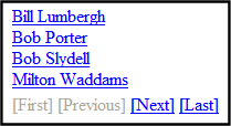
This property, in conjunction with the MaxResults property, lets site visitors view an unlimited number of collection items while controlling the amount of screen space. To accomplish this, the collection display is limited to the number set in the MaxResults property. If you set this property box is checked, and the number of collection items exceeds the MaxResults number, navigation aids appear below the last item. The site visitor uses the aids to view additional items. See example below.
So, for example, if a collection has 9 items and the MaxResults property is set to 4, the screen displays only the first four items. When the site visitor clicks [Next], he sees items 5, 6, 7 and 8, etc. Checked—enable paging Unchecked—disable paging Warning! If the EnablePaging property is set to True, the CacheInterval property is disabled. |
|
MaxResults Warning! Used in ASP.NET only. |
Enter the maximum number of items to appear in the initial display of this server control. To set no maximum, enter zero (0). To let site visitors view more than the maximum but limit the amount of space being occupied, enter the maximum number of results per page here. Then, check the EnablePaging property box. If you do and more than the number of MaxResults are available, navigation aids appear below the last item to help the site visitor view additional items. See example below.
|
|
Hide Warning! Used in ASP.NET only. |
Used to hide a collection in design time and run time.
Note: Note: If Hide and Visible are both checked, the property is hidden. |
|
Visible Warning! Used in ASP.NET only. |
Used to show or hide the function at run time. Checked—Show function Unchecked—Hide function Note: Note: If Hide and Visible are both checked, the property is hidden. |
|
Style (Positioning Info—GridLayout) Warning! Used in ASP.NET only. |
Set position information of a control as absolute, when using a GridLayout Web page. For example: style="Z-INDEX: 101; LEFT: 328px; POSITION: absolute; TOP: 240px" |
|
Wrap Tag Warning! Used in ASP.NET only. |
Allows a developer to specify a server control’s tag. The default is Span. Span—The <span> tag is used to designate an in-line portion of an HTML document as a span element. Div—The <div> tag is used when you want to apply attributes to a block of code. |
|
SuppressWrapper Warning! Used in ASP.NET only. |
Suppresses the output of the span/div tags around the control. The default is Unchecked. Checked—Suppress wrapper tags Unchecked—Do not suppress wrapper tags |
5. When completed, click insert.
A graphic defines where the collection appears on your template.

Shown below is an example of the code that is inserted.
|
Platform |
Code View |
|
.NET |
<cms:Collection id=”Collection1” DefaultCollectionID=”6” DisplayXslt=”ecmTeaser” runat=”server”></cms:Collection> |
|
ASP |
<% ecmCollection 6,"ecmNavigation" %> |
|
ColdFusion |
<cfmodule id="6" displayFunction="ecmNavigation" template="#request.ecm.AppPath#ecmCollection.cfm"> |
|
JSP |
<%= ecmCollection(6,"ecmTeaser") %> |
|
PHP |
<?php ecmCollection(6,"ecmNavigation"); ?> |
Content Block
This tag appears on the following menu(s):
Commands > Ektron CMS400—(ASP CF JSP PHP) > CMS Function...
or
Commands > Ektron CMS400.NET (Server Controls) > Content Controls...
For a description of the Content Block function, see ContentBlock Server Control.
To insert a content block:
1. Move the blinking cursor to the area that you want to place it.
2. From the list of Ektron CMS400.NET Functions, click Content.
3. The Insert Content box is displayed

Warning! When inserting a Content Block using ASP, CF, JSP or PHP, a different dialog box appears.
4. Use the following table to help you insert a content block.
|
Field |
Description |
|
Control ID Warning! Used in ASP.NET only. |
A unique name for the function you are inserting. |
|
Content ID |
Specify the ID number of the content block that you wish to use as a content block on the Web page. If you do not know the Content ID, you can navigate to it using the Select Category and Select Content drop down boxes. |
|
Select Category |
Choose the folder where the content is located. If you insert the content ID, you do not need to select a category. |
|
Select Content |
Select the content block to use from the list. If you insert the content ID, you do not need to select content. |
|
Dynamic Content Parameter Warning! Used in ASP.NET only. |
Determines if content is displayed as static or passed dynamically. By making content dynamic, when the content displayed on a Web page contains a link to another piece of content, you can display the second piece of content in the same Web page space. None: Displays a static content block. id: Content block is passed as a URL parameter. Warning! If you are using an ASP, CF, JSP or PHP page, you must use the Dynamic Content Block Tag to create a dynamic content block. See Dynamic Content Block |
|
DisplayXslt Warning! Used in ASP.NET only. |
Specify an external XSLT file. See Also: The OverrideXslt and DisplayXslt Properties Warning! If you specify an external file, it is strongly recommended that you do not store this file in your site's Workarea folder. If you store this file in the Workarea folder, the file will be lost when you upgrade. |
|
Hide Warning! Used in ASP.NET only. |
Used to hide a collection in design time and run time. Checked—Hide collection Unchecked—Show collection Note: Note: If Hide and Visible are both checked, the property is hidden. |
|
Visible Warning! Used in ASP.NET only. |
Used to show or hide the function at run time. Checked—Hide function Unchecked—Show function Note: Note: If Hide and Visible are both checked, the property is hidden. |
|
# of seconds—CacheInterval Warning! Used in ASP.NET only. |
Sets the amount of time the server control’s data is cached. The default is 0 (zero). This is the amount of time, in seconds, a control’s data is cached. For example, if you want to cache the data for five minutes, set this property to 300 (three hundred).See Also: Caching with Server Controls |
|
Style (Positioning Info—GridLayout) Warning! Used in ASP.NET only. |
Set position information of a control as absolute, when using a GridLayout Web page. For example: style="Z-INDEX: 101; LEFT: 328px; POSITION: absolute; TOP: 240px" |
|
Wrap Tag Warning! Used in ASP.NET only. |
Allows a developer to specify a server control’s tag. The default is Span. Span—The <span> tag is used to designate an in-line portion of an HTML document as a span element. Div—The <div> tag is used when you want to apply attributes to a block of code. |
|
SuppressWrapper Warning! Used in ASP.NET only. |
Suppresses the output of the span/div tags around the control. The default is Unchecked. Checked—Suppress wrapper tags Unchecked—Do not suppress wrapper tags |
Note: You see only the list of Ektron CMS400.NET content blocks if you are working online.
5. Click insert.
A graphic indicates the static content block’s location on the template.

Shown below is an example of the code that is inserted.
|
Platform |
Code View |
|
.NET |
<cms:contentblock id="ContentBlock1" DefaultContentID="12" runat="server"></cms:contentblock> |
|
ASP |
<% ecmContentBlock(1) %> |
|
ColdFusion |
<cfmodule id=”1” template=”#request.ecm.AppPath#ecmContentBlock.cfm”> |
|
JSP |
<%= ecmContentBlock(12) %> |
|
PHP |
<?php ecmContentBlock(1); ?> |
Content List
For a description of the Content List function, see ContentList Server Control .
This tag appears on the following menu(s):
Commands > Ektron CMS400.NET (Server Controls) > Content Controls...
To insert the Content List function:
1. Move the blinking cursor to the area that you want to place it.
2. From the list of Ektron CMS400.NET functions, click Content List.
3. The Insert Ektron CMS400.NET Content List box appears.

4. Use the following table to assist you with inserting the Content List function.
|
Field |
Description |
|
Control ID |
A unique name for the function you are inserting. |
|
ContentIds |
A comma delimited list of content blocks IDs. See Also: Using the ContentID Property to Display a Content List |
|
MetaTag |
Specify a Metadata definition whose type is Content Selector. When you do, the associated list of content items will appear where you place the server control. Warning! You cannot insert other metadata types. This works with the DefaultContentID property. See Also: Using Metadata to Display an Associated Content List For more information about using metadata to assign a list of related content to a content item, see Related Content Metadata. |
|
DefaultContentID |
Set content id value. Once set, content IDs are generated from the MetaTag value for this content. If you do not know the content’s ID, you can navigate to it using the Select Category and Select Content drop down boxes. |
|
DynamicParameter |
To make the content dynamic, select id. When you do, this server control uses the content passed as a URL parameter. |
|
Random |
Check this box if you want to randomly display one content list item. The item changes each time a site visitor views the page. Checked—randomly display one content list item Unchecked—display the content list |
|
GetHtml |
Check this box if you want to retrieve and display content (html body) for all content blocks in the content list. For example, to display content inside a web server control such as a GridView. Checked—retrieve and display content (html body) for all content blocks in the content list Unchecked—do not retrieve and display content (html body) for all content blocks in the content list |
|
Order By |
Sort the list by one of the values below. Title—the order of the content’s title. Date Modified—the last date the content was modified. Date Created—the date the content was created. Last Author First Name—the last editor’s first name. Last Author Last Name—the last editor’s last name. OrderOfTheIds—preserves the content ID order based on the list in the ContentIds property. |
|
Direction |
Choose whether the list is sorted in Ascending or Descending order. |
|
DisplayXslt |
Determines how information on the page is displayed. None-databind only ecmNavigation—lists the title of each content block See Also: Using the Collection Server Control ecmTeaser—lists the title of each content block plus the content summary See Also: Using the Collection Server Control ecmUnOrderedList—sorts the list in no particular order. Shows the title and content summary Warning! If you specify an external file, it is strongly recommended that you do not store this file in your site's Workarea folder. If you store this file in the Workarea folder, the file will be lost when you upgrade. Warning! If you enter a valid EkML file at the MarkupLanguage property, the Displayxslt property value is ignored. |
|
LinkTarget |
Defines the way a link acts when a link is clicked. _blank—This target causes the link to always be loaded in a new blank window. This window is not named. _self—This target causes the link to always load in the same window the anchor was clicked in. This is useful for overriding a globally assigned base target. _parent—This target makes the link load in the immediate frameset parent of the document. This defaults to acting like "_self" if the document has no parent. _top—This target makes the link load in the full body of the window. This defaults to acting like "_self" if the document is already at the top. It is useful for breaking out of an arbitrarily deep frame nesting. |
|
# of seconds—CacheInterval |
Sets the amount of time the server control’s data is cached. The default is 0 (zero). This is the amount of time, in seconds, a control’s data is cached. For example, if you want to cache the data for five minutes, set this property to 300 (three hundred). See Also: Caching with Server Controls |
|
IncludeIcons |
Choose whether to display icons next to the content list’s links. Warning! This property only works when ecmSummary or ecmTeaser are used in the DisplayXslt property. When the [$ImageIcon] variable is used in an EkML file and that file is assigned to the MarkupLanguage property, this property acts as True.
|
|
MarkupLanguage |
Identify the template markup file that controls the display of the content list. For example, mycontentlistmarkup.ekml. If the *.ekml file is located in the same folder as the Web form containing the server control, just enter its name. If the file is in another folder, enter the path relative to site root. For example, ..\CMS400Developer\workarea\customfiles\ markup\mycontentlistmarkup.ekml. See Also: Controlling Output with Ektron Markup Language and contentlist.ekml Note: Note: If you enter a valid EkML file, the DisplayXslt property value is ignored. If the EkML file contains the [$ImageIcon] variable, the IncludeIcons property acts as True. |
|
Hide |
Used to hide a function at run time. Checked—Hide function Unchecked—Show function Note: Note: If Hide and Visible are both checked, the property is hidden. |
|
Visible |
Used to show or hide the function at run time. Checked—Show function Unchecked—Hide function Note: Note: If Hide and Visible are both checked, the property is hidden. |
|
Style (Positioning Info—GridLayout) |
Set position information of a control as absolute, when using a GridLayout Web page. For example: style="Z-INDEX: 101; LEFT: 328px; POSITION: absolute; TOP: 240px" |
|
Wrap Tag |
Allows a developer to specify a server control’s tag. The default is Span. Span—The <span> tag is used to designate an in-line portion of an HTML document as a span element. Div—The <div> tag is used when you want to apply attributes to a block of code. |
|
SuppressWrapper |
Suppresses the output of the span/div tags around the control. The default is Unchecked. Checked—Suppress wrapper tags Unchecked—Do not suppress wrapper tags |
5. Click insert.
A Content List icon appears and indicates the Content List’s location on the template.

Shown below is an example of the code that is inserted:
|
Platform |
Code View |
|
.NET |
<cms:ContentList ID="ContentList1" DynamicParameter="id" DefaultContentID="30" OrderKey="DateCreated" DisplayXslt="ecmTeaser" runat="server"></cms:ContentList> |
|
ASP |
This function is not available as an Ektron Dreamweaver Extension for ASP. |
|
ColdFusion |
This function is not available as an Ektron Dreamweaver Extension for ColdFusion. |
|
JSP |
This function is not available as an Ektron Dreamweaver Extension for JSP. |
|
PHP |
This function is not available as an Ektron Dreamweaver Extension for PHP. |
Content Rating
For a description of the Content Rating function, see ContentRating Server Control .
This tag appears on the following menu(s):
Commands > Ektron CMS400.NET (Server Controls) > Content Controls...
To insert the Content Rating function:
1. Move the blinking cursor to the area that you want to place it.
2. From the list of Ektron CMS400.NET functions, click ContentRating.
3. The Insert Ektron CMS400.NET Content Rating box appears.

4. Use the following table to assist you with inserting the Content Rating function.
|
Field |
Description |
|
Control ID |
A unique name for the function you are inserting. |
|
Content ID |
Specify the ID number of a content item being tracked by this function. If you do not know the Content ID, you can navigate to it using the Select Category and Select Content drop down boxes. |
|
Dynamic Content Parameter |
To make this content rating control dynamic, select id. When you do, this server control is attached to the content block passed as a URL parameter. |
|
CompleteGraph Display |
Specify a value to indicate how the ratings graph appears if a site visitor has already rated content. horizontal—graph appears to the right of the AlreadyRatedMessage vertical— graph appears below the AlreadyRatedMessage none—graph does not appear |
|
GraphBarColor |
The color of the bars in the graph. |
|
InitialGraphDisplay |
Specify a value to indicate how the ratings graph appears if a site visitor has not yet rated content. horizontal—graph appears to the right of the content rating scale vertical—graph appears below the content rating scale none—graph does not appear |
|
Padding |
Enter the number of pixels used to create space between the rating scale and the graph. Note: Note: If you do not display the graph, this setting has no effect. |
|
Hide |
Used to hide the function at run time. Checked—Hide function Unchecked—Show function Note: Note: If Hide and Visible are both checked, the property is hidden. |
|
Visible |
Used to show or hide the function at run time. Checked—Show function Unchecked—Hide function Note: Note: If Hide and Visible are both checked, the property is hidden. |
|
Style (Positioning Info—GridLayout) |
Set position information of a control as absolute, when using a GridLayout Web page. For example: style="Z-INDEX: 101; LEFT: 328px; POSITION: absolute; TOP: 240px" |
|
Wrap Tag |
Allows a developer to specify a server control’s tag. The default is Span. Span—The <span> tag is used to designate an in-line portion of an HTML document as a span element. Div—The <div> tag is used when you want to apply attributes to a block of code. |
|
SuppressWrapper |
Suppresses the output of the span/div tags around the control. The default is Unchecked. Checked—Suppress wrapper tags Unchecked—Do not suppress wrapper tags |
5. Click insert.
An Content Rating icon appears and indicates the Content Rating’s location on the template.

Shown below is an example of the code that is inserted:
|
Platform |
Code View |
|
.NET |
<cms:ContentRating id="ContentRating1" DefaultContentID="30" runat="server"></cms:ContentRating> |
|
ASP |
This function is not available as an Ektron Dreamweaver Extension for ASP. |
|
ColdFusion |
This function is not available as an Ektron Dreamweaver Extension for ColdFusion. |
|
JSP |
This function is not available as an Ektron Dreamweaver Extension for JSP. |
|
PHP |
This function is not available as an Ektron Dreamweaver Extension for PHP. |
Content XSLT Tag...
This tag appears on the following menu(s):
Commands > Ektron CMS400—(ASP CF JSP PHP) > XML Function...
1.
2.
3.

4.
|
Field |
Description |
|
Content ID |
Either type in, or select from the drop down lists, the ID number of the XML content to insert. |
|
Select XSLT |
From the drop down list, select the XSLT you would like to apply to the XML content block. |
|
Enter XSLT |
If “Enter XSLT” is selected, you can insert the path and file name of the XSLT to apply to the content. Warning! If you specify an external file, it is strongly recommended that you do not store this file in your site's Workarea folder. If you store this file in the Workarea folder, the file will be lost when you upgrade. |
5.

|
Platform |
Code View |
|
.NET |
This function is not available as an Ektron Dreamweaver Extension for .NET. |
|
ASP |
<% ecmContentBlockEx 30, "", 1 %> |
|
ColdFusion |
<cfmodule id="5" xsltpath="" xslttype="1" template="#request.ecm.AppPath#ecmContentBlockEx.cfm"> |
|
JSP |
<%= ecmContentBlockEx(24, "", 0 ) %> |
|
PHP |
<?php ecmContentBlockEx (5, ““, 1); ?> |
DHTML Menu
For a description of the DHTML Menu function, see DhtmlMenu Server Control .
This tag appears on the following menu(s):
Commands > Ektron CMS400.NET (Server Controls) > CMS MENU Control...
To insert a DHTML Menu:
1. Move the blinking cursor to the area that you want to place it.
2. From the list of Ektron CMS400.NET Functions, click DHTML Menu
The DHTML Menu Control box appears.

3. Use the following table to assist you with inserting a DHTML Menu.
|
Field |
Description |
|
Control ID |
A unique name for the function you are inserting. |
|
DefaultMenuID |
The numeric id of the menu that you want to insert. If you do not know the DefaultMenuID path, you can navigate to it using the Select Menu drop down box. |
|
Select Menu |
Select a menu to be used. When a menu is selected, the DefaultMenuID textbox is filled with that menu's id number. If you insert the DefaultMenuID, you do not need to select a menu. |
|
Align |
Specifies the horizontal alignment of the root menu text. The default is Center. NotSet—Use the default setting. Left—Aligns text to the left. Center—Aligns text to the center. Right—Aligns text to the right. Justify—Aligns text justified to both margins. |
|
HorizontalDisplay |
Displays submenu to the right of the root menu. This only affects the first submenu of the root menu. All subsequent submenus appear to the right of each submenu. The default is Unchecked
|
|
CssClass |
Apply a .css class to the root menu. Enter the class name from the .css defined in the Stylesheet property. Since pop_style.css is the default style sheet, you can use its classes without defining it in the Stylesheet property. For example, if you enter lowtext in the property, the root menu changes as shown below.
|
|
MenuHoverOverColor |
Sets the background color for the root menu when hovering over it. |
|
SubMenuBackColor |
Sets the background color for the submenu. |
|
SubMenuHoverOverColor |
Sets the background color for the submenu when hovering over it. |
|
BackColor |
Sets the background color for the root menu. This property appears in the Appearance category |
|
ForeColor |
Sets the color of the font for the root menu. This property appears in the Appearance category. |
|
Font-Bold |
Checking this box allows the font to appear bold. |
|
Font_Italic |
Checking this box allows the font to appear italics. |
|
# of seconds—CacheInterval |
Sets the amount of time the server control’s data is cached. The default is 0 (zero). This is the amount of time, in seconds, a control’s data is cached. For example, if you want to cache the data for five minutes, set this property to 300 (three hundred). See Also: Caching with Server Controls |
|
FontNames |
Enter the name of a font to use. |
|
Font-Size |
The size of the font. |
|
SubMenuItemHeight |
Sets the height of each submenu item in pixels. The Default is 20 Example set to 20: Example set to 30: |
|
SubMenuItemWidth |
Sets the width of each submenu item in pixels. The Default is 150 Example set to 150: Example set to 130: |
|
SubMenuTopOffset |
Sets the location of the top of the submenu. This number is in pixels. The default is 3
Example set to 5:
Example set to 0 (zero):
Example set to -10:
|
|
MenuStyle |
A specified inline style that defines the root menu. For example, if you enter the following in the MenuStyle property box: font: bold 18px Arial;color:royalblue; background-color:slateblue
|
|
StyleSheet |
Specify the location and style sheet for the submenu. For example: \Workarea\csslib\mytest.css. Leave blank to use the default. pop_style.css is the default style sheet. It is located in \webroot\CMS400Developer\Workarea\csslib. The Stylesheet property can be used in conjunction with the CssClass property to define the root menu. |
|
Dynamic Menu Parameter |
Checks the QueryString for the menu value and replaces the menu with content when ID is specified. Leave blank to always display the menu. None—Use Default menu_ID—The control uses the menu passed as a URL parameter. |
|
Wrap Tag |
Allows a developer to specify a server control’s tag. The default is Span. Span—The <span> tag is used to designate an in-line portion of an HTML document as a span element. Div—The <div> tag is used when you want to apply attributes to a block of code. |
|
SuppressWrapper |
Suppresses the output of the span/div tags around the control. The default is Unchecked. Checked—Suppress wrapper tags Unchecked—Do not suppress wrapper tags |
|
Visible |
Used to show or hide the function at run time. Checked—Show function Unchecked—Hide function Note: If Hide and Visible are both checked, the property is hidden. |
|
Hide |
Used to hide the function at run time. Checked—Hide function Unchecked—Show function Note: If Hide and Visible are both checked, the property is hidden. |
|
Style (Positioning Info—GridLayout) |
Set position information of a control as absolute, when using a GridLayout Web page. For example: style="Z-INDEX: 101; LEFT: 328px; POSITION: absolute; TOP: 240px" |


4. When completed, click insert.
A graphic defines where the DHTML Menu appears on your template.
Shown below is an example of the code that is inserted:
|
Platform |
Code View |
|
.NET |
<cms:DhtmlMenu id="DhtmlMenu1" DefaultMenuID="16" ForeColor="" runat="server"></cms:DhtmlMenu> |
|
ASP |
This function is not available as an Ektron Dreamweaver Extension for ASP. |
|
ColdFusion |
This function is not available as an Ektron Dreamweaver Extension for ColdFusion. |
|
JSP |
This function is not available as an Ektron Dreamweaver Extension for JSP. |
|
PHP |
This function is not available as an Ektron Dreamweaver Extension for PHP. |
Directory-Taxonomy
For a description of the Directory-Taxonomy function, see Directory Server Control.
This tag appears on the following menu(s):
Commands > Ektron CMS400.NET (Server Controls) > Content Controls...
To insert a Directory-Taxonomy:
1. Move the blinking cursor to the area that you want to place it.
2. From the list of Ektron CMS400.NET Functions, click Directory-Taxonomy
The Directory-Taxonomy Control box appears.

3. Use the following table to assist you with inserting a Directory-Taxonomy.
|
Field |
Description |
|
Control ID |
A unique name for the function you are inserting. |
|
TaxonomyId |
Enter the ID number of the taxonomy or category to appear in this server control. If you don’t know the number, click the button and navigate to the taxonomy or category. When you select one, it appears in the center of the Visual Studio window. |
|
ItemsControlId |
Specify the id of the <span> or <div> tag you will use to format the display of taxonomy items. |
|
TaxonomyCols |
Enter the number of columns in which this taxonomy/category will appear on the page. |
|
TaxonomyDepth |
Enter the number of taxonomy levels to retrieve below each taxonomy/category. Only the top level is displayed in the control. The rest of the levels are available through XML in code behind. For example, if the taxonomy is Businesses > Restaurants > Pizza, and you set Taxonomy Depth to 2, only Business and Restaurants are available in code behind. To retrieve the all of the categories for a taxonomy recursively, enter -1. A depth greater than 1 or using -1 is only useful if you create a custom output using the Taxonomy’s XML. The default value is 1 Warning! For a live site, Ektron strongly recommends leaving this value at 1. Increasing this value can slow down your live Web server. However, for testing on a staging server, you can increase the depth. |
|
DynamicParameter |
Gets or sets the QueryString parameter to read a content ID dynamically. |
|
Link Target |
Defines the way a link acts when it is clicked. The choices are: _blank—loads the link in a new blank window. This window is not named. _self—loads the link in the same window the anchor was clicked in. This is useful for overriding a globally assigned base target. _parent—loads the link in the immediate frameset parent of the document. This defaults to acting like “_self” if the document has no parent. _top—loads the link in the full body of the window. This defaults to acting like “_self” if the document is already at the top. It is useful for breaking out of an arbitrarily deep frame nesting. |
|
MaxResults |
Enter the maximum number of items to appear in the initial display of this server control. To set no maximum, enter zero (0). To let site visitors view more than the maximum but limit the amount of space being occupied, enter the maximum number of results per page here. Then, check the EnablePaging property box. If you do and more than the number of MaxResults are available, navigation aids appear below the last item to help the site visitor view additional items. See example below.
|
|
EnableAjax |
Check this box to enable Ajax searches. When enabled, the MaxResults property determines the maximum number of results per page. Checked—Enable Ajax Search Unchecked—Original HTML Search |
|
EnablePaging |
This property, in conjunction with the MaxResults property, lets site visitors view an unlimited number of taxonomy items while controlling the amount of screen space. To accomplish this, the taxonomy display is limited to the number set in the MaxResults property. If you check this property box, and the number of taxonomy items exceeds the MaxResults number, navigation aids appear below the last item. The site visitor uses the aids to view additional items. See example below.
So, for example, if a taxonomy has 9 items and the MaxResults property is set to 3, the screen displays only the first three items. When the site visitor clicks [Next], he sees items 4, 5 and 6, etc. Checked—enables paging Unchecked—disables paging Warning! If the EnablePaging property is set to True, the CacheInterval property is disabled. |
|
TaxonomySearch |
Check this box if you want a search box (shown below) to appear above this taxonomy display. A site visitor can use the search to find content within a taxonomy/category that includes terms of interest. Checked—a search box appears above the taxonomy display Unchecked—suppress the search box
|
|
DisplayXslt |
Determines how the information on the page is displayed. Options are None—databind only ecmNavigation—lists the title of every content block in the folder See Also: . Using the Collection Server Control ecmTeaser—lists the title of every content block in the folder plus the content summary See Also: Using the Collection Server Control Path to Custom Xslt—Enter the path to an Xslt that determines the display of the page Warning! If you specify an external file, it is strongly recommended that you do not store this file in your site's Workarea folder. If you store this file in the Workarea folder, the file will be lost when you upgrade. Note: If an EkML file is inserted into the MarkupLanguage property, this value is ignored. |
|
NaviDisplayControlId |
Specify the id of the <span> or <div> tag to format the display of this taxonomy’s navigation. Here is an example. Top : Restaurant : Italian (0) |
|
# of seconds—CacheInterval |
Sets the amount of time the server control’s data is cached. The default is 0 (zero). This is the amount of time, in seconds, a control’s data is cached. For example, if you want to cache the data for five minutes, set this property to 300 (three hundred). See Also: Caching with Server Controls Warning! the EnablePaging property is set to True, the CacheInterval property is disabled. |
|
MarkupLanguage |
Identify the template markup file that controls the display of the taxonomy. For example, mytaxonomymarkup.ekml. If the *.ekml file is located in the same folder as the Web form containing the server control, just enter its name. If the file is in another folder, enter the path relative to site root. For example, \CMS400Developer\workarea\customfiles\ markup\mytaxonomymarkup.ekml. See Also: . Controlling Output with Ektron Markup Language and taxonomy.ekml Note: Note: If you enter a valid EkML file, the Displayxslt property value is ignored. |
|
Hide |
Used to hide the function at run time. Checked—Hide function Unchecked—Show function Note: Note: If Hide and Visible are both checked, the property is hidden. |
|
Visible |
Used to show or hide the function at run time. Checked—Show function Unchecked—Hide function Note: Note: If Hide and Visible are both checked, the property is hidden. |
|
Style (Positioning Info—GridLayout) |
Set position information of a control as absolute, when using a GridLayout Web page. For example: style="Z-INDEX: 101; LEFT: 328px; POSITION: absolute; TOP: 240px" |
|
Wrap Tag |
Allows a developer to specify a server control’s tag. The default is Span. Span—The <span> tag is used to designate an in-line portion of an HTML document as a span element. Div—The <div> tag is used when you want to apply attributes to a block of code. |
|
SuppressWrapper |
Suppresses the output of the span/div tags around the control. The default is Unchecked. Checked—Suppress wrapper tags Unchecked—Do not suppress wrapper tags |
4. When completed, click insert.
A graphic defines where the Directory-Taxonomy appears on your template.

Shown below is an example of the code that is inserted:
|
Platform |
Code View |
|
.NET |
<cms:Directory id="Directory1" TaxonomyId="2" DisplayXslt="ecmTeaser" DynamicParameter="id" runat="server"></cms:Directory> |
|
ASP |
This function is not available as an Ektron Dreamweaver Extension for ASP. |
|
ColdFusion |
This function is not available as an Ektron Dreamweaver Extension for ColdFusion. |
|
JSP |
This function is not available as an Ektron Dreamweaver Extension for JSP. |
|
PHP |
This function is not available as an Ektron Dreamweaver Extension for PHP. |
Discussion Forum
For a description of the Discussion Forum function, see Discussion Board Server Controls.
This tag appears on the following menu(s):
Commands > Ektron CMS400.NET (Server Controls) > Community Controls... > Forums
To insert the Discussion Forum function:
1. Move the blinking cursor to the area that you want to place it.
2. From the list of Ektron CMS400.NET functions, click Discussion Forum.
3. The Insert Ektron CMS400.NET Discussion Forum box appears.

4. Use the following table to assist you with inserting the Blog function.
|
Field |
Description |
|
Control ID |
A unique name for the function you are inserting. |
|
Board ID |
The ID of the Discussion Board in Ektron CMS400.NET. If you do not know the Board ID, you can choose it from the Select Folder drop down box. |
|
JavascriptEditorToolbar |
Note: Note: As of version 7.6, the JavaScript editor has been removed from Ektron CMS400.NET. This property has been deprecated. Decide which buttons are available in the JavaScript Editor. |
|
JavascriptEditorWidth |
Note: Note: As of version 7.6, the JavaScript editor has been removed from Ektron CMS400.NET. This property has been deprecated. Set the width in pixels for the editor. The default is 625. |
|
JavascriptEditorHeight |
Note: Note: As of version 7.6, the JavaScript editor has been removed from Ektron CMS400.NET. This property has been deprecated. Set the height in pixels for the editor. The default is 400. |
|
# of seconds—CacheInterval |
Sets the amount of time the server control’s data is cached. The default is 0 (zero). This is the amount of time, in seconds, a control’s data is cached. For example, if you want to cache the data for five minutes, set this property to 300 (three hundred). See Also: Caching with Server Controls |
|
Hide |
Used to hide a function at run time. Checked—Hide function Unchecked—Show function Note: Note: If Hide and Visible are both checked, the property is hidden. |
|
Visible |
Used to show or hide the function at run time. Checked—Show function Unchecked—Hide function Note: Note: If Hide and Visible are both checked, the property is hidden. |
|
Style (Positioning Info—GridLayout) |
Set position information of a control as absolute, when using a GridLayout Web page. For example: style="Z-INDEX: 101; LEFT: 328px; POSITION: absolute; TOP: 240px" |
|
Wrap Tag |
Allows a developer to specify a server control’s tag. The default is Span. Span—The <span> tag is used to designate an in-line portion of an HTML document as a span element. Div—The <div> tag is used when you want to apply attributes to a block of code. |
|
SuppressWrapper |
Suppresses the output of the span/div tags around the control. The default is Unchecked. Checked—Suppress wrapper tags Unchecked—Do not suppress wrapper tags |
5. Click insert.
A Discussion Forum icon appears and indicates the Discussion Forum’s location on the template.

Shown below is an example of the code that is inserted:
|
Platform |
Code View |
|
.NET |
<cms:Forum id="Forum1" BoardID="106" runat="server"></cms:Forum> |
|
ASP |
This function is not available as an Ektron Dreamweaver Extension for ASP. |
|
ColdFusion |
This function is not available as an Ektron Dreamweaver Extension for ColdFusion. |
|
JSP |
This function is not available as an Ektron Dreamweaver Extension for JSP. |
|
PHP |
This function is not available as an Ektron Dreamweaver Extension for PHP. |
Display By Meta Value
For a description of the Display By Meta Value function, see MetaDataList Server Control.
This tag appears on the following menu(s):
Commands > Ektron CMS400.NET (Server Controls) > Content Controls...
To insert Display By Meta Value:
1. Move the blinking cursor to the area that you want to place it.
2. From the list of Ektron CMS400.NET Functions, click Display By Meta Value
The Display By Meta Value box appears.

3. Use the following table to assist you with inserting Display By Meta Value.
|
Field |
Description |
|
Control ID |
A unique name for the function you are inserting. |
|
FolderID |
The numeric id of the folder that you want to use. If you do not know the folder ID, you can navigate to it using the Select folder drop down box. |
|
Select Folder |
Select a folder path to be used. When a folder is selected, the folderID textbox is filled with that folder's id number. If you insert the Folder ID, you do not need to select a folder. |
|
IncludeIcons |
Choose whether to display icons next to the metadatalist’s links. Warning! This property only works when ecmSummary or ecmTeaser are used in the DisplayXslt property. When the [$ImageIcon] variable is used in an EkML file and that file is assigned to the MarkupLanguage property, this property acts as True.
|
|
Recursive |
Determines whether the Display By Meta Value control uses this folder’s child folders. |
|
EnablePaging |
This property, in conjunction with the MaxResults property, lets site visitors view an unlimited number of taxonomy items while controlling the amount of screen space. To accomplish this, the taxonomy display is limited to the number set in the MaxResults property. If you check this property box, and the number of taxonomy items exceeds the MaxResults number, navigation aids appear below the last item. The site visitor uses the aids to view additional items. See example below.
So, for example, if a taxonomy has 9 items and the MaxResults property is set to 3, the screen displays only the first three items. When the site visitor clicks [Next], he sees items 4, 5 and 6, etc. Checked—enables paging Unchecked—disables paging Warning! If the EnablePaging property is set to True, the CacheInterval property is disabled. |
|
Order By |
Specify how you want to order the results that are generated. Also specify if you want the results in ascending or descending order. Title—The title of the content block Date Created—The date the content block was created Date Modified—The date the content block was last modified Last Author Last Name—The last author’s last name Last Author First Name—The last author’s first name ID—The content blocks ID Ascending—Alphabetic or numerical order Descending—Reverse alphabetic or numerical order |
|
MaxResults |
Enter the maximum number of items to appear in the initial display of this server control. To set no maximum, enter zero (0). To let site visitors view more than the maximum but limit the amount of space being occupied, enter the maximum number of results per page here. Then, check the EnablePaging property box. If you do and more than the number of MaxResults are available, navigation aids appear below the last item to help the site visitor view additional items. See example below.
|
|
ExactPhrase |
Determines whether the KeyWordValue needs to match the phrase exactly. For example, if “site” is the KeyWordValue and the title of a content block is “Welcome to the site” and the ExactPhrase box is checked, you would not see the content block in the metadata list. This is because “site” does not equal “Welcome to the site”. Checked—Match the exact phrase Unchecked—Doesn’t need to match exact phrase |
|
LinkTarget |
Defines the way a link acts when a link is clicked. Choices are: _blank—This target causes the link to always be loaded in a new blank window. This window is not named. _self—This target causes the link to always load in the same window the anchor was clicked in. This is useful for overriding a globally assigned BASE target. _parent—This target makes the link load in the immediate frameset parent of the document. This defaults to acting like “_self” if the document has no parent. _top—This target makes the link load in the full body of the window. This defaults to acting like “_self” if the document is already at the top. It is useful for breaking out of an arbitrarily deep frame nesting. |
|
KeyWordName |
The KeyWordName is the container where the KeyWordValues are located. Some examples of a KeyWordName might be “Keywords or Title.” For information on creating KeyWordNames for Metadata, see Adding a Metadata Definition. |
|
KeyWordValue |
The value that is associated with the KeyWordName. Some examples of a KeyWordValue might be “Home; page; or company” |
|
CacheInterval |
Sets the amount of time the server control’s data is cached. The default is 0 (zero). This is the amount of time, in seconds, a control’s data is cached. For example, if you want to cache the data for five minutes, set this property to 300 (three hundred). See Also: Caching with Server Controls Warning! If the EnablePaging property is set to True, the CacheInterval property is disabled. |
|
DisplayXslt |
Determines how the information on the page is displayed. None-databind only ecmNavigation—lists the title of every content block in the folder See Also: Using the Collection Server Control ecmTeaser—lists the title of every content block in the folder plus the content summary See Also: Using the Collection Server Control Warning! If you specify an external file, it is strongly recommended that you do not store this file in your site's Workarea folder. If you store this file in the Workarea folder, the file will be lost when you upgrade. Warning! If you enter a valid EkML file at the MarkupLanguage property, the Displayxslt property value is ignored. |
|
MarkupLanguage |
Identify the template markup file that controls the display of the metadata list. For example, mymetadatalistmarkup.ekml. If the *.ekml file is located in the same folder as the Web form containing the server control, just enter its name. If the file is in another folder, enter the path relative to site root. For example, ..\CMS400Developer\workarea\customfiles\ markup\mymetadatalist.ekml. See Also: Controlling Output with Ektron Markup Language and metadatalist.ekml Note: Note: If you enter a valid EkML file, the DisplayXslt property value is ignored. If the EkML file contains the [$ImageIcon] variable, the IncludeIcons property acts as True. |
|
Dynamic Content Parameter |
Checks the QueryString for the content block ID value and replaces the Display By Meta Value Control with content when an ID is specified. Leave blank to always display the Display By Meta Value Control. None—Use Default ID—The control uses the content block passed as a URL parameter. |
|
Content Type |
Defines what type of list summary appears. Content—Displays only content blocks in the folder. All Types—Displays all content in the folder. Forms—Displays only forms in the folder. Archive_Content—Displays archived content from the folder. Archive_Forms—Displays archived forms from the folder. |
|
GetHtml |
Check this box if you want to retrieve and display content (html body) for all content blocks in the collection. For example, display content inside a web server control such as a GridView. Checked—retrieve and display content (html body) for all content blocks in the metadata list Unchecked—do not retrieve and display content (html body) for all content blocks in the metadata list |
|
Hide |
Used to hide the function in design time and run time. Checked—Hide function Unchecked—Show function Note: Note: If Hide and Visible are both checked, the property is hidden. |
|
Visible |
Used to show or hide the function at run time. Checked—Show function Unchecked—Hide function Note: Note: If Hide and Visible are both checked, the property is hidden. |
|
Style (Positioning Info—GridLayout) |
Set position information of a control as absolute, when using a GridLayout Web page. For example: style="Z-INDEX: 101; LEFT: 328px; POSITION: absolute; TOP: 240px" |
|
Wrap Tag |
Allows a developer to specify a server control’s tag. The default is Span. Span—The <span> tag is used to designate an in-line portion of an HTML document as a span element. Div—The <div> tag is used when you want to apply attributes to a block of code. |
|
SuppressWrapper |
Suppresses the output of the span/div tags around the control. The default is Unchecked. Checked—Suppress wrapper tags Unchecked—Do not suppress wrapper tags |
4. When completed, click insert.
A graphic defines where the Display By Meta Value appears on your template.

Shown below is an example of the code that is inserted:
|
Platform |
Code View |
|
.NET |
<cms:metadatalist id="Metadatalist1" FolderId="6" DisplayXslt="ecmTeaser" runat="server"></cms:metadatalist> |
|
ASP |
This function is not available as an Ektron Dreamweaver Extension for ASP. |
|
ColdFusion |
This function is not available as an Ektron Dreamweaver Extension for ColdFusion. |
|
JSP |
This function is not available as an Ektron Dreamweaver Extension for JSP. |
|
PHP |
This function is not available as an Ektron Dreamweaver Extension for PHP. |
Dynamic Content Block
This tag appears on the following menu(s):
Commands > Ektron CMS400—(ASP CF JSP PHP) > CMS Function...
For a description of a dynamic content block, see Dynamic Content Block
To insert a dynamic content block tag:
1. Move the blinking cursor to the area that you want to place it.
2. From the list of Ektron CMS400.NET Content functions, click on Dynamic Tag...
3. The Insert Ektron Dynamic Tag box is displayed

4. Use the following table to assist you with inserting a dynamic content block function.
|
Field |
Description |
|
Insert Default Content |
If you want a static content block to be displayed if no ID is passed through the URL, place a check in this box. |
|
Default Content ID |
Specify the ID number of the content block that you wish to use as a default content block on the Web page. |
|
Select Content |
If you are working online, you may select the content block to use as a default content block from the list. |
5. When completed, click Insert.
A graphic to define where the dynamic content block has been placed on your template is inserted.

Shown below is the code that will be inserted according to the platform that has been specified in the setup:
|
Platform |
Code View |
|
.NET |
For ASP.NET pages, use the CMS400.NET (Server Control) Content Block tag and set the dynamic parameter to id. See Content Block |
|
ASP |
<% if request.QueryString(“id”)<> “” then ecmContentBlock(request.QueryString(“id”)) else ecmContentBlock(1) end if %> |
|
ColdFusion |
<cfif isdefined(“url.id”)> <cfmodule id=”#url.id#” template=”#request.ecm.AppPath#ecmContentBlock.cfm”> <cfelse> <cfmodule id=”1” template=”#request.ecm.AppPath#ecmContentBlock.cfm”> </cfif> |
|
JSP |
Inserting a Dynamic Content Block using Ektron’s Dreamweaver Extensions is not supported in JSP. |
|
PHP |
<?php $id =GetURL_Id(1); ecmContentBlock($id); ?> |
Folder Bread Crumb
For a description of the Folder Bread Crumb function, see FolderBreadcrumb Server Control.
This tag appears on the following menu(s):
Commands > Ektron CMS400.NET (Server Controls) > CMS MENU Controls...
To insert a Folder Bread Crumb Trail:
1. Move the blinking cursor to the area that you want to place it.
2. From the list of Ektron CMS400.NET Functions, click Folder BreadCrumb.
3. The Folder Bread Crumb dialog box appears.

4. Use the following table to assist you with inserting a Folder Bread Crumb.
|
Field |
Description |
|
Control ID |
A unique name for the function you are inserting. |
|
FolderID |
The numeric id of the folder that you want to use. If you do not know the folder ID, you can navigate to it using the Select folder drop down box. |
|
Content ID |
Gets or Sets the ContentID. If you do not know the Content ID, you can navigate to it using the Select Category and Select Content drop down boxes. |
|
DynamicParameter |
Gets or sets the QueryString parameter to read a content ID dynamically. |
|
DisplayStyle |
Indicate how to display the folder bread crumb: horizontally or vertically. The default is Horizontal. |
|
Hide |
Used to hide a FolderBreadcrumb in design time and run time. Checked—Hide FolderBreadcrumb Unchecked—Show FolderBreadcrumb Note: Note: If Hide and Visible are both checked, the property is hidden. |
|
Visible |
Used to show or hide the function at run time. Checked—Show function Unchecked—Hide function Note: Note: If Hide and Visible are both checked, the property is hidden. |
|
Style (Positioning Info—GridLayout) |
Set position information of a control as absolute, when using a GridLayout Web page. For example: style="Z-INDEX: 101; LEFT: 328px; POSITION: absolute; TOP: 240px" |
|
Wrap Tag |
Allows a developer to specify a server control’s tag. The default is Span. Span—The <span> tag is used to designate an in-line portion of an HTML document as a span element. Div—The <div> tag is used when you want to apply attributes to a block of code. |
|
SuppressWrapper |
Suppresses the output of the span/div tags around the control. The default is Unchecked.
|
5. When completed, click Insert.
A graphic defines where the Folder Bread Crumb appears on your template.

Shown below is an example of the code that is inserted:
|
Platform |
Code View |
|
.NET |
<cms:FolderBreadcrumb id="FolderBreadcrumb1" DefaultContentID="65" runat="server"></cms:FolderBreadcrumb> |
|
ASP |
This function is not available as an Ektron Dreamweaver Extension for ASP. |
|
ColdFusion |
This function is not available as an Ektron Dreamweaver Extension for ColdFusion. |
|
JSP |
This function is not available as an Ektron Dreamweaver Extension for JSP. |
|
PHP |
This function is not available as an Ektron Dreamweaver Extension for PHP. |
Form
For a description of the Form function, see FormBlock Server Control
This tag appears on the following menu(s):
Commands > Ektron CMS400—(ASP CF JSP PHP) > CMS Function...
or
Commands > Ektron CMS400.NET (Server Controls) > Content Controls...
To insert a form:
1. Move the blinking cursor to the area that you want to place it.
2. From the list of Ektron CMS400.NET Content functions, click Form
3. The Insert Form box is displayed.

Warning! When inserting a form tag using ASP, CF, JSP or PHP, a different dialog box appears.
4. Use the following table to assist you with inserting a form.
|
Field |
Description |
|
Control ID Warning! Used in ASP.NET only. |
A unique name for the function you are inserting. |
|
Form ID |
Type in the form ID that you want to insert. If you do not know the Form ID, you can navigate to it using the Select Form drop down box. |
|
Select Form |
The drop-down box is populated with a list of all the form titles. When a title is selected, the form ID textbox is filled with that form's id number. If you insert the Form ID, you do not need to select a form. |
|
Dynamic Form Parameter Warning! Used in ASP.NET only. |
To make this form block dynamic, select ekfrm. When you do, this control uses the form block passed as a URL parameter. |
|
# of seconds—CacheInterval Warning! Used in ASP.NET only. |
Sets the amount of time the server control’s data is cached. The default is 0 (zero). This is the amount of time, in seconds, a control’s data is cached. For example, if you want to cache the data for five minutes, set this property to 300 (three hundred). See Also: Caching with Server Controls |
|
Add Validation Warning! Used in ASP.NET only. |
When checked, adds Validation to your main runat=server form. Checked—add validation Unchecked—Do not add validation |
|
Include Form Tags Warning! Used in ASP.NET only. |
Determines if tags are generated automatically or manually. See Also: Automatic versus Manual Generation of Form Tags Checked—automatically generate form tags Unchecked—generate form tags manually |
|
Hide Warning! Used in ASP.NET only. |
Used to hide a form in design time and run time. Checked—Hide form Unchecked—Show form Note: Note: If Hide and Visible are both checked, the property is hidden. |
|
Visible Warning! Used in ASP.NET only. |
Used to show or hide the function at run time. Checked—Show function Unchecked—Hide function Note: Note: If Hide and Visible are both checked, the property is hidden. |
|
Style (Positioning Info—GridLayout) Warning! Used in ASP.NET only. |
Set position information of a control as absolute, when using a GridLayout Web page. For example: style="Z-INDEX: 101; LEFT: 328px; POSITION: absolute; TOP: 240px" |
|
Wrap Tag Warning! Used in ASP.NET only. |
Allows a developer to specify a server control’s tag. The default is Span. Span—The <span> tag is used to designate an in-line portion of an HTML document as a span element. Div—The <div> tag is used when you want to apply attributes to a block of code. |
|
SuppressWrapper |
Suppresses the output of the span/div tags around the control. The default is Unchecked.
|
5. When completed, click Insert.
A graphic defines where the form appears on your template.

Shown below is an example of the code that is inserted.
|
Platform |
Code View |
|
.NET |
<cms:FormBlock id="FormBlock1" DefaultFormID="13" runat="server"></cms:FormBlock> |
|
ASP |
<% ecmFormBlock (1) %> |
|
ColdFusion |
<cfmodule id="1" template="#request.ecm.AppPath#ecmFormBlock.cfm"> |
|
JSP |
<%= ecmFormBlock(1) %> |
|
PHP |
<?php ecmFormBlock (1); ?> |
ImageControl
For a description of the ImageControl function, see AssetControl Server Control.
This tag appears on the following menu(s):
Commands > Ektron CMS400.NET (Server Controls) > Community Controls...
To insert the ImageControl function:
1. Move the blinking cursor to the area that you want to place it.
2. From the list of Ektron CMS400.NET functions, click ImageControl.
3. The Insert Ektron CMS400.NET ImageControl box appears.

4. Use the following table to assist you with inserting the ImageControl function.
|
Field |
Description |
|
Control ID |
A unique name for the function you are inserting. |
|
FolderID |
The ID of the folder where Images are located. This property is used when the UploadType property is set to Update. If you do not know the Folder ID, you can navigate to it using the Select Folder drop down box. |
|
UploadType |
Select whether the control adds new assets or update existing ones. Select Add to add assets and use the FolderID property. The default is None. |
|
Hide |
Used to hide a function at run time. Checked—Hide function Unchecked—Show function Note: Note: If Hide and Visible are both checked, the property is hidden. |
|
Visible |
Used to show or hide the function at run time. Checked—Show function Unchecked—Hide function Note: Note: If Hide and Visible are both checked, the property is hidden. |
|
Style (Positioning Info—GridLayout) |
Set position information of a control as absolute, when using a GridLayout Web page. For example: style="Z-INDEX: 101; LEFT: 328px; POSITION: absolute; TOP: 240px" |
|
Wrap Tag |
Allows a developer to specify a server control’s tag. The default is Span. Span—The <span> tag is used to designate an in-line portion of an HTML document as a span element. Div—The <div> tag is used when you want to apply attributes to a block of code. |
|
SuppressWrapper |
Suppresses the output of the span/div tags around the control. The default is Unchecked. Checked—Suppress wrapper tags Unchecked—Do not suppress wrapper tags |
5. Click insert.
An ImageControl icon appears and indicates the ImageControl’s location on the template.

Shown below is an example of the code that is inserted:
|
Platform |
Code View |
|
.NET |
<cms:ImageControl id="ImageControl1" DefaultFolderID="14" UploadType=”Update” runat="server"></cms:AssetControl> |
|
ASP |
This function is not available as an Ektron Dreamweaver Extension for ASP. |
|
ColdFusion |
This function is not available as an Ektron Dreamweaver Extension for ColdFusion. |
|
JSP |
This function is not available as an Ektron Dreamweaver Extension for JSP. |
|
PHP |
This function is not available as an Ektron Dreamweaver Extension for PHP. |
Language API
For a description of the Language API function, see LanguageAPI Server Control.
This tag appears on the following menu(s):
Commands > Ektron CMS400.NET (Server Controls) > Content Controls...
To insert a Language API:
1. Move the blinking cursor to the area that you want to place it.
2. From the list of Ektron CMS400.NET Functions, click Language API
3. The Language API box appears.

4. Use the following table to assist you with inserting a Language API box.
|
Field |
Description |
|
Control ID |
A unique name for the function you are inserting. |
|
Hide |
Used to hide a Language API in design time and run time. Checked—Hide Language API Unchecked—Show Language API Note: Note: If Hide and Visible are both checked, the property is hidden. |
|
Visible |
Used to show or hide the function at run time. Checked—Show function Unchecked—Hide function Note: Note: If Hide and Visible are both checked, the property is hidden. |
|
Style (Positioning Info—GridLayout) |
Set position information of a control as absolute, when using a GridLayout Web page. For example: style="Z-INDEX: 101; LEFT: 328px; POSITION: absolute; TOP: 240px" |
|
Wrap Tag |
Allows a developer to specify a server control’s tag. The default is Span. Span—The <span> tag is used to designate an in-line portion of an HTML document as a span element. Div—The <div> tag is used when you want to apply attributes to a block of code. |
|
SuppressWrapper |
Suppresses the output of the span/div tags around the control. The default is Unchecked.
|
5. When completed, click insert.
A graphic defines where the Language API appears on your template.

Shown below is an example of the code that is inserted:
|
Platform |
Code View |
|
.NET |
<cms:LanguageAPI id="LanguageAPI2" runat="server"></cms:LanguageAPI> |
|
ASP |
This function is not available as an Ektron Dreamweaver Extension for ASP. |
|
ColdFusion |
This function is not available as an Ektron Dreamweaver Extension for ColdFusion. |
|
JSP |
This function is not available as an Ektron Dreamweaver Extension for JSP. |
|
PHP |
This function is not available as an Ektron Dreamweaver Extension for PHP. |
Language Select Box
For a description of the Language Select Box, see LanguageSelect Server Control.
This tag appears on the following menu(s):
Commands > Ektron CMS400.NET (Server Controls) > Content Controls...
To insert a Language Select Box:
1. Move the blinking cursor to the area that you want to place it.
2. From the list of Ektron CMS400.NET Functions, click Language Select
3. The Language Select box appears.

4. Use the following table to assist you with inserting a Language Select box.
|
Field |
Description |
|
Control ID |
A unique name for the function you are inserting. |
|
Hide |
Used to hide a function in design time and run time. Checked—Hide function Unchecked—Show function Note: Note: If Hide and Visible are both checked, the property is hidden. |
|
Visible |
Used to show or hide the function at run time. Checked—Show function Unchecked—Hide function Note: Note: If Hide and Visible are both checked, the property is hidden. |
|
Style (Positioning Info—GridLayout) |
Set position information of a control as absolute, when using a GridLayout Web page. For example: style="Z-INDEX: 101; LEFT: 328px; POSITION: absolute; TOP: 240px" |
|
Wrap Tag |
Allows a developer to specify a server control’s tag. The default is Span. Span—The <span> tag is used to designate an in-line portion of an HTML document as a span element. Div—The <div> tag is used when you want to apply attributes to a block of code. |
|
SuppressWrapper |
Suppresses the output of the span/div tags around the control. The default is Unchecked. Checked—Suppress wrapper tags Unchecked—Do not suppress wrapper tags |
5. When completed, click insert.
A graphic defines where the Language Select appears on your template.

Shown below is an example of the code that is inserted.
|
Platform |
Code View |
|
.NET |
<cms:LanguageSelect id="LanguageSelect1" runat="server"></cms:LanguageSelect> |
|
ASP |
This function is not available as an Ektron Dreamweaver Extension for ASP. |
|
ColdFusion |
This function is not available as an Ektron Dreamweaver Extension for ColdFusion. |
|
JSP |
This function is not available as an Ektron Dreamweaver Extension for JSP. |
|
PHP |
This function is not available as an Ektron Dreamweaver Extension for PHP. |
List Summary
For a description of the List Summary function, see ListSummary Server Control.
This tag appears on the following menu(s):
Commands > Ektron CMS400—(ASP CF JSP PHP) > CMS Function...
or
Commands > Ektron CMS400.NET (Server Controls) > Content Controls...
To insert a list summary:
1. Move the blinking cursor to the area that you want to place it.
2. From the list of Ektron CMS400.NET Functions, click List Summary.
3. The Insert Ektron List Summary box is displayed.

Warning! When inserting a list summary using ASP, CF, JSP or PHP, a different dialog box appears.
4. Use the following table to assist you with inserting a metadata control.
|
Field |
Description |
|
Control ID Warning! Used in ASP.NET only. |
A unique name for the function you are inserting. |
|
Folder ID |
Enter the folder ID. If you do not know the folder path, you can navigate to it using the Select folder drop down box. |
|
Select Folder |
Select the folder the summary information comes from. The folder drop-down contains folders from your site. If you insert the folder path, you do not need to select a folder from the dropdown box. |
|
Recursive |
If checked, summary information is gathered from the folder selected and all of its child folders. |
|
IncludeIcons Warning! Used in ASP.NET only. |
Choose whether to display icons next to the list summary list’s links. Warning! This property only works when ecmSummary or ecmTeaser are used in the DisplayXslt property. When the [$ImageIcon] variable is used in an EkML file and that file is assigned to the MarkupLanguage property, this property acts as True.
|
|
EnablePaging Warning! Used in ASP.NET only. |
This property, in conjunction with the MaxResults property, lets site visitors view an unlimited number of taxonomy items while controlling the amount of screen space. To accomplish this, the taxonomy display is limited to the number set in the MaxResults property. If you check this property box, and the number of taxonomy items exceeds the MaxResults number, navigation aids appear below the last item. The site visitor uses the aids to view additional items. See example below.
So, for example, if a taxonomy has 9 items and the MaxResults property is set to 3, the screen displays only the first three items. When the site visitor clicks [Next], he sees items 4, 5 and 6, etc. Checked—enables paging Unchecked—disables paging Warning! If the EnablePaging property is set to True, the CacheInterval property is disabled. |
|
OrderKey |
Specify how the summaries are ordered. Sort by the following criteria. Title—The title of the content block Date Created—The date the content block was created Date Modified—The date the content block was last modified Last Author Last Name—The last author’s last name Last Author First Name—The last author’s first name Ascending—Alphabetic or numerical order Descending—Reverse alphabetic or numerical order |
|
Max Number of results Warning! Used in ASP.NET only. |
Enter the maximum number of items to appear in the initial display of this server control. To set no maximum, enter zero (0). To let site visitors view more than the maximum but limit the amount of space being occupied, enter the maximum number of results per page here. Then, check the EnablePaging property box. If you do and more than the number of MaxResults are available, navigation aids appear below the last item to help the site visitor view additional items. See example below.
|
|
DisplayXslt Warning! Used in ASP.NET only. |
Determines how the information on the page is displayed. Select: None—databind only ecmNavigation—lists the title of every content block in the folder See Also: Using the Collection Server Control ecmTeaser—lists the title of every content block in the folder plus the content summary See Also: Using the Collection Server Control Path to Custom Xslt—Enter the path to an Xslt that determines the display of the page Warning! If you specify an external file, it is strongly recommended that you do not store this file in your site's Workarea folder. If you store this file in the Workarea folder, the file will be lost when you upgrade. Note: Note: If an .ekml file is inserted into the MarkupLanguage property, this value is ignored. |
|
LinkTarget |
Defines the way a link acts when a link is clicked. _blank—This target causes the link to always be loaded in a new blank window. This window is not named. _self—This target causes the link to always load in the same window the anchor was clicked in. This is useful for overriding a globally assigned base target. _parent—This target makes the link load in the immediate frameset parent of the document. This defaults to acting like "_self" if the document has no parent. _top—This target makes the link load in the full body of the window. This defaults to acting like "_self" if the document is already at the top. It is useful for breaking out of an arbitrarily deep frame nesting. |
|
Dynamic Content Parameter Warning! Used in ASP.NET only. |
Checks the QueryString for this value and replaces the list summary with a content block when specified. Choose None to always display List Summary. |
|
Random Output Warning! Used in ASP.NET only. |
Displays random content within a list summary. Checked—display random content from list summary Unchecked—show a list summary |
|
GetHtml Warning! Used in ASP.NET only. |
Check this box if you want to retrieve and display content (html body) for all content blocks in the collection. For example, to display content inside a web server control such as a GridView. Checked—retrieve and display content (html body) for all content blocks in the collection Unchecked—do not retrieve and display content (html body) for all content blocks in the collection |
|
Content Type Warning! Used in ASP.NET only. |
Defines what type of list summary appears. Content—Displays only content blocks in the folder. All Types—Displays all content in the folder. Forms—Displays only forms in the folder. Archive_Content—Displays archived content from the folder. Archive_Forms—Displays archived forms from the folder. |
|
# of seconds—CacheInterval Warning! Used in ASP.NET only. |
Sets the amount of time the server control’s data is cached. The default is 0 (zero). This is the amount of time, in seconds, a control’s data is cached. For example, if you want to cache the data for five minutes, set this property to 300 (three hundred). See Also: Caching with Server Controls Warning! If the EnablePaging property is set to True, the CacheInterval property is disabled. |
|
Hide Warning! Used in ASP.NET only. |
Used to hide a list summary in design time and run time. Checked—Hide list summary Unchecked—Show list summary Note: Note: If Hide and Visible are both checked, the property is hidden. |
|
Visible Warning! Used in ASP.NET only. |
Used to show or hide the function at run time. Checked—Show function Unchecked—Hide function Note: Note: If Hide and Visible are both checked, the property is hidden. |
|
Style (Positioning Info—GridLayout) Warning! Used in ASP.NET only. |
Set position information of a control as absolute, when using a GridLayout Web page. For example: style="Z-INDEX: 101; LEFT: 328px; POSITION: absolute; TOP: 240px" |
|
Wrap Tag Warning! Used in ASP.NET only. |
Allows a developer to specify a server control’s tag. The default is Span. Span—The <span> tag is used to designate an in-line portion of an HTML document as a span element. Div—The <div> tag is used when you want to apply attributes to a block of code. |
|
SuppressWrapper |
Suppresses the output of the span/div tags around the control. The default is Unchecked.
|
|
MarkupLanguage Warning! Used in ASP.NET only. |
Identify the template markup file that controls the display of the list summary. For example, mylistsummary.ekml. If the *.ekml file is located in the same folder as the Web form containing the server control, just enter its name. If the file is in another folder, enter the path relative to site root. For example, ..\CMS400Developer\workarea\customfiles\ markup\mylistsummary.ekml. See Also: ”Ektron Markup Language” on page 35 and ”listsummary.ekml” on page 77 Note: Note: If you enter a valid EkML file, the Displayxslt property value is ignored. If the EkML file contains the [$ImageIcon] variable, the IncludeIcons property acts as True. |
5. When completed, click insert.
A graphic defines where the list summary appears on your template.

Shown below is an example of the code that is inserted:
|
Platform |
Code View |
|
.NET |
<cms:ListSummary id="ListSummary1" FolderId="14" DisplayXslt="ecmTeaser" runat="server"></cms:ListSummary> |
|
ASP |
<% ecmListSummary "\Human Resources",1,1,"","DateModified,desc", "DateCreated",0,"","" %> |
|
ColdFusion |
<cfmodule template="#request.ecm.AppPath#ecmListSummary.cfm" Folder="\Human Resources" MaxNumber="0" Recursive="1" ShowSummary="1" StyleInfo="" OrderBy="DateModified,desc" ShowInfo="DateCreated"> |
|
JSP |
<%= ecmListSummary("\Human Resources",0,1,"", "Title,asc","DateModified",0,"","") %> |
|
PHP |
<?php ecmListSummary("\Human Resources",1,1,"", "DateModified,desc","DateCreated",0,"",""); ?> |
Login
For a description of the Login button, see Login Server Control.
This tag appears on the following menu(s):
Commands > Ektron CMS400—(ASP CF JSP PHP) > CMS Function...
or
Commands > Ektron CMS400.NET (Server Controls) > CMS Content Controls...
To insert a login button:
1. Move the blinking cursor to the area that you want to place it.
2. From the list of Ektron CMS400.NET functions, click Login.
3. The Insert Ektron CMS400.NET Login box appears.

Warning! When inserting a login function using ASP, CF, JSP or PHP, the dialog box that appears has no settings.
4. Use the following table to assist you with inserting a Login button.
|
Field |
Description |
|
ID Warning! Used in ASP.NET only. |
A unique name for the function you are inserting. |
|
OnlyAllowMemberLogin Warning! Used in ASP.NET only. |
This changes the Login button so only membership users can log in. This prevents someone from trying to login as an Ektron CMS400.NET user and gain access to the Ektron CMS400.NET Workarea. The default is Unchecked.
|
|
PromptLogout Warning! Used in ASP.NET only. |
When set to False, the logout process will not include the Logout Prompt window (shown below).
True—Users must click the Logout button in the Logout prompt window before they are logged out. False—Users are logged out without having to use the Logout prompt window. |
|
AutoLogin Warning! Used in ASP.NET only. |
When this box is checked, users are automatically logged in using Active Directory authentication. They do not need to enter a username or password. The default is Unchecked. Checked—Use Active Directory authentication when logging in. Unchecked—Do not use Active Directory authentication when logging in. Warning! For this property to function properly, you must be using Active Directory authentication with your Ektron CMS400.NET Site. |
|
AutoAddType Warning! Used in ASP.NET only. |
Set this type to define automatically added users as membership users or Ektron CMS400.NET content authors. Author—Ektron CMS400.NET content authors Member—membership users |
|
SuppressHelpButton Warning! Used in ASP.NET only. |
Hides the Help button that appears below the Login button when this box is checked. The default is Unchecked. Checked—Do not display the Help button. Unchecked—Display Help button.
|
|
Hide Warning! Used in ASP.NET only. |
Used to hide a Login button at run time. Checked—Hide Login button Unchecked—Show Login button Note: Note: If Hide and Visible are both checked, the property is hidden. |
|
Visible Warning! Used in ASP.NET only. |
Used to show or hide the function at run time. Checked—Show function Unchecked—Hide function Note: Note: If Hide and Visible are both checked, the property is hidden. |
|
Style (Positioning Info—GridLayout) Warning! Used in ASP.NET only. |
Set position information of a control as absolute, when using a GridLayout Web page. For example: style="Z-INDEX: 101; LEFT: 328px; POSITION: absolute; TOP: 240px" |
|
Wrap Tag Warning! Used in ASP.NET only. |
Allows a developer to specify a server control’s tag. The default is Span. Span—The <span> tag is used to designate an in-line portion of an HTML document as a span element. Div—The <div> tag is used when you want to apply attributes to a block of code. |
|
SuppressWrapper Warning! Used in ASP.NET only. |
Suppresses the output of the span/div tags around the control. The default is Unchecked. Checked—Suppress wrapper tags Unchecked—Do not suppress wrapper tags |
5. Click insert.
A login icon indicates where the Login button appears on the template.

Shown below is an example of the code that is inserted:
|
Platform |
Code View |
|
.NET |
<cms:Login id="Login1" runat="server"></cms:Login> |
|
ASP |
<% ecmlogin %> |
|
ColdFusion |
<cfmodule template="#request.ecm.AppPath#ecmLogin.cfm”> |
|
JSP |
<%= ecmLogin() %> |
|
PHP |
<?php ecmlogin() ?> |
Map Control
For a description of the Map Control, see Map Server Control .
This tag appears on the following menu(s):
Commands > Ektron CMS400.NET (Server Controls) > CMS Module Controls...
To insert a Map Control button:
1. Move the blinking cursor to the area that you want to place it.
2. From the list of Ektron CMS400.NET functions, click Map Control.
3. The Ektron Map Control dialog box appears.

4. Use the following table to assist you with inserting a Map Control.
|
Field |
Description |
|
Control ID |
A unique name for the function you are inserting. |
|
Folder ID |
Enter the folder ID. If you do not know the folder path, you can navigate to it using the Select folder drop down box. |
|
Recursive |
In the FolderID property, you specify a folder whose content is searched on this map. To extend the search to all folders below this folder, check this box. |
|
Latitude |
To set a default map center via latitude and longitude (as opposed to an address), enter the latitude here. |
|
Longitude |
To set a default map center via latitude and longitude (as opposed to an address), enter the longitude here. |
|
MyAddress |
To set a default map center, enter its address here. If you only enter a zip code, the map centers on its post office. The address appears in the Search field when the map first displays. |
|
MapCategory |
Enter the ID number of the taxonomy whose categories appear when a site visitor clicks this map’s Display on Map button. When a map first appears, all eligible content appears. If a site visitor clicks the Display on Map button, he can choose one or more categories and limit the map to items assigned to them. For example, the user could view restaurants only (as shown below). As another example, your map could display all campuses in your state’s college system. A site visitor could use the Display on Map popup window to limit the map to community colleges. To learn more about Taxonomy, see Taxonomy. |
|
MinZoomLevel |
If you want to set a map zoom level below which map locations will not appear, enter that value. The default value is 4. Possible values are between 1 (most detailed) and 19. |
|
StartZoomLevel |
Enter the zoom level at which the map initially appears. See Also: Determining a Map’s Initial Boundaries |
|
MapStyle |
Enter the map’s display mode: Road, Satellite or Hybrid. Note: This setting only affects Bing Maps for Enterprise maps. |
|
PageSize |
Enter the number of locations that can appear on one page of the text box after a search is executed. See Also: Displaying/Suppressing Map Elements If more than this number of locations are available, the site visitor sees [First] [Previous] [Next] [Last] at the bottom of the page. He can use the navigation aids to view additional locations.
|
|
MapProvider |
Select the service that provides the map, either Google or Bing Maps for Enterprise. |
|
DistanceUnit |
Enter the units of distance on the map. Choices are miles and kilometers. The default value is miles. |
|
CustomIcon |
Use this field if you want the Category popup box to display an icon to the left of each category, as shown below.
Prerequisite To use this value, open the webroot/images/application/maps/tree folder. In that folder, create a new folder whose name is the same as the Taxonomy category assigned to the Map server control at the MapCategory property. In the sample site, this Taxonomy’s name is MapCategory. Then, place the icons in that folder by category title name with a .png extension. Use an underscore (_) to separate taxonomy levels. For example, the image for the category Restaurant > American must be named Restaurant_American.png. |
|
DisplayTextResult |
If you want the site visitor to see a box of information about each map item to the right of a map, check this box. To suppress the text box, uncheck this box. See Also: Displaying/Suppressing Map Elements Checked—display text results about each map item Unchecked—suppress text box |
|
TypeControl |
If this map uses Bing Maps for Enterprise maps, this property enables or disables the zoom/direction/type control (highlighted below). It lets a site visitor zoom the map in and out, move the center in any direction, and change the display style (Road or Aerial).
If this map uses Google Earth maps, this property enables or disables the type control (highlighted below). It lets the site visitor change the display style (Map, Satellite, or Hybrid). Use the ZoomControl property to display or suppress Google Earth’s zoom and direction controls.
Checked—display zoom/direction/type controls Unchecked—suppress zoom/direction/type controls |
|
ZoomControl |
Use this property to display or suppress the Google map zoom control (highlighted below).
For Bing Maps for Enterprise maps, the display of the zoom control is determined by the TypeControl property. Checked—display Google map zoom control Unchecked—suppress Google map zoom control |
|
Hide |
Used to hide a Login button at run time. Checked—Hide Login button Unchecked—Show Login button Note: Note: If Hide and Visible are both checked, the property is hidden. |
|
Visible |
Used to show or hide the function at run time. Checked—Show function Unchecked—Hide function Note: Note: If Hide and Visible are both checked, the property is hidden. |
|
Style (Positioning Info—GridLayout) |
Set position information of a control as absolute, when using a GridLayout Web page. For example: style="Z-INDEX: 101; LEFT: 328px; POSITION: absolute; TOP: 240px" |
|
Wrap Tag |
Allows a developer to specify a server control’s tag. The default is Span. Span—The <span> tag is used to designate an in-line portion of an HTML document as a span element. Div—The <div> tag is used when you want to apply attributes to a block of code. |
|
SuppressWrapper |
Suppresses the output of the span/div tags around the control. The default is Unchecked. Checked—Suppress wrapper tags Unchecked—Do not suppress wrapper tags |
 If you enter an address, the


5. Click insert.
A Map Control icon indicates where the Map Control appears on the template.

Shown below is an example of the code that is inserted:
|
Platform |
Code View |
|
.NET |
<cms:Map id="Map1" FolderId="14" runat="server"></cms:Map> |
|
ASP |
This function is not available as an Ektron Dreamweaver Extension for ASP. |
|
ColdFusion |
This function is not available as an Ektron Dreamweaver Extension for ColdFusion. |
|
JSP |
This function is not available as an Ektron Dreamweaver Extension for JSP. |
|
PHP |
This function is not available as an Ektron Dreamweaver Extension for PHP. |
Membership Control
For a description of the Membership function, see Membership Server Control.
This tag appears on the following menu(s):
Commands > Ektron CMS400.NET (Server Controls) > Community Controls...
To insert a Membership Control:
1. Move the blinking cursor to the area that you want to place it.
2. From the list of Ektron CMS400.NET Functions, click Membership.
3. The Membership dialog box appears.

4. Use the following table to assist you with inserting a Membership Control.
|
Field |
Description |
|
ID |
A unique name for the function you are inserting. |
|
DisplayMode |
The type of membership form displayed. Choose from the following: UserRegistration—Lets a site visitor to register as a membership user. ResetPassword—Lets a membership user to reset his password. UnsubscribeSecured—Lets a membership user unsubscribe. The membership user needs to enter his username and password to unsubscribe. UnsubscribeUnsecured—Lets a membership user unsubscribe by entering his membership username only. AccountActivate—Let a site visitor activate his membership account by entering the ID number sent him in the account verification email. For more information on the DisplayMode property, see Membership Server Control. |
|
RedirectedFailedURL |
The URL where a membership user is sent if the registration fails. If the page resides in the same folder as the registration page, you only need to enter the name of the page. For example, RegFailed.aspx. If the redirect page is located in a subfolder, you need to add the folder path. For example, members\RegFailed.aspx. |
|
RedirectedSuccessURL |
The URL where a membership user is sent if the registration is successful. If the page resides in the same folder as the registration page, you only need to enter the name of the page. For example, RegSuccess.aspx. If the redirect page is located in a subfolder, you need to add the folder path. For example, members\RegSuccess.aspx. |
|
RegisterButtonImg |
Lets you add an image in place of the text on the register button. |
|
RegisterButtonText |
Text that appears on the Register button. The default is Register. If you use a register button image, you do not see this text. |
|
ResetButtonImg |
Lets you add an image in place of the text on the reset button. |
|
ResetButtonText |
Text that appears on the reset button. The default is Reset. If you use a reset button image, you do not see this text. |
|
ShowExtended |
Decide if the Custom User Properties are available when using this control. The default setting is checked. Checked—show Custom User Properties Unchecked—hide Custom User Properties Note: Note: For more information , see Custom User Properties. |
|
ShowTerms |
When set to True this property shows the Terms and Conditions as defined in the Workarea. In addition, users are asked to check a box stating they have read and agree to abide by the terms and conditions of the forum. Default is False. See Also: ShowTerms and Terms & Conditions |
|
UserExistsMessage |
The message that appears when a membership user already exists. The default message is: Username(email) already exists! |
|
UserSuccessMessage |
The message that appears when a membership user successfully registers. The default message is: You have registered successfully. |
|
UserUpdateSuccessMessage |
The message that appears when a membership user successfully updates their information. The default message is: You have successfully updated your information. |
|
Hide |
Used to hide a Membership in design time and run time. Checked—Hide Membership Unchecked—Show Membership Note: Note: If Hide and Visible are both checked, the property is hidden. |
|
Visible |
Used to show or hide the function at run time. Checked—Show function Unchecked—Hide function Note: Note: If Hide and Visible are both checked, the property is hidden. |
|
Style (Positioning Info—GridLayout) |
Set position information of a control as absolute, when using a GridLayout Web page. For example: style="Z-INDEX: 101; LEFT: 328px; POSITION: absolute; TOP: 240px" |
|
Wrap Tag |
Allows a developer to specify a server control’s tag. The default is Span. Span—The <span> tag is used to designate an in-line portion of an HTML document as a span element. Div—The <div> tag is used when you want to apply attributes to a block of code. |
|
SuppressWrapper |
Suppresses the output of the span/div tags around the control. The default is Unchecked. Checked—Suppress wrapper tags Unchecked—Do not suppress wrapper tags |
5. When completed, click insert.
A graphic defines where the Membership Control appears on your template.

Shown below is an example of the code that is inserted:
|
Platform |
Code View |
|
.NET |
<cms:membership id="Membership1" runat="server"></cms:membership> |
|
ASP |
This function is not available as an Ektron Dreamweaver Extension for ASP. |
|
ColdFusion |
This function is not available as an Ektron Dreamweaver Extension for ColdFusion. |
|
JSP |
This function is not available as an Ektron Dreamweaver Extension for JSP. |
|
PHP |
This function is not available as an Ektron Dreamweaver Extension for PHP. |
Metadata for ASP.NET Pages
For a description of the Metadata function, see MetaData Server Control.
This tag appears on the following menu(s):
Commands > Ektron CMS400.NET (Server Controls) > Content Controls...
To insert a metadata function:
1. Move the blinking cursor to the area that you want to place it.
Note: The Ektron CMS400.NET Metadata function should be inserted within the <head> tags of your template to work properly.
2. From the list of Ektron CMS400.NET Functions, click on Metadata.
3. The Insert Ektron Metadata box is displayed.

4. Use the following table to assist you with inserting metadata.
|
Field |
Description |
|
Control ID |
A unique name for the function you are inserting. |
|
Content ID |
Enter a valid content ID in the Content ID textbox. If you do not know the Content ID, you can navigate to it using the Select Category and Select Content Block drop down boxes. |
|
GenerateDublinCore |
When enabled, this property automatically creates seven of the Simple Dublin Core metadata fields from standard Ektron CMS400.NET system properties. The default is Unchecked. Checked—Generate Simple Dublin Core metadata fields Unchecked—Do not generate Simple Dublin Core metadata fields The seven fields and how they are associated with the Ektron CMS400.NET properties is explained in Simple Dublin Core Metadata |
|
Select Category |
The drop-down list contains a list of content folders. If you insert the content ID, you do not need to select a category. |
|
Select Content Block |
The drop-down box is populated with a list of all the content block titles within that folder. When a title is selected, the content ID textbox is filled with that content block's id number. If you insert the content ID, you do not need to select a content block. |
|
DefaultItemList |
A comma delimited list of content block IDs to get metadata from. DefaultContentID must be set to 0 (zero) so you can add IDs to the list. For example: [2,4,46] |
|
Dynamic Content Parameter |
Gets or sets the QueryString parameter to read a content ID dynamically. |
|
Hide |
Used to hide a Membership in design time and run time. Checked—Hide Membership Unchecked—Show Membership Note: Note: If Hide and Visible are both checked, the property is hidden. |
|
Visible |
Used to show or hide the function at run time. Checked—Show function Unchecked—Hide function Note: Note: If Hide and Visible are both checked, the property is hidden. |
|
Style (Positioning Info—GridLayout) |
Set position information of a control as absolute, when using a GridLayout Web page. For example: style="Z-INDEX: 101; LEFT: 328px; POSITION: absolute; TOP: 240px" |
|
Wrap Tag |
Allows a developer to specify a server control’s tag. The default is Span. Span—The <span> tag is used to designate an in-line portion of an HTML document as a span element. Div—The <div> tag is used when you want to apply attributes to a block of code. |
|
SuppressWrapper |
Suppresses the output of the span/div tags around the control. The default is Unchecked. Checked—Suppress wrapper tags Unchecked—Do not suppress wrapper tags |
5. When completed, click insert.
6. The following line appears in the <body> of the HTML code.
<cms:MetaData id="MetaData2" runat="server" DefaultContentID="12"></cms:MetaData>
7. Move that line from the <body> tag into the <head> tag.

8. Save the Web form.
9. Open the Web page in the browser.
10. Right click on the Web page and click View Source. Look in the head tag. The meta tags from the content block are added to the page.
The metadata information added is shown below.

Shown below is an example of the code that is inserted:
|
Platform |
Code View |
|
.NET |
<cms:MetaData id="MetaData2" runat="server" DefaultContentID="12"></cms:MetaData> |
|
ASP, ColdFusion, JSP or PHP |
Metadata Function for ASP, CF, JSP or PHP Pages
For a description of the Metadata function, see MetaData Server Control.
This tag appears on the following menu(s):
Commands > Ektron CMS400—(ASP CF JSP PHP) > CMS Function...
To insert a metadata function:
1. Move the blinking cursor to the area that you want to place it.
Note: The Ektron CMS400.NET Metadata function should be inserted within the <head> tags of your template to work properly.
2. From the list of Ektron CMS400.NET Functions, click on Metadata.
3. The Insert Ektron Metadata box is displayed.

4. Use the following table to assist you with inserting metadata.
|
Field |
Description |
|
Metadata List |
When you select a content ID and click the Add to Metadata List button, The content ID is added to this text box. This allows you to create a list of content blocks for which the metadata of each content block is added to the page. |
|
Content ID |
Enter a valid content ID in the Content ID textbox. If you do not know the Content ID, you can navigate to it using the Select Category and Select Content Block drop down boxes. |
|
GenerateDublinCore |
When enabled, this property automatically creates seven of the Simple Dublin Core metadata fields from standard Ektron CMS400.NET system properties. The default is Unchecked. Checked—Generate Simple Dublin Core metadata fields Unchecked—Do not generate Simple Dublin Core metadata fields The seven fields and how they are associated with the Ektron CMS400.NET properties is explained in Simple Dublin Core Metadata |
|
Select Category |
The drop-down list contains a list of content folders. If you insert the content ID, you do not need to select a category. |
|
Select Content Block |
The drop-down box is populated with a list of all the content block titles within that folder. When a title is selected, the content ID textbox is filled with that content block's id number. If you insert the content ID, you do not need to select a content block. |
|
Metadata types for exclusion |
Select the metadata types that you do not want added to the metadata function you are inserting. Hold the control key down for multiple selections. |
5. When completed, click insert.
6. The following line appears in the <body> of the HTML code.
<cms:MetaData id="MetaData2" runat="server" DefaultContentID="12"></cms:MetaData>
7. Move that line from the <body> tag into the <head> tag.
8. Save the Web form.
9. Open the Web page in the browser.
10. Right click on the Web page and click View Source. Look in the head tag. The meta tags from the content block are added to the page.
The metadata information added is shown below.
Shown below is an example of the code that is inserted:
|
Platform |
Code View |
|
.NET |
For ASP.NET pages, see Metadata for ASP.NET Pages |
|
ASP |
<% ecmMetadata "[1;Title][9][3;Keywords,Title]","" %> |
|
ColdFusion |
<cfmodule template="#request.ecm.AppPath#ecmMetadata.cfm" ItemList="[1;Title][9][3;Keywords,Title]"> |
|
JSP |
<%= ecmMetadata("[12;keywords,Title]","") %> |
|
PHP |
<?php ecmMetadata("[1;Title][9][3;Keywords,Title]",""); ?> |
Multipurpose Content Block
This tag appears on the following menu(s):
Commands > Ektron CMS400—(ASP CF JSP PHP) > CMS Function...
To insert a Multipurpose content block function:
1. Move the blinking cursor to the area that you want to place it.
2. From the list of Ektron CMS400.NET Content functions, click on Multipurpose Tag...
3. The Insert Ektron CMS400.NET Multipurpose Tag box is displayed.

4. Use the following table to assist you with inserting a Multipurpose tag.
|
Field |
Description |
|
Default Content ID |
Type in the default content ID, or select a category from the drop down list, then select a content block from the second dropdown list. |
5. When completed, click insert.
A graphic to define where the Multipurpose tag will appear on your template is inserted.

Shown below is the code that will be inserted according to the platform that has been specified in the setup:
|
Platform |
Code View |
|
.NET |
In ASP.NET, the Content Block Tag functions as a Multipurpose Content block. |
|
ASP |
<% ecmMultiPurpose(24) %> |
|
ColdFusion |
<cfmodule DefaultID="24" template="#request.ecm.AppPath#ecmMultipurpose.cfm"> |
|
JSP |
This function is not available as an Ektron Dreamweaver Extension for JSP. |
|
PHP |
<?php ecmMultiPurpose(12); ?> |
Poll
For a description of the Poll function, see Poll Server Control.
This tag appears on the following menu(s):
Commands > Ektron CMS400.NET (Server Controls) > Content Controls...
To insert a Poll:
1. Move the blinking cursor to the area that you want to place it.
2. From the list of Ektron CMS400.NET Content functions, click Poll.
3. The Insert Poll box is displayed.

4. Use the following table to assist you with inserting a poll.
|
Field |
Description |
|
Control ID |
A unique name for the function you are inserting. |
|
Poll ID |
Type in the Poll ID that you want to insert. If you do not know the Poll ID, you can navigate to it using the Select Poll drop down box. |
|
Select Poll |
The drop-down box is populated with a list of all the form titles. When a title is selected, the Poll ID textbox is filled with that form's id number. If you insert the Poll ID, you do not need to select a form. |
|
Dynamic Form Parameter |
To make this form block dynamic, select ekfrm. When you do, this control uses the form block passed as a URL parameter. |
|
Ajax |
Displays the poll or results, using an iFrame, in the area of the page that contains the poll without disturbing its surrounding contents. The default is checked. Checked—Polls and results are shown in an iFrame without any modification or refresh of the surrounding contents. Unchecked—The poll and the results replace the Web page’s content. |
|
# of seconds—CacheInterval |
Sets the amount of time the server control’s data is cached. The default is 0 (zero). This is the amount of time, in seconds, a control’s data is cached. For example, if you want to cache the data for five minutes, set this property to 300 (three hundred). See Also: Caching with Server Controls |
|
Include Form Tags |
Determines if tags are generated automatically or manually. See Also: Automatic versus Manual Generation of Form Tags |
|
Add Validation |
When checked, adds Validation to your main runat=server form. Checked—add validation Unchecked—do not add validation |
|
Hide |
Used to hide a poll in design time and run time. Checked—Hide poll Unchecked—Show poll Note: Note: If Hide and Visible are both checked, the property is hidden. |
|
Visible |
Used to show or hide the function at run time. Checked—Show function Unchecked—Hide function Note: Note: If Hide and Visible are both checked, the property is hidden. |
|
Style (Positioning Info—GridLayout) |
Set position information of a control as absolute, when using a GridLayout Web page. For example: style="Z-INDEX: 101; LEFT: 328px; POSITION: absolute; TOP: 240px" |
|
Wrap Tag |
Allows a developer to specify a server control’s tag. The default is Span. Span—The <span> tag is used to designate an in-line portion of an HTML document as a span element. Div—The <div> tag is used when you want to apply attributes to a block of code. |
|
SuppressWrapper |
Suppresses the output of the span/div tags around the control. The default is Unchecked.
|
5. When completed, click Insert.
A graphic defines where the form appears on your template.

Shown below is an example of the code that is inserted.
|
Platform |
Code View |
|
.NET |
<cms:Poll id="Poll1" PollID="300" runat="server"></cms:Poll> |
|
ASP |
This function is not available as an Ektron Dreamweaver Extension for ASP. |
|
ColdFusion |
This function is not available as an Ektron Dreamweaver Extension for ColdFusion. |
|
JSP |
This function is not available as an Ektron Dreamweaver Extension for JSP. |
|
PHP |
This function is not available as an Ektron Dreamweaver Extension for PHP. |
PostHistory
For a description of the PostHistory function, see PostHistory Server Control.
This tag appears on the following menu(s):
Commands > Ektron CMS400.NET (Server Controls) > Community Controls... > Forums
To insert the PostHistory function:
1. Move the blinking cursor to the area that you want to place it.
2. From the list of Ektron CMS400.NET functions, click PostHistory.
3. The Insert Ektron CMS400.NET PostHistory box appears.

4. Use the following table to assist you with inserting the ActiveTopics function.
|
Field |
Description |
|
Control ID |
A unique name for the function you are inserting. |
|
BoardID |
The ID of the Discussion Board. If you do not know the board ID, you can navigate to it using the Select folder drop down box. |
|
UserID |
The ID of the user for whom to get the post history. |
|
URLPath |
The URL path to the page the where the Forum server control is located. |
|
MaxNumber |
The maximum number of topics listed. |
|
# of seconds—CacheInterval |
Sets the amount of time the server control’s data is cached. The default is 0 (zero). This is the amount of time, in seconds, a control’s data is cached. For example, if you want to cache the data for five minutes, set this property to 300 (three hundred). See Also: Caching with Server Controls |
|
Hide |
Used to hide the function at run time. Checked—Hide function Unchecked—Show function Note: Note: If Hide and Visible are both checked, the property is hidden. |
|
Visible |
Used to show or hide the function at run time. Checked—Show function Unchecked—Hide function Note: Note: If Hide and Visible are both checked, the property is hidden. |
|
Style (Positioning Info—GridLayout) |
Set position information of a control as absolute, when using a GridLayout Web page. For example: style="Z-INDEX: 101; LEFT: 328px; POSITION: absolute; TOP: 240px" |
|
Wrap Tag |
Allows a developer to specify a server control’s tag. The default is Span. Span—The <span> tag is used to designate an in-line portion of an HTML document as a span element. Div—The <div> tag is used when you want to apply attributes to a block of code. |
|
SuppressWrapper |
Suppresses the output of the span/div tags around the control. The default is Unchecked. Checked—Suppress wrapper tags Unchecked—Do not suppress wrapper tags |
5. Click insert.
An PostHistory icon appears to indicate the location of the post history list.

Shown below is an example of the code that is inserted:
|
Platform |
Code View |
|
.NET |
<cms:PostHistory BoardID="106" id="PostHistory1" URLPath="forum.aspx" UserID="14" runat="server"></cms:PostHistory> |
|
ASP |
This function is not available as an Ektron Dreamweaver Extension for ASP. |
|
ColdFusion |
This function is not available as an Ektron Dreamweaver Extension for ColdFusion. |
|
JSP |
This function is not available as an Ektron Dreamweaver Extension for JSP. |
|
PHP |
This function is not available as an Ektron Dreamweaver Extension for PHP. |
Random Content
For a description of the Random Content function, see Random Content
This tag appears on the following menu(s):
Commands > Ektron CMS400—(ASP CF JSP PHP) > CMS Function...
To insert a Random Content function:
1. Move the blinking cursor to the area that you want to place it.
2. From the list of Ektron CMS400.NET Content functions, click on Insert Random Content Tag...
3. The Insert Random Content Tag box is displayed.

4. Use the following table to assist you with inserting a Random Content tag.
|
Field |
Description |
|
Collection ID |
Type in the collection ID, or select it from the drop down list, of the collection where the random content function will retrieve content from. |
|
XSLT to apply XML Content only |
If desired, you may specify an XSLT to apply to the content that gets displayed. |
5. When completed, click Insert.
A graphic to define where the Random Content tag will appear on your template is inserted.

Shown below is the code that will be inserted according to the platform that has been specified in the setup:
|
Platform |
Code View |
|
.NET |
This function is not available as an Ektron Dreamweaver Extension for .NET |
|
ASP |
<% ShowRandomContent 3, 0 %> |
|
ColdFusion |
<cfmodule id="3" displayFunction="0" template="#request.ecm.AppPath#ecmShowRandomContent.cfm"> |
|
JSP |
<%= ShowRandomContent(3, 0) %> |
|
PHP |
<?php ShowRandomContent(3, 0); ?> |
Random Summary
For a description of the Random Summary function, see Random Summary
This tag appears on the following menu(s):
Commands > Ektron CMS400—(ASP CF JSP PHP) > CMS Function...
To insert a Random Summary function:
1. Move the blinking cursor to the area that you want to place it.
2. From the list of Ektron CMS400.NET Content functions, click on Random Summary Tag...
3. The Insert Ektron CMS400.NET Random Summary Tag box is displayed.

4. Use the following table to assist you with inserting a Random Summary tag.
|
Field |
Description |
|
Collection ID |
Type in the collection ID, or select it from the drop down list, of the collection where the random summary function will retrieve summaries from. |
5. When completed, click Insert.
A graphic to define where the Random Summary tag will appear on your template is inserted.

Shown below is the code that will be inserted according to the platform that has been specified in the setup:
|
Platform |
Code View |
|
.NET |
This function is not available as an Ektron Dreamweaver Extension for .NET |
|
ASP |
<% ShowRandomSummary (2) %> |
|
ColdFusion |
<cfmodule id="2" template="#request.ecm.AppPath#ecmShowRandomSummary.cfm"> |
|
JSP |
<%= ShowRandomSummary(2) %> |
|
PHP |
<?php ShowRandomSummary (2); ?> |
RSS Aggregator
For a description of the RSS Aggregator function, see RssAggregator Server Control.
This tag appears on the following menu(s):
Commands > Ektron CMS400.NET (Server Controls) > CMS Module Control...
To insert an RSS Aggregator:
1. Move the blinking cursor to the area that you want to place it.
2. From the list of Ektron CMS400.NET Functions, click RSS Aggregator.
3. The RSS Aggregator dialog box appears.

4. Use the following table to assist you with inserting an RSS Aggregator.
|
Field |
Description |
|
Control ID |
A unique name for the function you are inserting. |
|
URL |
The RSS feed path for the server control. For example: |
|
MaxResults |
The Maximum number of items from an RSS feed that are returned (0=unlimited). |
|
LinkTarget |
Defines the way a link acts when a link is clicked. The choices are: _blank—This target causes the link to always be loaded in a new blank window. This window is not named. _self—This target causes the link to always load in the same window the anchor was clicked in. This is useful for overriding a globally assigned base target. _parent—This target makes the link load in the immediate frameset parent of the document. This defaults to acting like “_self” if the document has no parent. _top—This target makes the link load in the full body of the window. This defaults to acting like “_self” if the document is already at the top. It is useful for breaking out of an arbitrarily deep frame nesting. |
|
Display Type |
Determines how the information on the page is displayed None-databind only ecmNavigation—lists the title of every RSS feed item See Also: . Using the Collection Server Control ecmTeaser—lists a title and a description of every RSS feed item See Also: Using the Collection Server Control Path to Custom Xslt—Enter the path to an Xslt that determines the display of the page Warning! If you specify an external file, it is strongly recommended that you do not store this file in your site's Workarea folder. If you store this file in the Workarea folder, the file will be lost when you upgrade. |
|
Hide |
Used to hide an RssAggregator in design time and run time. Checked—Hide RssAggregator Unchecked—Show RssAggregator Note: Note: If Hide and Visible are both checked, the property is hidden. |
|
Visible |
Used to show or hide the function at run time. Checked—Show function Unchecked—Hide function Note: Note: If Hide and Visible are both checked, the property is hidden. |
|
Style (Positioning Info—GridLayout) |
Set position information of a control as absolute, when using a GridLayout Web page. For example: style="Z-INDEX: 101; LEFT: 328px; POSITION: absolute; TOP: 240px" |
|
Wrap Tag |
Allows a developer to specify a server control’s tag. The default is Span. Span—The <span> tag is used to designate an in-line portion of an HTML document as a span element. Div—The <div> tag is used when you want to apply attributes to a block of code. |
|
SuppressWrapper |
Suppresses the output of the span/div tags around the control. The default is Unchecked.
|
5. When completed, click insert.
A graphic defines where the RSS Aggregator appears on your template.

Shown below is an example of the code that is inserted:
|
Platform |
Code View |
|
.NET |
<CMS:RssAggregator id="RssAggregator1" URL="http://example.com/rss.xml" DisplayXslt="ecmTeaser" runat="server"></CMS:RssAggregator> |
|
ASP |
This function is not available as an Ektron Dreamweaver Extension for ASP. |
|
ColdFusion |
This function is not available as an Ektron Dreamweaver Extension for ColdFusion. |
|
JSP |
This function is not available as an Ektron Dreamweaver Extension for JSP. |
|
PHP |
This function is not available as an Ektron Dreamweaver Extension for PHP. |
Old Search
This tag appears on the following menu(s):
Commands > Ektron CMS400—(ASP CF JSP PHP) > CMS Function...
or
Commands > Ektron CMS400.NET (Server Controls) > Content Controls...
To insert a Old Search function:
1. Move the blinking cursor to the area that you want to place it.
2. From the list of Ektron CMS400.NET Content functions, click on Old Search
3. The Insert Ektron Search box is displayed.

Warning! When inserting a list summary using ASP, CF, JSP or PHP, a slightly different dialog box appears.
4. Use the following table to assist you with inserting a search.
|
Field |
Description |
|
Ajax |
Check this box to enable Ajax searches. When enabled, the MaxResults property determines the maximum number of results per page, and the ResultTagId property becomes active. Checked—Enable Ajax Search Unchecked—Original HTML Search |
|
ButtonImgSrc (ASP.NET) Button Image Source (ASP, CF, JSP or PHP) |
If you wish to use an image for the search button, insert the location of the image in this field. If no image is specified, a standard submit button is used. |
|
ButtonText |
The button text is the text that is displayed on the standard submit button, or the alt text of a search button image. |
|
Control ID Warning! Used in ASP.NET only. |
A unique name for the function you are inserting. |
|
Display Horizontally |
The search can be displayed either vertically or horizontally on your Web page. Check off this box if you want it to appear horizontally. |
|
Display Type Warning! Used in ASP.NET only. |
Determines how the information on the page is displayed None-databind only ecmNavigation—lists the title of every content block in the folder ecmTeaser—lists the title of every content block in the folder plus the content summary See Also: Using the Collection Server Control |
|
EmptyResultMsg Warning! Used in ASP.NET only. |
The return message displayed, if the search returns no hits. The default is: |
|
EnableAdvancedLink Warning! Used in ASP.NET only. |
Check this box to display the link that makes the advanced properties available. Checked—Display Advanced link Unchecked—Hide Advanced link |
|
EnableArchived Warning! Used in ASP.NET only. |
Enables users to search archived content. The archived content must be archived as Archived Remain On Site.The default is Unchecked. Checked—Searching archived content is enabled. Unchecked—Searching archived content is disabled, unless Include Archived is checked in the Advanced search. |
|
EnableArchivedBtn Warning! Used in ASP.NET only. |
Provides a check box so users can decide if they want to perform an archive search. The default is Unchecked. Checked—The Include Archive check box is enabled in the advanced search properties. If used with EnableArchived, the check box is checked by default. Unchecked—The Include Archive check box is disabled in the advanced search properties. |
|
EnableContent Warning! Used in ASP.NET only. |
Enables users to search content. The default is Unchecked. Checked—Searching content is enabled. Unchecked—Searching content is disabled, unless Content is checked in the Advanced search. |
|
EnableContentBtn Warning! Used in ASP.NET only. |
Provides a check box so users can decide if they want to perform a content search. The default is Unchecked. Checked—The Content check box is enabled in the advanced search properties. If used with EnableContent, the check box is checked by default. Unchecked =The Content check box is disabled in the advanced search properties. |
|
Warning! Used in ASP.NET only. |
Creates a border around the group of content items in an advanced search. These content items include Content, Forms and DMS Assets. The default is Unchecked. Checked—Show border around content items. Unchecked—No border around content items. |
|
EnableDMSAssets Warning! Used in ASP.NET only. |
Enables users to search DMS Assets. The default is Unchecked. Checked—Searching DMS Assets is enabled. Unchecked—Searching DMS Assets is disabled, unless DMS Assets is checked in the Advanced search. |
|
EnableDMSAssetsBtn Warning! Used in ASP.NET only. |
Provides a check box so users can decide if they want to perform a DMS Asset search. The default is Unchecked. Checked—The DMS Asset check box is enabled in the advanced search properties. If used with EnableContent, the check box is checked by default. Unchecked—The DMS Asset check box is disabled in the advanced search properties. |
|
EnableForms Warning! Used in ASP.NET only. |
Enables users to search Forms. The default is Unchecked. Checked—Searching Forms is enabled. Unchecked—Searching Forms is disabled, unless Forms is checked in the Advanced search. |
|
EnableFormsBtn Warning! Used in ASP.NET only. |
Provides a check box so users can decide if they want to perform a Forms search. The default is Unchecked. Checked—The Forms check box is enabled in the advanced search properties. If used with EnableContent, the check box is checked by default. Unchecked—The Forms check box is disabled in the advanced search properties. |
|
EnableLibFiles Warning! Used in ASP.NET only. |
Enables users to search Library Files. The default is Unchecked. Checked—Searching Library Files is enabled. Unchecked—Searching Library Files is disabled, unless Files is checked in the Advanced search. |
|
EnableLibFilesBtn Warning! Used in ASP.NET only. |
Provides a check box so users can decide if they want to perform a Library Files search. The default is Unchecked. Checked—The Files check box is enabled in the advanced search properties. If used with EnableLibFiles, the check box is checked by default. Unchecked—The Files check box is disabled in the advanced search properties. |
|
EnableLibHyperlinks Warning! Used in ASP.NET only. |
Enables users to search Library Hyperlinks. The default is Unchecked. Checked—Searching Library Hyperlinks is enabled. Unchecked—Searching Library Hyperlinks is disabled, unless Hyperlinks is checked in the Advanced search. |
|
EnableLibHyperlinksBtn Warning! Used in ASP.NET only. |
Provides a check box so users can decide if they want to perform a Library Hyperlinks search. The default is Unchecked. Checked—The Hyperlinks check box is enabled in the advanced search properties. If used with EnableLibHyperlinks, the check box is checked by default. Unchecked—The Hyperlinks check box is disabled in the advanced search properties. |
|
EnableLibImages Warning! Used in ASP.NET only. |
Enables users to search Library Images. The default is Unchecked. Checked—Searching Library Images is enabled. Unchecked—Searching Library Images is disabled, unless Images is checked in the Advanced search. |
|
EnableLibImageBtn Warning! Used in ASP.NET only. |
Provides a check box so users can decide if they want to perform a Library Images search. The default is Unchecked. Checked—The Images check box is enabled in the advanced search properties. If used with EnableLibImages, the check box is checked by default. Unchecked—The Images check box is disabled in the advanced search properties. |
|
Folder |
Type in the folder path to be searched. If you do not know the folder path, you can navigate to it using the Select folder drop down box. |
|
Font Color Warning! Used in ASP, CF, JSP and PHP only. |
The color of the font used in the search function. |
|
Font Face Warning! Used in ASP, CF, JSP and PHP only. |
The type of font to use for search function. |
|
Font Size Warning! Used in ASP, CF, JSP and PHP only. |
The size of the font used in the search function. |
|
Hide Warning! Used in ASP.NET only. |
Used to hide a search in design time and run time. Checked—Hide search Unchecked—Show search Note: Note: If Hide and Visible are both checked, the property is hidden. |
|
LinkTarget Warning! Used in ASP.NET only. |
Defines the way a link acts when a link is clicked. The choices are: _blank—This target causes the link to always be loaded in a new blank window. This window is not named. _self—This target causes the link to always load in the same window the anchor was clicked in. This is useful for overriding a globally assigned base target. _parent—This target makes the link load in the immediate frameset parent of the document. This defaults to acting like “_self” if the document has no parent. _top—This target makes the link load in the full body of the window. This defaults to acting like “_self” if the document is already at the top. It is useful for breaking out of an arbitrarily deep frame nesting. |
|
MaxCharacters (ASP.NET) Text Box Max Char (ASP, CF, JSP or PHP) |
Specify the maximum amount of characters that is accepted in the text box. |
|
Max Number of results Warning! Used in ASP.NET only. |
Enter a number to specify how many results are displayed on the page (0=unlimited). When the Ajax property is checked, this property changes from the maximum amount of results to the maximum results per page. This takes advantage of Ajax’s ability to have paging in the searches. If zero is entered, all results appear on the same page. |
|
Order By Warning! Used in ASP.NET only. |
Specify how you want to order the search results that are generated when a search is performed on you Web site. Also specify if you want the results in ascending or descending order. Title—The title of the content block Date Created—The date the content block was created Date Modified—The date the content block was last modified Last Author Last Name—The last author’s last name Last Author First Name—The last author’s first name Ascending—Alphabetic or numerical order Descending—Reverse alphabetic or numerical order |
|
PostResultsAt (ASP.NET) Target Page (ASP, CF, JSP or PHP) |
The path of the Web page where the search results will be posted. The # symbol appears in the text box by default. The # symbol tells the control to post back to the Web page that created the search. Warning! A search control must exist on the posting page. |
|
Recursive |
If checked, search information is gathered from the folder selected and all of its child folders. |
|
RemoveTeaserHtml Warning! Used in ASP.NET only. |
An optional search result formatting parameter that removes all the HTML from each content item’s teaser/summary before sending it to the browser. Checked—Remove HTML Unchecked—Do not remove HTML |
|
ResultTagId Warning! Used in ASP.NET only. |
Specify the div tag control ID to display the search results. This property is only active when the EnableAjax property is checked. |
|
Select Folder |
Select a folder path to be searched. If you insert the folder path, you do not need to select a folder. |
|
ShowExtendedSearch |
Allows a user to search via the metadata type: Searchable Property. Checked—Show extended search. Unchecked—Hide extended search. For more information on Metadata and Searchable Property, see Working with Metadata. |
|
ShowSearchBoxAlways Warning! Used in ASP.NET only. |
If unchecked, the search box does not appear on PostBack. |
|
ShowSearchOptions Warning! Used in ASP.NET only. |
If this box is checked, the following choices appear along with the search box. This type of search is also known as a Standard search. The default setting is Checked. All the words Any of the words Exact phrase Match Partial words Checked—Show search options Unchecked—Hide search options |
|
Style (Positioning Info—GridLayout) Warning! Used in ASP.NET only. |
Set position information of a control as absolute, when using a GridLayout Web page. For example: style="Z-INDEX: 101; LEFT: 328px; POSITION: absolute; TOP: 240px" |
|
TextBoxSize |
Specify the size of the text box that is displayed on the Web page for users to enter the search keywords. The width is based on the number of characters. |
|
Visible Warning! Used in ASP.NET only. |
Used to show or hide the function at run time. Checked—Show function Unchecked—Hide function Note: Note: If Hide and Visible are both checked, the property is hidden. |
|
Wrap Tag Warning! Used in ASP.NET only. |
Allows a developer to specify a server control’s tag. The default is Span. Span—The <span> tag is used to designate an in-line portion of an HTML document as a span element. Div—The <div> tag is used when you want to apply attributes to a block of code. |
|
SuppressWrapper Warning! Used in ASP.NET only. |
Suppresses the output of the span/div tags around the control. The default is Unchecked. Checked—Suppress wrapper tags Unchecked—Do not suppress wrapper tags |
5. When completed, click insert.
A graphic defines where the search appears on your template.

Shown below is an example of the code that is inserted:
|
Platform |
Code View |
|
.NET |
<cms:Search id="Search1" FolderID="41" MaxResults="50" DisplayXslt="ecmTeaser" runat="server"></cms:Search> |
|
ASP |
<% ecmSearch "\Products",1,"SearchDisplay.asp",10,25,"","Search", "Verdana","Blue","2",0,"" %> |
|
ColdFusion |
<CFMODULE template=”#request.ecm.AppPath#ecmSearch.cfm” StartingFolder=”\Products” Recursive="1" TargetPage="SearchDisplay.cfm" TextBoxSize="10" MaxCharacters="25" ButtonImageSrc="" ButtonText="Search" FontFace="Verdana" FontColor="Blue" FontSize="2" Horizontal="0"> |
|
JSP |
<%= ecmSearch("\Products",1,"SearchDisplay.jsp",10,25,"","Search", "Verdana","Blue","2",0,"") %> |
|
PHP |
<?php ecmSearch("\Products",1,"SearchDisplay.php",10,25,"","Search", "Verdana","Blue","",0,""); ?> |
Search Display
The search display custom tag creates the area where search results appear after a search is executed.
This tag appears on the following menu(s):
Commands > Ektron CMS400—(ASP CF JSP PHP) > CMS Function...
To insert a search display function:
1. Move the blinking cursor to the area that you want to place it.
2. From the list of Ektron CMS400.NET Content functions, click on Insert Search Display Tag...
3. The Insert Ektron Search Display Tag box is displayed.

4. Use the following table to assist you with inserting a search display function.
|
Field |
Description |
|
Maximum Number of Documents |
Specify the maximum amount of results that will be returned to the user when a search is performed. |
|
Style Info |
Insert an inline style sheet that will be used to format all the hyperlinks that are returned. |
|
Show Last Modified Date |
Check off this box to show the last modified date with the search result. This allows users to distinguish between updated and old content. |
5. When completed, click insert.
A graphic to define where the search display tag has been placed on your template is inserted.

Shown below is the code that will be inserted according to the platform that has been specified in the setup:
|
Platform |
Code View (with no default content block set) |
|
.NET |
In ASP.NET, you do not need to add a separate search display. |
|
ASP |
<% ecmSearchDisplay 0, "", 1 %> |
|
ColdFusion |
<cfmodule template="#request.ecm.AppPath#ecmSearchDisplay.cfm" MaxNumber="0" StyleInfo="" ShowDate="1"> |
|
JSP |
<%= ecmSearchDisplay(0, "", 1)%> |
|
PHP |
<?php ecmSearchDisplay(0, "", 1)?> |
Single Summary
For a description of the Single Summary function, see Single Summary Function
This tag appears on the following menu(s):
Commands > Ektron CMS400—(ASP CF JSP PHP) > CMS Function...
To insert a Single summary:
1. Move the blinking cursor to the area that you want to place it.
2. From the list of Ektron CMS400.NET Content functions, click on Single Summary Tag...
3. The Insert Ektron Single Summary Tag box is displayed.

4. Use the following table to assist you with inserting a single summary tag.
|
Field |
Description |
|
Content ID |
Working Offline—Enter a valid content ID into the Content ID textbox. Working Online—The top drop-down list will be filled with a list of content folders that you have privileges to. After choosing a content folder, the bottom drop-down box will be filled with a list of all the content block titles within that category. When a title is selected, the content ID textbox will be filled with that content block's id number. |
|
Show Summary |
If checked, content summaries will be displayed. |
|
Style Info |
Insert any inline style information, which will be applied to the generated text hyperlink, here. |
|
Show Info |
Select the type of information that will be displayed next to the generated hyperlinks. |
5. When completed, click insert.
A graphic to define where the single summary tag will appear on your template is inserted.

Shown below is the code that will be inserted according to the platform that has been specified in the setup:
|
Platform |
Code View |
|
ASP |
<% ecmSingleSummary "1",1,"","DateModified","" %> |
|
ColdFusion |
<cfmodule template="#request.ecm.AppPath#ecmSingleSummary.cfm" ContentID="1" ShowSummary="1" StyleInfo="" ShowInfo="DateModified"> |
|
JSP |
<%= ecmSingleSummary("1",1,"","DateModified","") %> |
|
PHP |
<?php ecmSingleSummary("1",1,"","DateModified","") ?> |
Site Map
For a description of the Site Map function, see SiteMap Server Control.
This tag appears on the following menu(s):
Commands > Ektron CMS400.NET (Server Controls) > CMS Menu Controls...
To insert a Site Map:
1. Move the blinking cursor to the area that you want to place it.
2. From the list of Ektron CMS400.NET Functions, click Site Map.
3. The Site Map dialog box appears.

4. Use the following table to assist you with inserting a SiteMap.
|
Field |
Description |
|
Control ID |
A unique name for the function you are inserting. |
|
FolderID |
The numeric id of the folder that you want to use. If you do not know the folder ID, you can navigate to it using the Select folder drop down box. |
|
DisplayStyle |
Indicate how to display the site map: horizontally or vertically. The default is Horizontal. |
|
DisplayXslt |
Determines how the information on the page is displayed. None—databind only ecmNavigation—lists the title of every content block in the collection See Also: Using the Collection Server Control ecmTeaser—lists the title of every content block in the collection plus the content summary : If you specify an external file, it is strongly recommended that you do not store this file in your site's Workarea folder. If you store this file in the Workarea folder, the file will be lost when you upgrade. See Also: Using the Collection Server Control |
|
StartLevel |
Set to the starting level of the site map. If set to 0 (zero), starts from the root. |
|
MaxLevel |
Set the maximum amount of levels to show. Set it to 0 (zero) for unlimited. |
|
FlatTopLevel |
When this box is checked, include site nodes from the parent folder but not their items. Unchecking this box includes all nodes and items. Checked—include site nodes from the parent folder but not their items Unchecked—includes all nodes and items |
|
Hide |
Used to hide a SiteMap in design time and run time. Checked—Hide the SiteMap Unchecked—Show the SiteMap Note: Note: If Hide and Visible are both checked, the property is hidden. |
|
Visible |
Used to show or hide the function at run time. Checked—Show function Unchecked—Hide function Note: Note: If Hide and Visible are both checked, the property is hidden. |
|
# of seconds—CacheInterval |
Sets the amount of time the server control’s data is cached. The default is 0 (zero). This is the amount of time, in seconds, a control’s data is cached. For example, if you want to cache the data for five minutes, set this property to 300 (three hundred). See Also: Caching with Server Controls. |
|
Style (Positioning Info—GridLayout) |
Set position information of a control as absolute, when using a GridLayout Web page. For example: style="Z-INDEX: 101; LEFT: 328px; POSITION: absolute; TOP: 240px" |
|
Wrap Tag |
Allows a developer to specify a server control’s tag. The default is Span. Span—The <span> tag is used to designate an in-line portion of an HTML document as a span element. Div—The <div> tag is used when you want to apply attributes to a block of code. |
|
SuppressWrapper |
Suppresses the output of the span/div tags around the control. The default is Unchecked.
|
5. When completed, click Insert.
A graphic defines where the Site Map appears on your template.

Shown below is an example of the code that is inserted:
|
Platform |
Code View |
|
.NET |
<cms:sitemap id="sitemap1" folderid="32" runat="server"></cms:sitemap> |
|
ASP |
This function is not available as an Ektron Dreamweaver Extension for ASP. |
|
ColdFusion |
This function is not available as an Ektron Dreamweaver Extension for ColdFusion. |
|
JSP |
This function is not available as an Ektron Dreamweaver Extension for JSP. |
|
PHP |
This function is not available as an Ektron Dreamweaver Extension for PHP. |
Smart Menu
For a description of the Smart Menu function, see Smart Menu Server Control.
This tag appears on the following menu(s):
Commands > Ektron CMS400.NET (Server Controls) > CMS Menu Controls...
To insert a Smart Menu:
1. Move the blinking cursor to the area that you want to place it.
2. From the list of Ektron CMS400.NET Functions, click Smart Menu
The Smart Menu Control box appears.

3. Use the following table to assist you with inserting a Smart Menu.
|
Field |
Description |
|
Control ID |
A unique name for the function you are inserting. |
|
DefaultMenuID |
The numeric id of the menu that you want to insert. If you do not know the DefaultMenuID, you can navigate to it using the Select Menu drop down box. |
|
Select Menu |
Select a menu to be used. When a menu is selected, the DefaultMenuID textbox is filled with that menu's id number. If you insert the DefaultMenuID, you do not need to select a menu. |
|
DynamicParameter |
Checks the QueryString for the menu value and replaces the menu with content when ID is specified. Leave blank to always display the menu. None—Use Default menu_ID—The control uses the menu passed as a URL parameter. |
|
Stylesheet |
Enter the style sheet that will determine the appearance of the menus. Menu style sheets reside in the site root/workarea/csslib/smartmenu folder. You can modify any of the standard style sheets or create your own. |
|
LaunchLinksinNew Window |
Check this box and when a site visitor selects a menu option, it appears in a new browser window. If unchecked, the new page replaces the current page in the browser. Checked—when a site visitor selects a menu option, it appears in a new browser window Unchecked—the new page replaces the current page in the browser |
|
CacheInterval |
Sets the amount of time the server control’s data is cached. The default is 0 (zero). This is the amount of time, in seconds, a control’s data is cached. For example, if you want to cache the data for five minutes, set this property to 300 (three hundred). See Also: Caching with Server Controls |
|
Enable508compliance |
If you check this box, the menu will comply with Section 508. See Also: Section 508 Compliance Features of Smart Menus Checked—menu will comply with Section 508 Unchecked—menu does not comply with Section 508 |
|
StartCollapsed |
If you check this box, all submenus are closed when the menu initially displays. Checked—all submenus are closed when the menu initially displays Unchecked—initially display submenus |
|
AutoCollapseBranches |
If you check this box, whenever a new submenu opens, all other submenus close. If unchecked, other submenus remain open when a new one opens. Checked—whenever a new submenu opens, all other submenus close Unchecked—submenus remain open when a new one opens |
|
Start With RootCollapsed |
If you check this box, the menu initially displays with its root menu closed. Note: Note: This property is ignored if the ShowRootFolder property is unchecked. Checked—the menu initially displays with its root menu closed Unchecked—the menu initially displays with its root menu open |
|
ShowRootFolder |
If you check this box, a menu option listing the title of the root folder appears. If unchecked, the title of the root folder does not appear. Checked—a menu option listing the title of the root folder appears Unchecked—the title of the root folder does not appear |
|
Hide |
Used to hide a Smart Menu in design time and run time. Checked—Hide Smart Menu Unchecked—Show Smart Menu Note: Note: If Hide and Visible are both checked, the property is hidden. |
|
Visible |
Used to show or hide the function at run time. Checked—Show function Unchecked—Hide function Note: Note: If Hide and Visible are both checked, the property is hidden. |
|
Style (Positioning Info—GridLayout) |
Set position information of a control as absolute, when using a GridLayout Web page. For example: style="Z-INDEX: 101; LEFT: 328px; POSITION: absolute; TOP: 240px" |
|
Wrap Tag |
Allows a developer to specify a server control’s tag. The default is Span. Span—The <span> tag is used to designate an in-line portion of an HTML document as a span element. Div—The <div> tag is used when you want to apply attributes to a block of code. |
|
SuppressWrapper |
Suppresses the output of the span/div tags around the control. The default is Unchecked. Checked—Suppress wrapper tags Unchecked—Do not suppress wrapper tags |
4. When completed, click insert.
A graphic defines where the Smart Menu appears on your template.

Shown below is an example of the code that is inserted:
|
Platform |
Code View |
|
.NET |
<cms:SmartMenu DefaultMenuID="6" id="SmartMenu1" Enable508Compliance="True" DynamicParameter="menu_id" Stylesheet="shuttermenu_blue.css" runat="server"></cms:SmartMenu> |
|
ASP |
This function is not available as an Ektron Dreamweaver Extension for ASP. |
|
ColdFusion |
This function is not available as an Ektron Dreamweaver Extension for ColdFusion. |
|
JSP |
This function is not available as an Ektron Dreamweaver Extension for JSP. |
|
PHP |
This function is not available as an Ektron Dreamweaver Extension for PHP. |
Standard Menu
For a description of the Standard Menu function, see Menu Server Control.
This tag appears on the following menu(s):
Commands > Ektron CMS400.NET (Server Controls) > CMS Menu Controls...
To insert a Standard Menu:
1. Move the blinking cursor to the area that you want to place it.
2. From the list of Ektron CMS400.NET Functions, click Standard Menu
The Standard Menu Control box appears.

3. Use the following table to assist you with inserting a Standard Menu.
|
Field |
Description |
|
Control ID |
A unique name for the function you are inserting. |
|
DefaultMenuID |
The numeric id of the menu that you want to insert. If you do not know the DefaultMenuID, you can navigate to it using the Select Menu drop down box. |
|
Select Menu |
Select a menu to be used. When a menu is selected, the DefaultMenuID textbox is filled with that menu's id number. If you insert the DefaultMenuID, you do not need to select a menu. |
|
MenuType |
The type of menu to render. None—databind only SampleMenu—A sample display, formatted as a bulleted menu list TreeMenu—A sample display, formatted as a folder tree. You can expand the tree by clicking on the folder icon. For more information on using the SampleMenu and TreeMenu Display, see Using DisplayXslt Samples . |
|
Dynamic Menu Parameter |
Checks the QueryString for the menu value and replaces the menu with content when ID is specified. Leave blank to always display the menu. None—Use Default menu_ID—The control uses the menu passed as a URL parameter. |
|
CacheInterval |
Sets the amount of time the server control’s data is cached. The default is 0 (zero). This is the amount of time, in seconds, a control’s data is cached. For example, if you want to cache the data for five minutes, set this property to 300 0* *(*three hundred). See Also: Caching with Server Controls |
|
Hide |
Used to hide a menu in design time and run time. Checked—Hide function Unchecked—Show function Note: Note: If Hide and Visible are both checked, the property is hidden. |
|
Visible |
Used to show or hide the function at run time. Checked—Show function Unchecked—Hide function Note: Note: If Hide and Visible are both checked, the property is hidden. |
|
Style (Positioning Info—GridLayout) |
Set position information of a control as absolute, when using a GridLayout Web page. For example: style="Z-INDEX: 101; LEFT: 328px; POSITION: absolute; TOP: 240px" |
|
Wrap Tag |
Allows a developer to specify a server control’s tag. The default is Span. Span—The <span> tag is used to designate an in-line portion of an HTML document as a span element. Div—The <div> tag is used when you want to apply attributes to a block of code. |
|
SuppressWrapper |
Suppresses the output of the span/div tags around the control. The default is Unchecked. Checked—Suppress wrapper tags Unchecked—Do not suppress wrapper tags |
4. When completed, click insert.
A graphic defines where the Standard Menu appears on your template.

Shown below is an example of the code that is inserted:
|
Platform |
Code View |
|
.NET |
<cms:Menu id="Menu1" DefaultMenuID="15" runat="server"></cms:Menu> |
|
ASP |
This function is not available as an Ektron Dreamweaver Extension for ASP. |
|
ColdFusion |
This function is not available as an Ektron Dreamweaver Extension for ColdFusion. |
|
JSP |
This function is not available as an Ektron Dreamweaver Extension for JSP. |
|
PHP |
This function is not available as an Ektron Dreamweaver Extension for PHP. |
Web Search
For a description of the Web Search Function, see Web Search Server Control.
This tag appears on the following menu(s):
Commands > Ektron CMS400.NET (Server Controls) > Content Controls...
To insert an Web Search:
1. Move the blinking cursor to the area that you want to place it.
2. From the list of Ektron CMS400.NET functions, click Web Search.
3. The Insert Web Search box is displayed.

4. Use the following table to assist you with inserting an Web Search.
|
Field |
Description |
|
Control ID |
A unique name for the function you are inserting. |
|
FolderID |
The numeric id of the folder that you want to search. If you do not know the folder path, you can navigate to it using the Select folder drop down box. |
|
Recursive |
In the FolderID property, you specify a folder whose content is searched on this map. To extend the search to all folders below this folder, check this box. |
|
Select Folder |
Select a folder path to be searched. When a folder is selected, the folderID textbox is filled with that folder's id number. If you insert the Folder ID, you do not need to select a folder. |
|
ButtonImgSrc |
If you want to display an image on the submit button, enter the server path to it. |
|
ButtonText |
The text used for the button if no image source is identified. If an image source is identified, this is alternative text for the button. |
|
DisplayXslt |
Determines how the information on the page is displayed None-databind only ecmNavigation—lists the title of every content block in the folder See Also: Using the Collection Server Control ecmTeaser—lists the title of every content block in the folder plus the content summary Warning! If you specify an external file, it is strongly recommended that you do not store this file in your site's Workarea folder. If you store this file in the Workarea folder, the file will be lost when you upgrade. See Also: Using the Collection Server Control |
|
PostResultsAt |
Enter the Web form on which the search results will post. To display results on the Web page from which the search was initiated, enter a pound sign (#) or leave the field blank. Warning! A Web Search server control must exist on the posting page. |
|
ResultTagId |
Lets you designate where search results appear. You can place search criteria in one area of a Web form and the results in another. For example, you have the following tag. <span id=”results”></span> In this case, enter results for the property value. |
|
Stylesheet |
Specify the location of the style sheet for the search results page. Set the location relative to the site root folder. For example: csslib\mytest.css. Leave blank to use the default style sheet, \webroot\Workarea\csslib\global.css. |
|
MarkupLanguage |
Identify the template markup file that controls the display of the search results. For example, mysearchmarkup.ekml. If the *.ekml file is located in the same folder as the Web form containing the server control, just enter its name. If the file is in another folder, enter the path relative to site root. For example, \CMS400Developer\workarea\customfiles\ markup\mysearchmarkup.ekml. Note: Note: If you enter a valid EkML file, the Displayxslt property value is ignored. See Also: Controlling Output with Ektron Markup Language and websearch.ekml |
|
Text Box Size |
The size of the Search text box for user input. The width is based on the number of characters. |
|
ShowSearchBoxAlways |
If set to unchecked, the search box does not appear when the results are posted to the Web page. Checked—search box always appears Unchecked—the search box does not appear when the results are posted to the Web page |
|
ShowSearchOptions |
If this box is checked, the following options appear above the Search box. Site Html Documents Images Multimedia Checked—show search options Unchecked—hide search options |
|
EnableAdvancedLink |
Set to true to display the link to the Advanced Search page (see image below).
|
|
MaxCharacters |
The maximum number of characters the Search text box accepts. If you enter a value less than 50, it is a good idea to set the TextBoxSize property to the same number. |
|
Order By |
Specify how you want to order the search results that are generated when a search is performed on you Web site. Title—The title of the content block Date Created—The date the content block was created Date Modified—The date the content block was last modified Last Author Last Name—The last author’s last name Last Author First Name—The last author’s first name |
|
OrderDirection |
Specify if you want the results in ascending or descending order. Ascending—Alphabetic or numerical order Descending—Reverse alphabetic or numerical order |
|
LinkTarget |
Defines the way a link acts when a link is clicked. _blank—This target causes the link to always be loaded in a new blank window. This window is not named. _self—This target causes the link to always load in the same window the anchor was clicked in. This is useful for overriding a globally assigned base target. _parent—This target makes the link load in the immediate frameset parent of the document. This defaults to acting like “_self” if the document has no parent. _top—This target makes the link load in the full body of the window. This defaults to acting like “_self” if the document is already at the top. It is useful for breaking out of an arbitrarily deep frame nesting. |
|
Hide |
Used to hide an Web Search in design time and run time. Checked—Hide Web Search Unchecked—Show Web Search Note: Note: If Hide and Visible are both checked, the property is hidden. |
|
Visible |
Used to show or hide the function at run time. Checked—Show function Unchecked—Hide function Note: Note: If Hide and Visible are both checked, the property is hidden. |
|
Style (Positioning Info—GridLayout) |
Set position information of a control as absolute, when using a GridLayout Web page. For example: style="Z-INDEX: 101; LEFT: 328px; POSITION: absolute; TOP: 240px" |
|
Wrap Tag |
Allows a developer to specify a server control’s tag. The default is Span. Span—The <span> tag is used to designate an in-line portion of an HTML document as a span element. Div—The <div> tag is used when you want to apply attributes to a block of code. |
|
SuppressWrapper |
Suppresses the output of the span/div tags around the control. The default is Unchecked.
|

5. When completed, click insert.
A graphic defines where the Web Search appears on your template.

Shown below is an example of the code that is inserted.
|
Platform |
Code View |
|
.NET |
<cms:WebSearch id="WebSearch1" ButtonText="Search!" FolderId="14" runat="server"></cms:WebSearch> |
|
ASP |
This function is not available as an Ektron Dreamweaver Extension for ASP. |
|
ColdFusion |
This function is not available as an Ektron Dreamweaver Extension for ColdFusion. |
|
JSP |
This function is not available as an Ektron Dreamweaver Extension for JSP. |
|
PHP |
This function is not available as an Ektron Dreamweaver Extension for PHP. |
XML Index Search
For a description of the XML Index Search Function, see IndexSearch Server Control.
This tag appears on the following menu(s):
Commands > Ektron CMS400.NET (Server Controls) > Content Controls...
To insert an XML Index Search:
1. Move the blinking cursor to the area that you want to place it.
2. From the list of Ektron CMS400.NET functions, click XML Index Search.
3. The Insert XML Index Search box is displayed.

4. Use the following table to assist you with inserting an XML Index Search.
|
Field |
Description |
|
Control ID |
A unique name for the function you are inserting. |
|
XML ConfigID |
ID of the Smart Form whose indexed fields appear on the search screen. If you do not know the XML ConfigID, you can navigate to it using the Select Smart Form drop down box. |
|
Select XML Configuration |
The drop-down box is populated with a list of all the XML Configuration titles. When a title is selected, the XML ConfigID textbox is filled with that XML Configuration's id number. If you insert the XML ConfigID, you do not need to select a XML Configuration. |
|
FolderID |
The numeric id of the folder that you want to search. If you do not know the folder path, you can navigate to it using the Select folder drop down box. |
|
Select Folder |
Select a folder path to be searched. When a folder is selected, the folderID textbox is filled with that folder's id number. If you insert the Folder ID, you do not need to select a folder. |
|
Search Parm XML |
This property preserves settings that a developer would create in Visual Studio. |
|
Weighted |
If this value is checked, content blocks are ranked by the number of criteria matches. For example, if a content block matches all search criteria, it appears at the top of the results page. A hit marker appears for each match. If a second content block only matches one criterion, it also appears on the results page underneath the first content block. One asterisk appears above the page’s title to indicate the single match. Checked—display every content block that matches at least one search criteria Unchecked—show only content blocks that match all search criteria |
|
ShowSearchBoxAlways |
If set to unchecked, the search box does not appear on when the results are posted to the Web page. |
|
Recursive |
Determines whether the XML Index Search Control uses this folder’s child folders in the search. |
|
LinkTarget |
Defines the way a link acts when a link is clicked. _blank—This target causes the link to always be loaded in a new blank window. This window is not named. _self—This target causes the link to always load in the same window the anchor was clicked in. This is useful for overriding a globally assigned base target. _parent—This target makes the link load in the immediate frameset parent of the document. This defaults to acting like “_self” if the document has no parent. _top—This target makes the link load in the full body of the window. This defaults to acting like “_self” if the document is already at the top. It is useful for breaking out of an arbitrarily deep frame nesting. |
|
Order By |
Specify how you want to order the search results that are generated when a search is performed on you Web site. Also specify if you want the results in ascending or descending order. Title—The title of the content block Date Created—The date the content block was created Date Modified—The date the content block was last modified Last Author Last Name—The last author’s last name Last Author First Name—The last author’s first name Ascending—Alphabetic or numerical order Descending—Reverse alphabetic or numerical order When you choose weighted search results, Ascending and Descending use how many criteria match your search. For example, if you have weighted results, and you choose Ascending, the results that match the most criteria appear first. |
|
Max Number of results |
The Maximum number of content blocks returned (0=unlimited). |
|
Display Type |
Determines how the information on the page is displayed None-databind only ecmNavigation—lists the title of every content block in the folder See Also: Using the Collection Server Control ecmTeaser—lists the title of every content block in the folder plus the content summary See Also: Using the Collection Server Control |
|
Dynamic Content Parameter |
Checks the QueryString for the content block ID value and replaces the search with content when ID is specified. Leave blank to always display the search. By making content dynamic, when the content displayed on a Web page contains a link to another piece of content, you can display the second piece of content in the same Web page space. None—Use Default ID—The control uses the content block passed as a URL parameter. |
|
EncodeContentHtml |
When checked, Content HTML is encoded when it is returned. Checked—Content HTML is encoded Unchecked—Content HTML is not encoded |
|
Hide |
Used to hide an IndexSearch in design time and run time. Checked—Hide IndexSearch Unchecked—Show IndexSearch Note: Note: If Hide and Visible are both checked, the property is hidden. |
|
Visible |
Used to show or hide the function at run time. Checked—Show function Unchecked—Hide function Note: Note: If Hide and Visible are both checked, the property is hidden. |
|
Style (Positioning Info—GridLayout) |
Set position information of a control as absolute, when using a GridLayout Web page. For example: style="Z-INDEX: 101; LEFT: 328px; POSITION: absolute; TOP: 240px" |
|
Wrap Tag |
Allows a developer to specify a server control’s tag. The default is Span. Span—The <span> tag is used to designate an in-line portion of an HTML document as a span element. Div—The <div> tag is used when you want to apply attributes to a block of code. |
|
SuppressWrapper |
Suppresses the output of the span/div tags around the control. The default is Unchecked. Checked—Suppress wrapper tags Unchecked—Do not suppress wrapper tags |
|
Button Text |
The text that appears on the button. |
|
Hits Marker |
This symbol shows how many search criteria each hit matched. The following example shows the first hit met three of the criteria. The second group met one criterion.
|

5. When completed, click insert.
A graphic defines where the XML Index Search appears on your template.

Shown below is an example of the code that is inserted.
|
Platform |
Code View |
|
.NET |
<cms:IndexSearch id="IndexSearch1" XmlConfigId="10" FolderId="14" DisplayXslt="ecmTeaser" runat="server"></cms:IndexSearch> |
|
ASP |
This function is not available as an Ektron Dreamweaver Extension for ASP. |
|
ColdFusion |
This function is not available as an Ektron Dreamweaver Extension for ColdFusion. |
|
JSP |
This function is not available as an Ektron Dreamweaver Extension for JSP. |
|
PHP |
This function is not available as an Ektron Dreamweaver Extension for PHP. |


