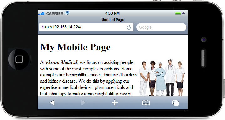
Your Web site may be optimized for the desktop experience and may need help translating to mobile use. Mobile applications require different, more compact navigational aids, and content must fit into a smaller footprint. Mobile Web sites need "click to call" options to take advantage of cellular technology, a robust search, flexible menus, and quick access to content. Tables and figures may need to be adjusted to avoid unnecessary "pinching" and scrolling.
The following topics help you develop Mobile Web pages for Ektron.
Separating Content from Presentation
Ektron separates content from presentation so that content developers can concentrate on composition. A mobile device template, because of the smaller footprint, may have a single column to eliminate horizontal scrolling, pinching and zooming. Instead of creating different content, you decide what is optimal for each device by creating different templates. You may need to replace objects (such as a rotating banner or those with large download times) with mobile-equivalent objects.
Mobile device templates differ from desktop ones in several ways.
- Screen "real estate" is smaller
- Capabilities like Flash might not be supported
- Support for JavaScript might vary
- Menu functions may differ
In addition, some content considerations are needed.
- Let visitors complete tasks with as few clicks as possible
- Use a vertical mobile navigation at the bottom of each page
- Provide a "Click to Call" button
Ektron can detect specific characteristics of a mobile device, such as the differences between the Android Droid X and Droid 2. These characteristics help you determine how to render the user experience. For example, one device may support Flash technology and another may not.
Using Business Analytics to Determine Configuration Groups
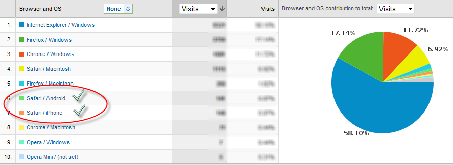
To determine which mobile devices to add to your device configurations, review your Analytics reporting to see which mobile devices are browsing your site. To see the Browser and OS report:
- In the Workarea, select Reports > Traffic Analytics > Visitors > Browser Capabilities > Browsers and OS.
- Modify the time period and rank if needed. For more information, see Viewing Analytics Data.
The example shows that Android and iPhone mobile devices have browsed pages. Create templates and device configurations to improve the experience of these visitors.
Setting Up a Mobile Template
Follow these steps to set up a mobile template. If additional details are needed, a link is provided at the end of the step.
- In the site root/web.config file, set ek_EnableDeviceDetection to True.
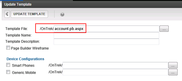
<add key="ek_EnableDeviceDetection" value="true"> - Identify a template for which you want to create a mobile version, using the Workarea > Settings > Configuration Template Configurations screen. Click any template to see its folder location relative to your site root.
- Open Windows Explorer and locate that template.
- Copy and save a mobile version of the template under a suitable name, for example,
account.pb.smartphone.aspx. - Adapt the template for mobile use by changing column styles, removing unwanted navigation, images, headers, footers, adding components that help mobile users, etc. See Also: Separating Content from Presentation
- Create device configurations. Assign to each one any mobile devices that use the template you created in Step 6. See Also: Separating Content from Presentation
- Return to the Template Configuration screen and click the template you identified in Step 1.
- Check every mobile Device Configuration for which you created a mobile template version. Then, for every checked configuration, click the ellipsis button (
 ) to its right, navigate to and select the mobile template you created in Step 6.
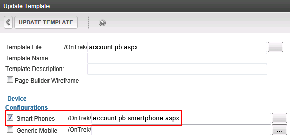
Now, if a mobile device user accesses a page which uses that template, the mobile-enhanced template displays the content.
- To test mobile templates, preview your content within them. See Separating Content from Presentation.
- Ektron uses the Wireless Universal Resource File (WURFL) file to obtain wireless device information. To learn how to view, update, and customize this file, see Updating the Wireless Universal Resource File.
- To conditionalize Smart Form content based on user device, see Specifying Device-Specific Content.
- To use a mobile site visitor's geographic location to deliver relevant content, see Using Geomapping Features with a Mobile Device.
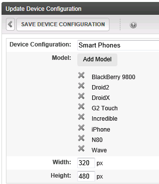
Add a Device Configuration
Create a device configuration to accommodate a variety of mobile devices by grouping characteristics, such as display size. You can group devices for standard presentation and add refinements for specific devices. For example, a device configuration may consist of a Smart Phones group (Android, BlackBerry, iPhone, etc.) and a Tablets group (iPad, RIM, etc.).
Within Ektron, you can group devices by model or operating system. Grouping by model gives you more control over specifications, but it's quicker to group by operating system. You may want to first group by operating system, then only define models that do not work properly under an operating system configuration.
IMPORTANT: Because a device may be covered by several configurations, use the Reorder button to determine the order in which devices are checked. See Also: Reordering Device Configurations
 Add a device configuration by selecting operating system
Add a Device Configuration by Selecting Operating System
Each mobile device's definition includes an operating system. To reduce effort, you can create configurations by choosing one or more operating systems. When you do, each device using that OS is automatically included in the list. For example, you create a device configuration for all Android phones.
While defining a mobile device, you decide if the configuration applies to handheld devices, tablets, or both device types. You also specify a resolution (width and height). So, if two devices share an operating system but have different resolutions, create a separate configuration for each one.
Prerequisites:
- You are a member of the Administrators group
- Device detection is enabled See Also: Separating Content from Presentation
To add a device configuration by selecting an operating system:
- Workarea > Settings > Configuration > Device Configurations.
- Click Add Device Configuration (by OS).
- In the Device Configuration field, enter a name for the configuration.
- Click Add OS.
- Select one or more operating systems for this configuration.
- At the Device Type field, choose whether the configuration applies to handheld devices, tablets, or both device types.
- Set the Width and Height of the device display in pixels.
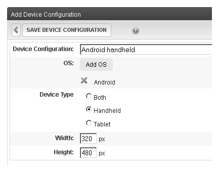
- Click Save Device Configuration.
Add a device configuration by selecting models
Add a Device Configuration by Selecting Models
When adding individual devices to a configuration, group devices that share characteristics, such as Flash support and screen resolution. Since you will assign the configuration to a mobile template, make sure that all devices support the template's functionality.
- Workarea > Settings > Configuration > Device Configurations.
- Click Add Device Configuration.
- In the Device Configuration field, enter a name for this configuration.
- Click Add Model.
- Select one or more models for this configuration.
- Set the Width and Height of the device display in pixels.
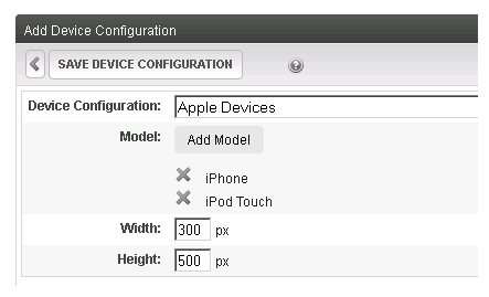
- Click Save Device Configuration.
Editing a Device Configuration
- Workarea > Settings > Configuration > Device Configurations.
- Click the configuration that you want to edit.
NOTE: You cannot edit the Generic and Generic Mobile configurations.
- Note that the second line of the display indicates if the configuration was determined by operating system or model. You can only add or remove models or operating systems, depending on that setting.
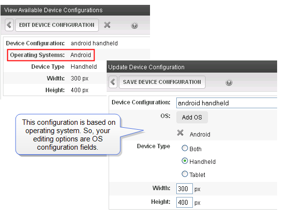
- Click Edit Device Configuration.
- To remove any model or operating system from this configuration, click X to the left of its name.
- Update the other fields on the screen as needed. For information on the fields, see Separating Content from Presentation.
- Click Save Device Configuration.
 ).
).Reordering Device Configurations
You can determine the first acceptable configuration that a device will use. To accomplish this, change the order of the device configurations.
For example, you configured an iPad in the AppleDevices and the TabletDevices configurations. However, because AppleDevices is set for a small resolution, you want an iPad to use the TableDevices configuration (which has a larger screen). Reorder the devices so that TableDevices appears above AppleDevices.
- Workarea > Settings > Configuration > Device Configurations.
- Click Reorder Device Configurations (
 ).
). - Click a configuration you want to move.
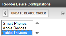
- Click Up/Down (
 ) to arrange the list to the desired order.
 - Click Update Device Order.
Previewing Content in a Mobile Device Template
You can view your Ektron content in any mobile device template. This will help ensure that the content fits properly within the screen resolution.
- Edit content in the editor.
- Click Preview (
 ). The Preview dialog appears. (For more information, see Separating Content from Presentation.)
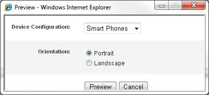
- Select a model from the Device Configuration drop-down and click Preview. The content displays in the selected template.
Updating the Wireless Universal Resource File
Prerequisite: Access to your Web server's file system
The Wireless Universal Resource File (WURFL) is an XML configuration file with information about many mobile devices. It is maintained by the open-source community. For more information, see http://wurfl.sourceforge.net/.
The following disclaimer is found on the WURFL.sourceforge.net site:
IMPORTANT: There is no guarantee of any kind that any of the info in the WURFL is correct. All the information has been gathered by collecting reports from users and developers around the globe.
This section contains these topics.
Locating and opening the WURFL file
Locating and Opening the WURFL File
The WURFL file is located in [siteroot]\app_data\wurfl.xml.gz.
WARNING! This file is part of Ektron's install and upgrade process. Changes to this file are overwritten during upgrades.
To open wurfl.xml.gz, use a file extractor that opens gzip files, such as 7zip. After extracting, use any program that opens a standard XML file to open wurfl.xml.
Downloading and replacing the WURFL file
Downloading and Replacing the WURFL File
- In the Workarea, go to Settings > Configuration > Device Configurations.
- Click Add Device Configuration.
- Click Add Model.
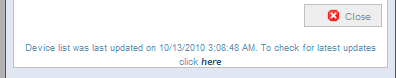
- At the bottom of the window, click here.
- This links to
http://sourceforge.net/projects/wurfl/files/WURFL/ - Download
wurfl-latest.xml.gz.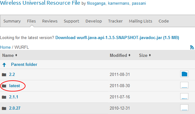
- Rename
wurfl-latest.xml.gztowurfl.xml.gz. - Replace wurfl.xml.gz in the folder
[siteroot]\app_data\.
Adding a new mobile deviceAdding a New Device to the WURFL File
To add a device that is not in the WURFL file:
- Identify the device's user agent by following these steps.
- Within your site root folder, create a test .aspx page. For example,
devicetest.aspx. - Open the corresponding .cs file. For example,
devicetest.aspx.cs. - Insert the following command into the .cs file :
Response.Write(Request.UserAgent.ToString()); - Save the .aspx.cs file.
- Using the mobile device that you want to support, open a browser and view the .aspx page you created. The user agent information appears on the screen.
It may look like this:
Mozilla/5.0 (iPad; CPU OS 5_0 like Mac OS X) AppleWebKit/534.46 (KHTML, like Gecko) Version/5.1 Mobile/9A5288d Safari/7534.48.3
- Within your site root folder, create a test .aspx page. For example,
- Search the
wurfl.xmlfile for the user agent. See Also: Locating and Opening the WURFL File- If you find the agent within
wurfl.xml, do nothing. - If you do not find the agent in
wurfl.xml, create a patch file and add the device to it. See Also: Creating a WURFL Patch File
- If you find the agent within
Creating a WURFL patch fileCreating a WURFL Patch File
Use a WURFL patch file to add a mobile device not included in the standard WURFL file.
NOTE: For more information, see http://wurfl.sourceforge.net/patchfile.php and http://db.scientiamobile.com/static/top.htm.
Prerequisite: You completed the steps in Adding a New Device to the WURFL File
- Update your siteroot/
web.configfile.- Find this element:
<wurflLocation path="c:\inetpub\wwwroot\your web site\App_Data\wurfl.xml.gz" /><patches /> - Add an opening
<patches>tag and the following line, as shown.<patches><add path="c:\inetpub\wwwroot\your web site\App_Data\wurfl_patch.xml" /></patches>Replace your web site with the path to your Web site.
- Within your
web.configfile, verify thatek_EnableDeviceDetectionis set to true.
- Find this element:
- Create the
wurfl.patch.xmlfile.- Open the
your-web-site\App_Datafolder. - Create a file named
wurfl.patch.xml. - Copy the following text to the file.
<wurfl_patch>
   <devices>
     <device id="apple_ipad_ver1_sub50" user_agent="Mozilla/5.0 (iPad; CPU OS 5_0 like Mac OS X)
      AppleWebKit/534.46 (KHTML, like Gecko) Version/5.1 Mobile/9A5288d Safari/7534.48.3"
      fall_back="apple_ipad_ver1_sub42">
     </device>
     <device id="apple_iphone_ver5_0" user_agent="Mozilla/5.0 (iPhone; U; CPU iPhone OS
	 4_2 like Mac OS X; en_us) AppleWebKit/534.46 (KHTML, like Gecko)"
        fall_back="apple_iphone_ver4_2">
     </device>
   </devices>
</wurfl_patch>
The following list explains the
<device>element's parameters. - Open the
- id—Enter an ID that is unique among all WURFL files on your server. In other words, you cannot use an ID that exists in
WURFL.XML.- user_agent—Enter the user agent information from Step 1e of Adding a New Device to the WURFL File.
- fall_back—Enter a device ID that is similar to the one your are defining and exists in the
WURFL.XMLfile. This value tells the patch file the type of device being identified. In the example above, the iPad iOS 5 points to iPad iOS 4.
Specifying Device-Specific Content
You can set up Smart Form configurations to recognize a user's device and, based on that information, display appropriate content. For example, if a user is not using a Smart Phone, show a complex display with rich graphics. If a user is using a Smart Phone, create a simpler presentation of the same fields without graphics. To learn about this capability, see Inserting a Conditional Section.
You can also designate some or all of an HTML form's postback message to be conditional upon a user's device. So, for example, the postback message for Smart Phone users can be much shorter than the message for users who are not using a mobile device. To learn more about this, see Specifying Conditional Text in the Postback Message.
Using Geomapping Features with a Mobile Device
Mobile browsing makes the geographic location of a site visitor very important information. For example, if a mobile visitor is accessing your site, you can show nearby stores and special promotions. Creating the mobile experience in Ektron takes 2 steps.
Step 1: Create content with geo location metadata
Step 1: Create Content with Geolocation Metadata
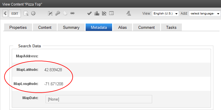
Ektron content can have MapLatitude and MapLongitude metadata. This metadata is automatically added when you publish content with a street and city address in the MapAddress field. To learn more about this, see Setting Content Found on a Map.
The following image shows the MapLatitude and MapLongitude metadata.
Step 2: Create a mobile template with the Map Server Control
Step 2: Create a Mobile Template with the Map Server Control
Because of the size of a mobile device, you may decide to rearrange the content list, map image, and search components provided by the Map server control. To do this, change the standard map EkML file. See Controlling Output with Ektron Markup Language and the sample file [siteroot]/workarea/template/map/map.ekml.
To complete this step, place the Map Server control on a mobile device template. See Map Server Control Properties and Separating Content from Presentation for more information.
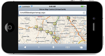
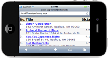
Showing maps and near-by locationsShowing Maps and Near-by Locations
After finishing the previous steps, you can browse to the template that contains the map on a mobile device. If your Smart Phone has GPS capability, it shows your location at the center of the map. For all other mobile devices, the center of the map is the Latitude and Longitude coordinates set on the Map Server Control.
Content locations appear as map pins, and the content list is sorted by distance from the current location (with GPS) or map center.
See also these Web pages.