Using Data Field Types
You can insert the following data field types into a data entry screen.
IMPORTANT: For Smart Form fields to searchable, they must be stored as elements or attributes not content.If you are upgrading to version 8.5 or higher, inspect your Smart Forms and change field properties as needed so they are not stored as content.
Calculated

Use a calculated field to perform a calculation based on values in other fields. For example, if your screen collects mortgage information, you could create one field to collect the mortgage and interest payment and another to collect taxes and insurance. The calculated field could sum those 2 numbers and display the monthly payment.
You can validate a calculated field. For example, you can require a positive number between 100 and 1,000.
Calculated fields are display only; users cannot edit them.
IMPORTANT: If a field will be referenced in a calculation, use the validation feature to require a value for that field. This forces the user to enter a number to be used in the calculation.
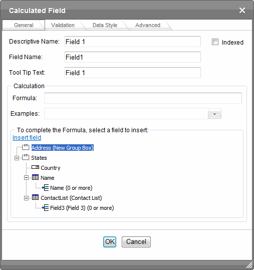
- Descriptive Name—Enter the name of the field.
- Indexed—Check if you want to index this field. For more information, see Searching XML Information. The Indexed field may or may not appear, depending on how your administrator has set up your system.
- Field Name—Enter the field’s element name. This defines the field in the XML.
- Tool Tip Text—Enter the text that appears when a user hovers the cursor over this field.
- Formula—Enter the calculation that this field will perform. See Also: Using the Formula Field
- Select Field—Click this button to select a field to reference in the calculation.
- Examples—Click the down arrow to the right of this field to see examples of calculations you can perform. When you select an example, it is copied into the Formula field. See Also: Formula Example Descriptions
- Validation—Select the kind of validation to apply to this field. Your choices are:
- No validation—the user’s response is not checked
- Non-negative number (required)—the result of the calculation must be a positive number
If you assign to this field any value other than No validation, the field is surrounded by red dashes in Data Entry mode. If the user’s response does not meet the validation criteria, the field remains surrounded by red dashes. Your system administrator determines if a user can save a screen with invalid data.
- Error message—If you select Non-negative number, insert text that appears on the screen if the user’s response does not meet this criterion.
- Custom Validation—See Creating Custom Validation Criteria
- Data Style tab—You can specify the following data styles:
- Font style and size
- Bold and italic
- Text alignment (especially helpful for formatting dollar amounts in a plain text field)
- Underline or strikethrough
- Font color and background color
NOTE: The configuration data controls a command's appearance on the toolbar and on the Data Style dialog. For example, if
<button command="cmdfontname" />is removed from configdatadesign.xml, it disappears from the toolbar and the Data Style dialog.
- Advanced tab—This is the same as the Group Box Advanced Tab.
 Using the Formula field
Using the Formula Field
- Copy a sample calculation into the Formula field by clicking the Examples field.
- Select an operation from the drop-down list. For example, if you click Examples Add 2 numbers {X}+{Y}, {X}+{Y} appears in this field.

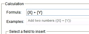
- Replace the variables with fields on the screen. Be sure to select the curly brackets ({}) with the letter between them. Then, when the user enters data into those fields, the calculation is performed using the current field values.
- Select the first variable to replace. To continue the example, select {X}.
- Select a field to replace that variable in the calculation.
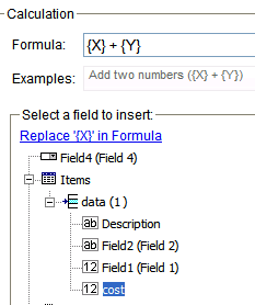
- Click Replace X in Formula.
- Continue replacing all variables in the formula.
Important information about calculated variables:
- If the user does not replace all variables with a field or a number, when the content is validated, validation will fail.
- If a variable appears more than once in a formula (for example,
{X} * number({X}<= {Y}) + {Y} * number({X}>{Y}), you only need to replace the first occurrence—the editor replaces subsequent occurrences for you. - If a calculated field tries to perform a numerical calculation with a value that is blank or contains letters,
NaNappears in the field. (NaNstands for “not a number.”) - If a calculated field tries to divide by zero,
Infinityappears. - If an XML document contains several occurrences of a field that is referenced in a formula, the value is derived as follows:
- When using the XPath functions
sum()andcount(), all values with the field name are considered. For example, a document includes 3 books whose prices are $10, $20 and $30. In this case,sum’s value is $60. - When using all other functions, the first value is used. For example, a document includes 3 books whose prices are $10, $20 and $30. If a calculation formula refers to
<price>, its value is $10.
- When using the XPath functions
- You can replace a variable with a number instead of a field. For example, replace
{X} * {Y}with../price * 1.15. - The expression can be complex, such as
(round(Field1 * 0.80) + (1 div Field2)) - 2. - You can use a string expression that creates a text message. For example, to calculate a full name from its parts:
concat( title, ' ', givenname, ' ', familyname), which could produce “Dr. Jonathan Smythe”. - A calculated field can only reference other calculated fields that appear before it in a document. For example, a document collects a series of numbers.
- One calculated field counts the number of numbers.
- Another totals their values.
- A third computes the average by dividing the total by the count.
In this example, you must place the third field below or to the right of the first 2 fields. Calculated fields that are defined later in a document do not appear in the Select Field or Group dialog.
Formula example descriptions
Formula Example Descriptions
The following table explains the standard examples that appear in the Examples drop-down list of the Calculated Field dialog. Note that your system administrator can customize the list.
|
Example Field Text |
Example Field Formula |
Description |
|
Add 2 numbers |
{X} + {Y} |
Add the value in the first field (X) to the value in the second field (Y). |
|
Subtract 2 numbers |
{X} - {Y} |
Subtract the value in the second field (Y) from the value in the first field (X). |
|
Multiply 2 numbers |
{X} * {Y} |
Multiply the value in the first field (X) by the value in the second field (Y). |
|
Divide 2 numbers |
format-number({X} div {Y},'0.###') |
Divide the value in the first field (X) by the value in the second field (Y). |
|
Format as a percentage |
format-number({X} div {Y},'#0%') |
Determine what percentage one number (X) is of another (Y). For example, if {X}=10 and {Y}=100, the result of the calculation is 10%. |
|
Absolute value of a number |
{X} * (number({X} > 0)*2-1) |
The number regardless of the sign (negative or positive). |
|
Minimum of 2 numbers |
{X} * number({X} <= |
The smaller of 2 field values. |
|
Maximum of 2 numbers |
{X} * number({X} >= |
The larger of 2 field values. |
|
Zero if subtraction is negative |
({X} - {Y}) * number(({X} - {Y}) >; 0) |
Subtract one number (Y) from another (X). If the difference is less than zero, insert zero. |
|
Multiply by another number if checkbox is checked |
|
X is a numeric field. Y is another numeric field to multiply by X if a checkbox is checked. Z is the checkbox. For example, {X}=2 and {Y}=3
|
|
Round a decimal number |
round({X}) |
Rounds the number to the nearest integer. For example, |
|
Round up a decimal number |
ceiling({X}) |
Returns the smallest integer that is greater than the number. For example, For negative numbers: ceiling(-3.14) = -3 |
|
Round down a decimal number |
floor({X}) |
Returns the largest integer that is not greater than the number argument. For example, For negative numbers: floor(-3.14) = -4 |
|
Format decimal number 0.00 |
format-number({X},'0.00') |
Rounds a value either up or down to the hundredth place. As examples, 100 becomes 100.00, and 3.14159265 becomes 3.14. |
|
Total numeric values from multiple fields |
sum({X}[text()] | |
Add the values in all referenced fields. Only elements that contain a value are summed. Empty elements are excluded. |
|
Total a list of numeric values |
sum({X}[text()]) |
Total all values in a single repeating field. Here’s an example. Plain Text Field properties Name: Miles Allow: more than one Validation: non-negative whole number XML Data
sum(Miles) equals 89+12+23+19=143 Only elements that contain a value are summed. Empty elements are excluded. |
|
Average a list of numeric values |
format-number(sum({X}[text()]) |
Calculate the average of all values in a single repeating field. To continue the example from the Total a list of numeric values field: Plain Text Field properties Name: Miles Allow: more than one Validation: non-negative whole number XML Data
Average=89+12+23+19=143 divided by the number of values (4)= 35.75 Only elements that contain a value are summed. Empty elements are excluded. |
|
Count the number of values in a list |
count({X}) |
Calculate the number of values in a single repeating field. To continue the example from the Total a list of numeric values field: Plain Text Field properties Name: Miles Allow: more than one Validation: non-negative whole number XML Data
Count = 4 |
|
Lowercase text |
translate({X},'ABCDEFGHIJKLMN |
Replace all uppercase characters with the lowercase version of that character |
|
Uppercase text |
translate({X},'abcdefghijklmn |
Replace all lowercase characters with the uppercase version of that character |
|
Remove extra spaces |
normalize-space({X}) |
Remove extra space characters from content\ |
|
Concatenate text |
concat({X}, ', ', {Y}) |
Link text strings together into a single string. For example, |
|
Size of a text string |
string-length({X}) |
Count the number of characters in a selected field’s value. For example, if the referenced field’s value is Hello, string-length = 5. |
Calendar

Insert a calendar field when you want a Smart Form to include a date field. You may choose to use the current date or set a date. To set the date, click one from a calendar. Because users cannot enter digits, a standard date format is ensured. The date is stored as a standard XML date (in the format yyyy-mm-dd), and localized to the computer of the user viewing it.
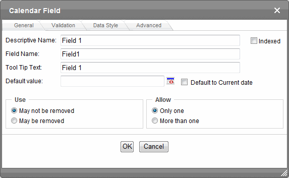
- Descriptive Name—Enter the name of the field.
- Indexed—Check if you want to index this field. For more information, see Searching XML Information. The Indexed field may or may not appear, depending on how your administrator has set up your system.
- Field Name—Enter the field’s element name. This defines the field in the XML.
- Tool Tip Text—Enter the text that appears when a user hovers the cursor over this field.
- Default value—If you want this screen to have a default date when the user first sees it, click the calendar icon to the right and select a date. The user can change the date in Data Entry mode.Check Default to Current date if you want to use the date on which the new content is created or edited.
NOTE: If you enter a default date, you cannot later remove it. You can change it. If necessary, you can delete the field and enter a new one.
- Use—Click May not be removed if this field must be included on the screen. Otherwise, click May be removed.
If you check May be removed, when this field appears on a data entry screen, an icon (
 ) appears to the left of the field. If the user clicks the icon, a drop-down menu provides an option to remove the field.
If the user removes the field,
 field name replaces the field on the data entry screen to indicate that the field was removed and can be re-added if necessary. For example, if the field’s display name is
 street address, and the user removes the field, appears in place of the field.
NOTE: The menu icon (
) can also indicate that the user can add instances of a field (see the Allow field). So, if a field is required, the icon could appear but omit a Remove option. - Allow—Check more than one if you want to let the user entering data add instances of this field. Otherwise, check only one. For example, if a screen is collecting names and addresses and you want to let the user enter several of them, check more than one. If you check More than one here, you are allowing the user to insert an entirely new table, not an additional table row.
WARNING! Do not insert a calendar field into a Smart Form that allows multiple entries (using the Allow more than One option on the dialog). If you do, you cannot search the Smart Form using that field.
If the user entering data clicks
, a menu appears, which lets the user click Duplicate to add instances of the field to the screen.NOTE: The menu icon (
) can also indicate that the user can remove a field (see the Use field). So, even if a field allows only one instance, the icon could appear but the menu would only display Remove. - Validation—If you want to require the user using the calendar to enter a response, click the down arrow to the right of this response field and select Cannot be blank.
- Error Message—If you select Cannot be blank, insert text that appears on the screen if the user’s response does not meet this criterion.
- Custom Validation—You can ensure the user’s input is greater or less than the date you are inserting on the Data Design screen.
- Message—displays in Data Entry mode when the user inserts an invalid value. Your system administrator determines if a user can save the invalid data.
- Data Type—shows Date.
- Condition—displays the validation logic.
- Examples—drop-down list shows validation expressions that you can apply to the field.
- Select a Field to Insert area—displays fields that can be inserted into the Condition field. You must choose a calendar type field (note the calendar icon to the left of these fields).
- Data Style tab—You can specify the following data styles:
- Font style and size
- Bold and italic
- Text alignment (especially helpful for formatting dollar amounts in a plain text field)
- Underline or strikethrough
- Font color and background color
NOTE: The configuration data controls a command's appearance on the toolbar and on the Data Style dialog. For example, if
<button command="cmdfontname" />is removed from configdatadesign.xml, it disappears from the toolbar and the Data Style dialog.
- Advanced tab—This is the same as the Group Box Advanced Tab.
Creating a custom validation
Creating a Custom Validation
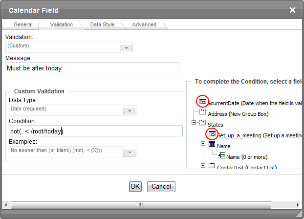
As an example of custom validation, assume a field collects the date when a patient’s health insurance policy expires. You want to make sure the date is later than today. To accomplish this:
- Create a calendar field that prompts for today’s date.
- Create another calendar field that prompts for a patient’s health insurance policy expiration date.
- While creating the second field, in the Validation section, click Custom Validation. The Custom validation screen appears.
- Click the down arrow to the right of the Examples field to see sample logic.
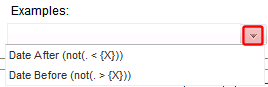
- Click Date After (not(. >={X}). This option lets you specify that the user’s response must be later than a specified date.
- In the Condition field, select {X} and click the Select Field button. The Select Field or Group screen appears.
- Select the field that prompts for today’s date, which you created in Step 1. That field replaces {X} in the Condition field.
- Move the cursor to the Error Message field and compose an error message. For example:
Must be after today. Your screen should look like this. 
- Click OK.
- Click OK to save that dialog and test the validation on the date field. To do this, switch to Data Entry mode and enter a date earlier than today to verify that validation works as expected.
Checkbox

A Checkbox field is only one character wide and accepts one of 2 possible values: checked or unchecked. For example:
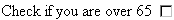
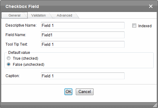
- Descriptive Name—Enter text to guide the user’s response to this field. To continue the example, the caption would be Check if you are over 65. After you insert this field onto the screen, the Descriptive Name appears to the right of the checkbox. You can use the editor's formatting capabilities to modify its size, font, color, and other attributes.
NOTE: The Descriptive Name field only appears on this dialog when you create the Check Box field. If you later try to edit the field, it is not on the dialog. However, you can edit the Descriptive Name text within the editor.
- Indexed—Check if you want to index this field. See Also: Searching XML Information. The Indexed field may not appear, depending on how your administrator set up your system.
- Field Name—Enter the field’s element name. This will define the field in the XML.
- Tool Tip Text—Enter text that appears when a user hovers the cursor over this field.
- Default value—If you want this field to be checked when the screen first appears, click True. Otherwise, click False.
- Validation tab—You can use this screen to specify that the checkbox must be checked or unchecked.
- Advanced tab—This is the same as the Group Box Advanced Tab.
Choices

Use the Choices field when you want to give the data entry user several options. For example, you create a Choices field named Interests that lists these options. The data entry user could check the first 2 and leave the third blank.
- music
- art
- sports
You can do the following with a Choices field.
- Limit a user’s response to one item, or allow more than one.
- Require a response.
- Determine the list’s appearance from these choices.
- Choose from a standard list of choices (such as Languages, Countries, and so on) or create your own list.
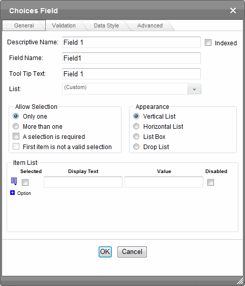
- Descriptive Name—Enter the name of the field.
- Indexed—Check if you want to index this field. For more information, see Searching XML Information. The Indexed field may or may not appear, depending on how your administrator set up your system.
- Field Name—Enter the field’s element name. This defines the field in the XML.
- Tool Tip Text—Enter the text that appears when a user hovers the cursor over this choice list.
- List—Select from a standard list or choose Custom to create your own.
- Allow selection—Click More than one to let the data entry user select more than one item on the data entry screen. Otherwise, click Only one. For example, if you click More than one, and the choices are: music, art, sports, the user could select all 3 choices.
- A selection is required—Check this box if the user must select at least one list item.
- First item is not a valid selection—Check here if the first item on the list is not a valid value but instead text that prompts the user to respond to the field. An example of such text for a list of states is Select a state. If you check this box and the user selects the first value on the list (most likely by default), an error message appears when the user tries to save the screen.
- Appearance—Determine the style of list.—List options—
List type
Example
Description
vertical

All choices appear, arranged vertically.
horizontal

All choices appear, arranged horizontally.
list box

All items appear. The default one is selected when the screen first appears, but can be changed.
drop list

Only the top item appears. To its right, a down arrow appears (circled). The user clicks the arrow to display all items and select one.
- Item List—See Creating a Custom Choice List.
- Value—Enter the value that is collected when the data entry user selects this item. For example, if Interests appears in the Name field, and you want
musicto be collected when the data entry user selects this item and saves the page, enter music here.
- Data Style tab—You can specify the following data styles:
- Font style and size
- Bold and italic
- Text alignment (especially helpful for formatting dollar amounts in a plain text field)
- Underline or strikethrough
- Font color and background color
NOTE: The configuration data controls a command's appearance on the toolbar and on the Data Style dialog. For example, if
<button command="cmdfontname" />is removed from configdatadesign.xml, it disappears from the toolbar and the Data Style dialog.
- Advanced tab—This is the same as the Group Box Advanced Tab.
Creating a custom choice list
Creating a Custom Choice List
To create your own set of list options, accept the List field’s default value, Custom. Then, enter the list values using the Item List section of the screen.
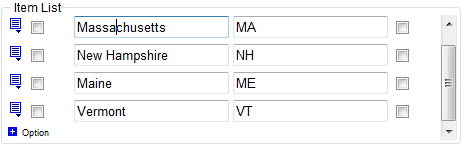
To indicate an option is the default choice, check the Selected checkbox.
- In the Display Textfield, enter text to describe this item on the data entry screen. After you insert this field onto the screen, you can format it. For example, you can apply bold, assign a style, and so on.
- In the Value field, enter the value that is collected when the data entry user selects this item.
For example, if Interests appears in the Name field, and you want music to be collected when the data entry user selects this item and saves the page, enter music here.
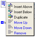
To add a new choice, delete an existing choice, or move a choice up or down within the list, click the menu icon ( ) to the left of that choice. The select a menu option.
Creating a custom choice list in a configuration file
Creating a Custom List in Configuration File
Although you can create a custom list of choices using the Item List area of the Choices Field dialog, that list is only available in that field of that screen. If you want to insert the same list in another section of the screen or a different screen, you must re-enter all options. However, if you create a list according to the following steps, your custom list is stored in the configuration file (along with the standard choice lists, such as Countries). As a result, any user connected to your server can insert the list into any Choices Field on any screen.
To insert a custom list of choices:
- Open the Ektron configuration file,
siteroot/workarea/contentdesigner/DataListSpec.xml. - Insert the new list following the pattern of the other lists in the file, like the following list.
<datalist name="MyNewList">
  <schema datatype="string" />
    <item default="true" value="Green" />
    <item value="Red" />
    <item value="Blue" />
</datalist>
NOTE: You can specify a data type of value: string, nonNegativeInteger, date, decimal. You also can specify a default value (as shown in the third line).
Creating a dynamically populated choice list
Creating a Dynamically Populated Choice List
You specify the elements of the custom options list described in the configuration data. You can also create a dynamically-populated list from any XML source. The source can be on your server or on a remote Web site. Follow these steps to add a dynamic data list to the Choices field.
- Open the Ektron configuration file,
siteroot/workarea/contentdesigner/DataListSpec.xml. - Insert the new list following the pattern of the other lists in the file, like the following list.
<datalist name="MyNewList"> <schema datatype="string" /> <item default="true" value="Green" /> <item value="Red" /> <item value="Blue" /> </datalist> - Insert a new datalist item according to this pattern.
<datalist name="MyNewList" src="{url to xml data source}"
  select="{xpath to data item element}"
  captionxpath="{relative xpath to data item's display text}"
  valuexpath="{relative xpath to data item's value}">
IMPORTANT: The
datalist namemust match thelistchoice dataattribute.For example
<datalist name="USPS-CA" src="[eWebEditProPath]/uspsca.xsd"
  select="/xsd:schema/xsd:simpleType/xsd:restriction/xsd:enumeration"
  captionxpath="xsd:annotation/xsd:documentation"\
  valuexpath="@value"
  namespaces="xmlns:xsd='http://www.w3.org/2001/XMLSchema'"
  validation="select-req">
In this example, the data list is stored in the uspsca.xsd file, located within the ewebeditpro folder. However, it could be in any XML data source.
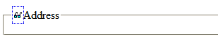
Group Box

A Group Box field lets you group related fields together by surrounding them with a box and optionally placing a caption above them. After you insert a Group Box field, to insert other kinds of fields within the box, place the cursor inside the box then select a field type button.
NOTE: The tabular data field type might better accommodate your needs. See Tabular Data.
Grouping fields in Data Entry mode lets you add another instance of a group. For example, if a screen collects information about each telephone call, you can click Insert Below to insert a new group of fields, ready to collect information about the next call.
Use the eyeglass icon to expand or collapse fields within a group.
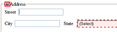
You also can suppress a group of irrelevant fields. For example, assume a screen includes 2 groups of fields that collect information about hardcover and paperback books. When adding information about a hardcover book, you can collapse the paperback book questions because they are not relevant to your task.
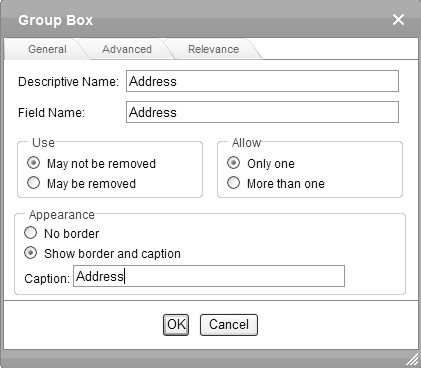
Group Box General Tab
- Descriptive Name—Enter the name of this field, which is used internally as the field’s caption. By default, the Data Designer assigns a name made up of Field followed by the next available number. So, the first field’s default name is Field1, the second field’s default name is Field2, and so on. You can change the default if you want.
- Field Name—Enter the field’s element name. This defines the field in the XML.
- Use—Click May not be removed if this field must be included on the screen. Otherwise, click May be removed.
If you check May be removed, when this field appears on a data entry screen, an icon (
) appears to the left of the field. If the user clicks the icon, a drop-down menu provides an option to remove the field.If the user removes the field,
field name replaces the field on the data entry screen to indicate that the field was removed and can be re-added if necessary. For example, if the field’s display name is street address, and the user removes the field, appears in place of the field.NOTE: The menu icon (
) can also indicate that the user can add instances of a field (see the Allow field). So, if a field is required, the icon could appear but omit a Remove option. - Allow—Check more than one if you want to let the user entering data add instances of this field. Otherwise, check only one. For example, if a screen is collecting names and addresses and you want to let the user enter several of them, check more than one. If you check More than one here, you are allowing the user to insert an entirely new table, not an additional table row.
WARNING! Do not insert a calendar field into a Smart Form that allows multiple entries (using the Allow more than One option on the dialog). If you do, you cannot search the Smart Form using that field.
If the user entering data clicks
, a menu appears, which lets the user click Duplicate to add instances of the field to the screen.NOTE: The menu icon (
) can also indicate that the user can remove a field. So, even if a field allows only one instance, the icon could appear but the menu would only display Remove. - Appearance—Click Show border and caption if you want to surround the fields in this group with a box. You can also create a caption to appear in the top line of the box. Click No border if you do not want to surround the fields in this group with a box.
- Caption—If desired, enter text to describe this group of fields on the data entry screen. For example:

After you insert this field onto the screen, you can use the editor's formatting capabilities to modify its size, font, color, and other attributes.
NOTE: The Caption field only appears on this dialog when you create the Group Box field. If you later try to edit the field, the Caption field is not on the dialog. However, you can edit Caption text within the editor.
- Advanced Tab—See Group Box Advanced Tab.
- Relevance—See Group Box Relevance Tab.
Group Box Advanced Tab
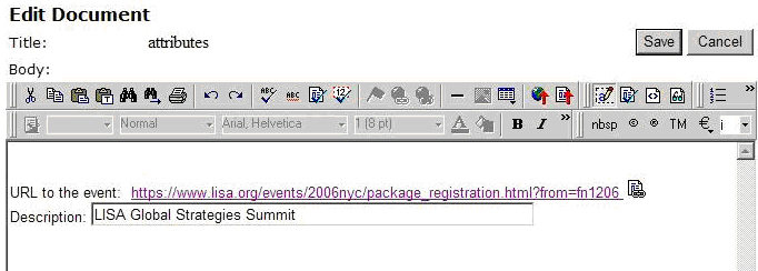
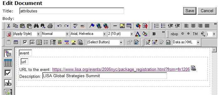
The Advanced tab lets you generate XML microformats made up of standard XHTML tags and attributes that contain a specific structure and values.
For example, the microformat of an event looks like this.
<span class="event">
<a class=
  "url" href="https://www.lisa.org/events/2006nyc/
  package_registration.html?from=fn1206 ">
  LISA Global Strategies Summit</a>
</span>
NOTE: If the element is a group box or table, its type must be Element because it surrounds other elements. If the element is a Rich Area field, its type must be Element or Content.
- Element—A unique tag. The user’s response to the field becomes its value.
<Lastname>Rogers</Lastname> - Attribute—An attribute of the containing field. The containing field is typically a Group Box. If you insert an Attribute field type, the Field Name field on the dialog box is grayed out. The field name and type can only be edited on the Advanced Field properties screen.
<PtInformation Lastname="Rogers"></PtInformation> - Content—The content of the containing field, typically a Group Box. Note that, in this case, field name is not used. As a result, the Field Namefield is grayed out. The field name and type can only be edited on the Advanced Field properties screen. Because most fields define their own content, this option is typically used to define a value to a Group Box that contains other fields defined as attributes.
WARNING! Only one Content type field is valid within a containing field.
<PtInformation>
Rogers
</PtInformation>
Data Entry View
Data Design View
Replacing the XML <root> tag
Replacing the XML <Root> Tag
By default, Ektron surrounds your Data Design with <root> XML tags. You can replace the <root> tags with another element name by following these steps.
- After creating a new Data Design screen, insert a Group Box as the first field.
- In the Group Box dialog box Field Name field, enter the root text. For example, "state" to replace <root> with <state>.
- Click the Advanced tab.
- In the Root tag section of that screen, select Use this element as the Root tag and click OK.
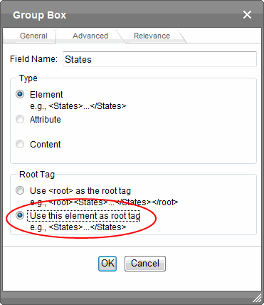
- Place all other screen elements within the Group Box field.
Group Box Relevance Tab
The Relevance tab allows a group of fields to appear or disappear according to the value of other fields in the configuration. It appears on both the Group Box and Tabular Data Box dialogs.
Here are some example uses.
- Questions about pregnancy that appear only if the patient is female.
- A list of states that appears only if the user selects United States as his country.
- A list of car manufacturers. When a user chooses one, all of its models appear in a second list.
Fields that can be Used in Relevance Conditions
Only the following field types can be used in a Relevance condition.
- Check box
- Text
- Calculated
- Choices
NOTE: If using a Choices field, in the Appearance area of the dialog, you can only choose List Box or Drop Box. Vertical List and Horizontal List are not supported.
Applying relevance to a Group Box field
Applying Relevance to a Group Box Field
- Edit a Smart Form configuration in Data Design mode to which you want to apply Relevance.
- If necessary, insert the field(s) on which the group box’s appearance depends.
- Insert a Group Box field. See Also: Group Box
NOTE: The location of the Group Box field is independent of the location of the fields to which you will apply conditions.
- Click the Group Box dialog’s Relevance tab.
- The Relevance tab appears.
- Scroll through the list of sample conditions to determine which one best fits your situation.
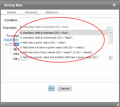
- Select a field from the lower half of the screen to replace the first variable (X or Y) in the condition. For example, if the condition is
A checkbox field is checked ({X} = 'true'), click the check box field whose value must betruefor this group to appear. - Click Replace {X} in Condition.
- Notice that, in the Condition field, the variable was replaced by the selected field.
- If the condition has another variable, repeat Steps 7 and 8.
- Click OK.
You should switch to Data Entry mode and test the Relevance conditions.
Example of applying relevance to a Group Box field
Example of Applying Relevance to a Group Box Field
Assume you want a list of states in the United States to appear only if a user selects United States from the Country field.
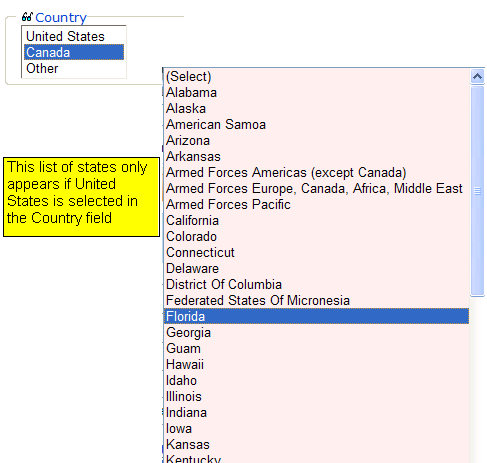
To accomplish this:
- Create a Choices field and assign it 3 values:
- United States
- Canada
- Other
See Also: Choices
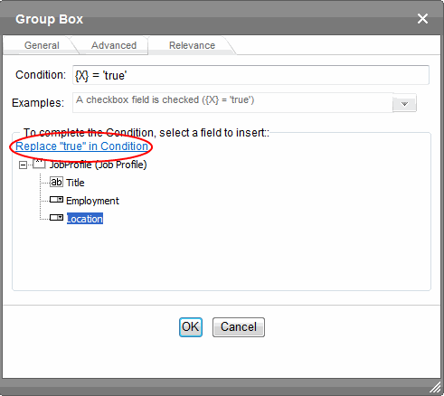
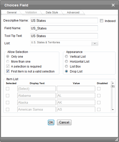
- Create a Group Box field and name it States.
- With that Group Box field, create a new Choices field.
- Name it US States.
- In its List field, select U.S. States & Territories.
- In Allow Selection, check First item is not a valid selection
- In the Appearance field, select Drop List.
- Click OK. The field appears on the form.
- Place the cursor on the States Group Box field and click Group Box.
- Click its Relevance tab.
- Pull down the Examples list.
- Click
A field has a given value ({X} = 'value'). - Scroll through the lower half of the screen until you see the country Choices field.
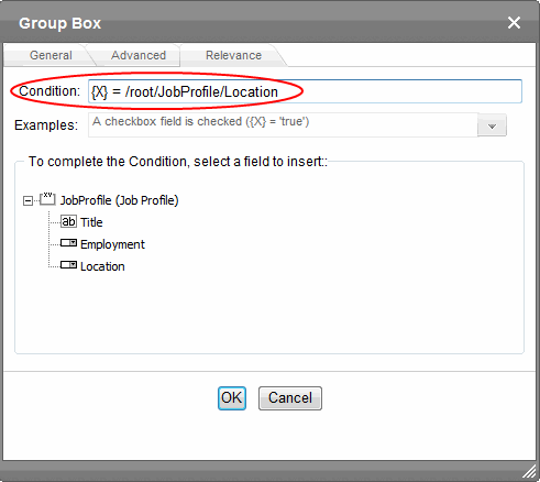
- Click Replace '{X}' in Condition. Notice that the Condition field now reads /root/Country = 'value'.
- In the Condition field, replace Value with United States.
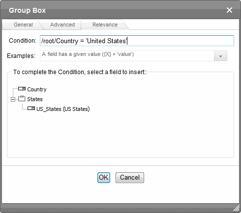
IMPORTANT: The text that replaces Value must exactly match the desired value of the selected field.
- Click OK.
Image Only

Use an Image Only field to place an icon on the screen, which the user in Data Entry mode can click to insert an image into the Web content. You can insert a default image if desired. To let the user insert any file, such as a Microsoft Word document, use a Link field.
In Data Entry mode, the image’s caption appears, followed by a default image (if you specify one) and this icon:
NOTE: The user can only insert a file whose extension is defined within the <validext> element of the configdataentry.xml file. Your system administrator can help you do this.
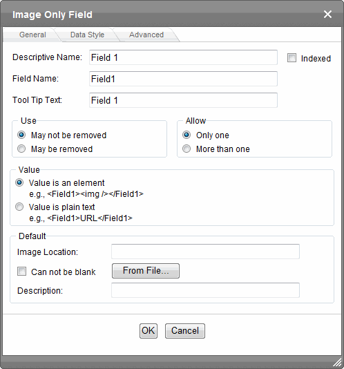
- Descriptive Name—Enter the name of the field.
- Indexed—Check if you want to index this field. For more information, see Searching XML Information. The Indexed field may or may not appear, depending on how your administrator has set up your system.
- Field Name—Enter the field’s element name. This defines the field in the XML.
- Tool Tip Text—Enter the text that appears when a user hovers the cursor over this field.
- Use—Click May not be removed if this field must be included on the screen. Otherwise, click May be removed.
If you check May be removed, when this field appears on a data entry screen, an icon (
) appears to the left of the field. If the user clicks the icon, a drop-down menu provides an option to remove the field.If the user removes the field,
field name replaces the field on the data entry screen to indicate that the field was removed and can be re-added if necessary. For example, if the field’s display name is street address, and the user removes the field, appears in place of the field.NOTE: The menu icon (
) can also indicate that the user can add instances of a field (see the Allow field). So, if a field is required, the icon could appear but omit a Remove option. - Allow—Check more than one if you want to let the user entering data add instances of this field. Otherwise, check only one. For example, if a screen is collecting names and addresses and you want to let the user enter several of them, check more than one. If you check More than one here, you are allowing the user to insert an entirely new table, not an additional table row.
WARNING! Do not insert a calendar field into a Smart Form that allows multiple entries (using the Allow more than One option on the dialog). If you do, you cannot search the Smart Form using that field.
If the user entering data clicks
, a menu appears, which lets the user click Duplicate to add instances of the field to the screen.NOTE: The menu icon (
) can also indicate that the user can remove a field. So, even if a field allows only one instance, the icon could appear but the menu would only display Remove. - Value—Whether the value is an element or plain text.
- Value is an element renders the field as
<img src=”url” alt=”text” />for an image. - Value is plain text renders the field as just the url.
- Value is an element renders the field as
- Default Image Location—If desired, you can insert a default image, which might be the most common image or simply a reminder that an image needs to be inserted. To help find the image, click the From File button and navigate to image file. You can only insert an image file whose extension appears between the
<validext>tags in the configdatadesign.xml file. For example:<validext>gif,jpg,png,jpeg,jpe,doc,txt</validext> - Cannot be blank—If you want to require the user completing this field to enter a response, click inside this check box.
- Description—Enter the image’s alt text, which is used as a replacement for an image whenever it cannot be seen. For example, a visually impaired person is using a screen reader.
- Advanced tab—This is the same as the Group Box Advanced Tab.
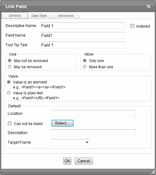
Link

Use a Link field to place an icon on the screen which the user in Data Entry mode can use to link to any Library file, such as a Microsoft Word document or a .gif image file. (You can also use an Image Only field to let the user insert an image. See Also: Image Only )
The File Link field does not let you link to Ektron assets.
In Data Entry mode, the file link field’s caption appears, followed by this icon: .When the user clicks the icon, a hyperlink screen prompts you to specify information about the link.
NOTE: Only insert a file whose extension is defined within the <validext> element of the configdataentry.xml file. Your system administrator can help you do this.
- Descriptive Name—Enter the name of the field.
- Indexed—Check if you want to index this field. For more information, see Searching XML Information. The indexed field may or may not appear, depending on how your administrator has set up your system.
- Field Name—Enter the field’s element name. This defines the field in the XML.
- Tool Tip Text—Enter the text that appears when a user hovers the cursor over this field.
- Use—Click May not be removed if this field must be included on the screen. Otherwise, click May be removed.
If you check May be removed, when this field appears on a data entry screen, an icon (
) appears to the left of the field. If the user clicks the icon, a drop-down menu provides an option to remove the field.If the user removes the field,
field name replaces the field on the data entry screen to indicate that the field was removed and can be re-added if necessary. For example, if the field’s display name is street address, and the user removes the field, appears in place of the field.NOTE: The menu icon (
) can also indicate that the user can add instances of a field (see the Allow field). So, if a field is required, the icon could appear but omit a Remove option. - Allow—Check more than one if you want to let the user entering data add instances of this field. Otherwise, check only one. For example, if a screen is collecting names and addresses and you want to let the user enter several of them, check more than one. If you check More than one here, you are allowing the user to insert an entirely new table, not an additional table row.
WARNING! Do not insert a calendar field into a Smart Form that allows multiple entries (using the Allow more than One option on the dialog). If you do, you cannot search the Smart Form using that field.
If the user entering data clicks
, a menu appears, which lets the user click Duplicate to add instances of the field to the screen.NOTE: The menu icon (
) can also indicate that the user can remove a field. So, even if a field allows only one instance, the icon could appear but the menu would only display Remove. - Value—Whether the value is an element or plain text.
- Value is an element renders the field as
<img src=”url” alt=”text” />for an image. - Value is plain text renders the field as just the url.
- Value is an element renders the field as
- Default Location—If desired, you can insert a default link, which can be the most common link or simply an example. To help find the link, click the Select button and navigate to a file. You can only insert a file whose extension appears between the
<validext>element of the configdatadesign.xml file. For example:<validext>gif,jpg,png,jpeg,jpe,pdf,doc</validext> - Cannot be blank—If you want to require the user completing this field to enter a response, click this check box.
- Description—If desired, enter text that the user can click to access the linked file.
- Target Frame—Use this field to indicate how the hyperlinked files will appear when clicked.
- New Window(_blank)—In a new browser window, on top of the current browser.
- Same Window(_self)—In the same position within the browser window. The new window replaces the current one.
- Parent Window(_parent)—If your page contains frames, in the frame that contains the frame with the hyperlink.
- Browser Window(_top)—If your page contains frames, in the full display area, replacing the frames.
- Data Style tab—You can specify the following data styles:
- Font style and size
- Bold and italic
- Text alignment (especially helpful for formatting dollar amounts in a plain text field)
- Underline or strikethrough
- Font color and background color
NOTE: The configuration data controls a command's appearance on the toolbar and on the Data Style dialog. For example, if
<button command="cmdfontname" />is removed from configdatadesign.xml, it disappears from the toolbar and the Data Style dialog.
- Advanced tab—This is the same as the Group Box Advanced Tab.
Resource Selector

A Resource Selector field lets you place elements of Ektron content, taxonomies, collections or folders on a Smart Form. For example, on the following page, content in a selected folder appears.

Each content item in the folder is represented as a hyperlink followed by its summary. A site visitor can click the hyperlink to view the content. An alternative display, showing hyperlinks only, appears as follows.

Therefore, a Resource Selector field acts like server controls that let you place content on a Web page, such as the Content Block and List Summary controls. The advantages of the Resource Selector field are:
- You can add individual content items or all content in a folder, collection or taxonomycategory to a Smart Form. This means you can easily position resources then surround them with text, images, and so on, to place them into proper context.
- Management is handled within the Workarea. So, Ektron administrators can display content via a Smart Form without needing a developer to create/modify templates and server controls.
The following overview shows how to use a Resource Selector on an XML Smart Form.
- Create a Smart Form configuration.
- Edit the Data Design and place a Resource Selector field on the configuration.
- Set the Resource Selector properties. For example, determine whether the content author can select content, a taxonomy category, a collection or a folder.
- An administrator assigns the Smart Form configuration to an Ektron folder.
See Also: Assigning a Smart Form to a Folder - An author creates a Smart Form based on that configuration.
- The author adds content, a collection, a taxonomy category, or a folder to the Smart Form, along with other field types.
- A site visitor browses to the page and views the assigned content.
When a content author creates a Smart Form whose configuration uses Resource Selector fields, they appear as follows.
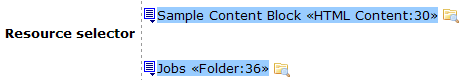
The upper field lets the content author select content (ID 30 is the default), and the lower one lets him select a folder (ID 36 is the default). To select either one, click the folder to its right, then make the selection. If working with content, the tabs that appear on the dialog are determined when the resource is placed on the Smart Form configuration.
NOTE: If someone changes the title of content used in a Resource Selector field, the title is not updated on the Smart Form. In the illustration, if someone changed the title of content ID 30, you would still see Sample Content Block when viewing the Resource Selector field.
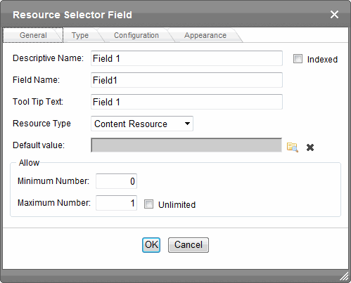
- Descriptive Name—Enter the name of this field. Internally, the name is used as the field’s caption. By default, the Data Designer assigns a name made up of Field followed by the next available number. So, the first field’s default name is Field1, the second field’s default name is Field2, and so on. You can change the default if you want.
- Field Name—Enter the field’s element name. This defines the field in the XML.
- Tool Tip Text— Enter the text that appears when a user hovers the cursor over the table’s column headers.
- Resource Type—Select one of the following: Content, Folder, Taxonomy, collection.
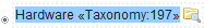
- Default Value—Define the default content, folder, taxonomy or collection item by clicking the folder icon and selecting the content you want. The following example shows a taxonomy default item. The author can accept the displayed default or change it by clicking on the folder icon.
- Minimum Number—Define the minimum number of content items that can appear where you insert the Resource Selector.
- Maximum Number—Define the maximum number of content items that can appear where you insert the Resource Selector.
These settings affect the content author’s work with this field on a Smart Form in the following way. Assume you set a minimum of 1 and a maximum of 2. After the content author adds 2 content items for this resource selector, the only options are to remove or rearrange fields; you cannot add more.
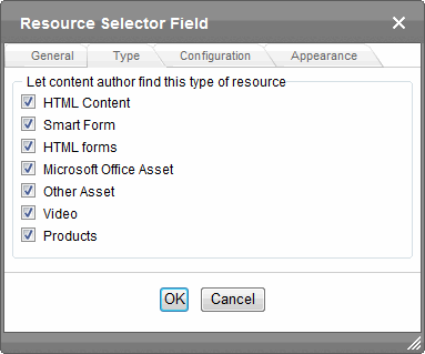
- Type tab—Choose the types of content you want the content author to find.
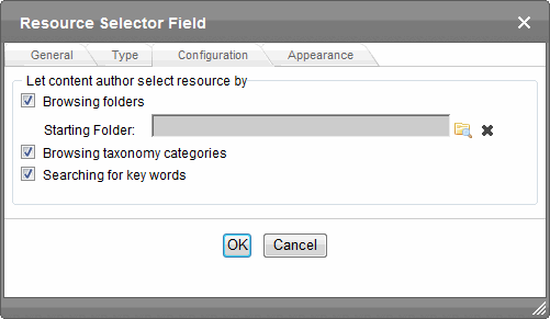
- Configuration tab—Determine how a content author can select content for the Smart Form.
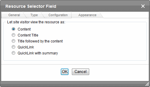
- Appearance tab—Determine the default appearance of the Smart Form on your Web site.Show the content resources Appearance tab and effects of each option.
 —Image: Content—
 —Image: Content Title—
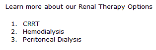 —Image: Title followed by content—
 —Image: QuickLink—
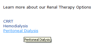 —Image: QuickLink with Summary—
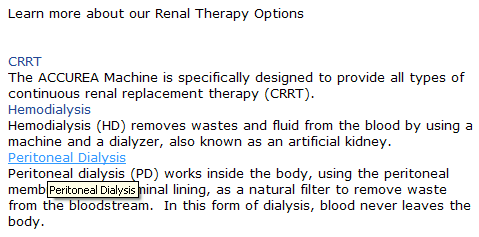 Show the folder resources Appearance tab and effects of each option.
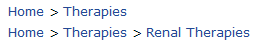
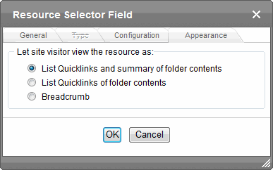 —Image: List Quicklinks and summary of folder contents——Image: List Quicklinks of folder contents——Image: Breadcrumb—
The folder’s breadcrumb path appears, as defined on the folder Properties screen’s Breadcrumb tab. See Also: Creating SiteMap Breadcrumbs
 —Show the taxonomy resources Appearance tab and effects of each option—
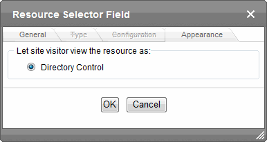
This is the only option if the Resource Type is Taxonomy Resource. See Also: Directory Server Control
 —Show the collection resources Appearance tab and effects of each option—
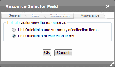 —Image: List Quicklinks and summary of collection items——Image: List Quicklinks of collection items—
Tabular Data

The Tabular data button inserts a table into which you can place other types of fields. It’s similar to a group box but its advantage over a group box is that it lets you place fields in columns. After you insert a table with the Tabular data button, you can insert an appropriate type of field into each column. For example, the Description field type is plain text, while the In Stock? field type is a choice.
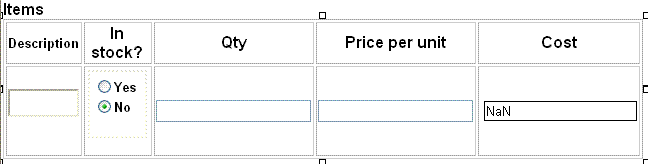
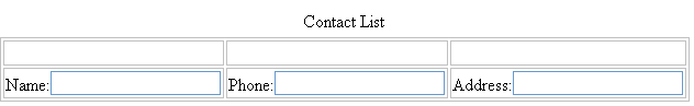
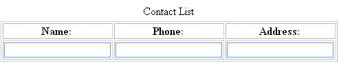
If you insert a field into a table and its caption appears to the left of the data entry region, move the caption to the column header.
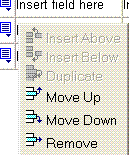
- To access table commands (such as add row and add column), place the cursor inside a table cell and right click the mouse.
NOTE: To delete a column, place the cursor in the column, right click the mouse, and select Delete Column. You cannot reduce the number of columns by editing the Tabular Data dialog’s Columns field.
- To edit tabular data, hover the cursor over a table border line until you see a 4-headed arrow. Then, click the right mouse button and select Field Properties.
IMPORTANT: Only table cells into which you place a field are available to visitors of your Web page.
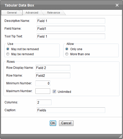
- Descriptive Name—Enter the name of this table. By default, the Data Designer assigns a name made up of Field followed by the next available number. So, the first field’s default name is Field1, the second field’s default name is Field2, and so on. You can change the default if you want.
- Field Name—Enter the table’s element name. This will define the table in the XML. See Also: Tabular data creates 3 levels of XML tags:
- Tool Tip Text—Enter the text that appears when a user hovers the cursor over the table’s column headers.
- Use—Click May not be removed if this field must be included on the screen. Otherwise, click May be removed.
If you check May be removed, when this field appears on a data entry screen, an icon (
) appears to the left of the field. If the user clicks the icon, a drop-down menu provides an option to remove the field.If the user removes the field,
field name replaces the field on the data entry screen to indicate that the field was removed and can be re-added if necessary. For example, if the field’s display name is street address, and the user removes the field, appears in place of the field.NOTE: The menu icon (
) can also indicate that the user can add instances of a field (see the Allow field). So, if a field is required, the icon could appear but omit a Remove option. - Allow—Check more than one if you want to let the user entering data add instances of this field. Otherwise, check only one. For example, if a screen is collecting names and addresses and you want to let the user enter several of them, check more than one. If you check More than one here, you are allowing the user to insert an entirely new table, not an additional table row.
WARNING! Do not insert a calendar field into a Smart Form that allows multiple entries (using the Allow more than One option on the dialog). If you do, you cannot search the Smart Form using that field.
If the user entering data clicks
, a menu appears, which lets the user click Duplicate to add instances of the field to the screen.NOTE: The menu icon (
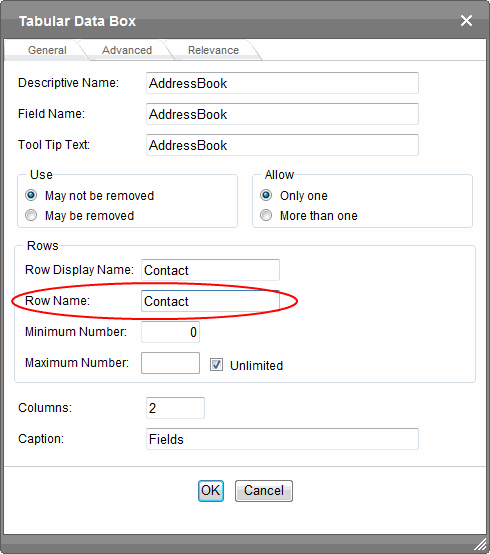
) can also indicate that the user can remove a field. So, even if a field allows only one instance, the icon could appear but the menu would only display Remove. - Row display name—Enter the text that appears when a user hovers the cursor over the table’s cells. Use this field to describe the kind of information to be inserted into the table’s cells.
- Row name—Enter the name of the XML tag used to collect data for each entry in the table.
- Minimum number—If desired, enter the minimum number of rows for this table. If you enter a number and the data entry user tries to save the screen without inserting at least the minimum number of rows, the user is informed thatElement content is incomplete according to the DTD/Schema. By default, the user is allowed to cancel or save the screen anyway. However, the system administrator determines whether or not the user can save an invalid document.
- Maximum number—If desired, enter the maximum number of rows for this table. If you don’t want to assign a maximum number, check the Unlimited check box. When this table appears on a data entry screen, and a user adds the maximum number of rows, the Insert Above and Insert Below options are grayed out on the menu.
- Columns—Enter the number of columns to appear in the table.
- Caption—Optionally enter text to describe this table on the data entry screen. The caption appears centered above the table. After you insert this field onto the screen, you can use eWebEditPro+XML’s formatting capabilities to modify the caption’s size, font, color, and other attributes.
- Advanced Tab—This is the same as the Group Box Advanced Tab.
- Relevance—This is the same as the Group Box Relevance Tab.
How Tabular Data Forms XML Structure
Tabular data creates 3 levels of XML tags:
- inner level: each field in the table
- middle level: each row in the table
- outer level: the entire set of table data
To explain how this works, use the following contact list as an example.
|
Name |
Phone |
|
|
John Doe |
555-1212 |
|
|
Mary Smith |
555-8765 |
When you insert a field into a table, a dialog helps you define the field type. For example, when inserting a plain text field, the Plain Text Field dialog appears. On that dialog, the value of the Phone field defines the tags that enclose that field’s contents.
To continue the example, every contact is represented in XML as:
<Name>John Doe</Name>
<Phone>555-1212</Phone>
<Email>[email protected]</Email>
	and
<Name>Mary Smith</Name>
<Phone>555-8765</Phone>
<Email>[email protected]</Email>
Each row of the table collects information for one contact. On the Tabular Data Box dialog, the Row Name field defines the XML tag that groups information for each contact. For example, the Row Name field value is Contact.
</AddressBook>
<contact>
<Name>John Doe</Name>
<Phone>555-1212</Phone>
<Email>[email protected]</Email></Contact><Contact>
<Name>John Doe</Name>
<Phone>555-1212</Phone>
<Email>[email protected]</Email>
 </Contact>
Contact>
<Name>Mary Smith</Name>
<Phone>555-8765</Phone>
<Email>[email protected]</Email>
</Contact>
</AddressBook>
Text

Use a text field when you want the user to enter a text response.
NOTE: If a plain text field tries to perform a numerical calculation with a value that is blank or contains letters, NaN appears in the field. (NaN stands for “not a number.”)
If a plain text field tries to divide by zero, Infinity appears.
If a plain text field collects a URL, add on-screen instructions to prefix it with http:\\. If the user does not, the URL address is not stored properly.
The following capabilities are available with a text field.
- Text can be read-only or hidden
- You can allow plain text only, or let the Smart Form author apply formatting
- The text field can consist of a single or multiple lines
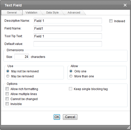
- Descriptive Name—Enter the name of the field.
- Indexed—Check if you want to index this field. For more information, see Searching XML Information. The Indexed field may or may not appear, depending on how your administrator set up your system.
- Field Name—Enter the field’s element name. This defines the field in the XML.
- Tool Tip Text—Enter the text that appears when a user hovers the cursor over this field.
- Default Value—If you want to set a default value for this field, enter that value here. The default value appears in Data Entry mode, where the user can accept, change, or delete it. For example, if this field collects a city, and most users enter New York, enter
New Yorkas the value. - Dimensions—Use the Dimensions area to set the size of the text field in characters.
- Size (or Width)—Enter the width of this textbox in characters. This field is available only if Allow Rich Formatting is not checked.
- Height—Enter the height of this textbox in characters. This field is available only if Allow Multiple Lines is checked and if Allow Rich Formatting is not checked.
- Use—Click May not be removed if this field must be included on the screen. Otherwise, click May be removed.
If you check May be removed, when this field appears on a data entry screen, an icon (
) appears to the left of the field. If the user clicks the icon, a drop-down menu provides an option to remove the field.If the user removes the field,
field name replaces the field on the data entry screen to indicate that the field was removed and can be re-added if necessary. For example, if the field’s display name is street address, and the user removes the field, appears in place of the field.NOTE: The menu icon (
) can also indicate that the user can add instances of a field (see the Allow field). So, if a field is required, the icon could appear but omit a Remove option. - Allow—Check more than one if you want to let the user entering data add instances of this field. Otherwise, check only one. For example, if a screen is collecting names and addresses and you want to let the user enter several of them, check more than one. If you check More than one here, you are allowing the user to insert an entirely new table, not an additional table row.
WARNING! Do not insert a calendar field into a Smart Form that allows multiple entries (using the Allow more than One option on the dialog). If you do, you cannot search the Smart Form using that field.
If the user entering data clicks
, a menu appears, which lets the user click Duplicate to add instances of the field to the screen.NOTE: The menu icon (
) can also indicate that the user can remove a field (see the Use field). So, even if a field allows only one instance, the icon could appear but the menu would only display Remove. - Allow Rich Formatting—Check this box if you want to let the Smart Form author format the text in this field. If you do not check the box, the author can only enter plain text.
- Keep Single Blocking Tag—This checkbox is active only if Allow Rich Formatting is checked. Check this box if you want the editor to maintain
<p>tags around a single line of text. Uncheck this box if you want the editor to strip<p>tags from a single line of text.NOTE: This checkbox has no effect if text that allows rich formatting consists of more than one line.
Sample Results
Checked:<p>Here is sample text</p>
Unchecked:Here is sample text - Allow Multiple Lines—Check here to let this text box expand to accommodate the user’s input. If you do not check this box, a single line input box appears on the data entry screen to accept user input.
- Cannot be Changed—Check here to make this field read-only. That is, the user cannot insert data into it in Data Entry mode. You might use this option to provide instructions for completing the screen.
- Invisible—Check here to make this field hidden in Data Entry mode. This option lets you store unseen information in an XML document. An example might be putting a version number for the data design so that XML documents can be upgraded to newer versions using an XSL transform.
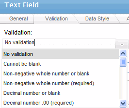
- Validation—Select the kind of validation to apply to this field. Your choices are:
- No validation—the user’s response is not checked.
- Cannot be blank—the user must enter a response.
- Non-negative whole number or blank—the user must enter a positive whole number or no response.
- Non-negative whole number (required)—the user must enter a positive whole number.
- Decimal number or blank—must be a decimal number (for example, 12.345 or 12) or blank. A leading minus sign “-” is allowed. The decimal point must be a period (.), even in locales that normally use a comma (,).
NOTE: Decimal numbers include whole numbers because the decimal point is implied. That is, 12 is 12.0000.
- Decimal number required—must be a decimal number (it cannot be blank) of 0, 1, or 2 decimal places.
A leading minus sign “-” is allowed. The decimal point must be period (.), even in locales that normally use a comma (,).
- Percent: (0-100) required—the user must enter a whole number from 0 to 100.
- email address/email address required—a user name followed by an at sign (@) followed by a domain name.
- email address list/email address list required—several email addresses separated by a semicolon (;)
- Zip code (US only)—the user’s response must consist of 5 (nnnnn) or 9 digits separated by a dash after the fifth (nnnnn-nnnn).
- Social Security number (US only)—the user’s response must consist of 9 digits in this pattern:nnn-nn-nnnn.
- Postal Code (Canada)/Postal Code (Canada) required—the user’s response must consist of 6 characters in the format
ANA NAN, whereAis an alphabetical character andNis a numeric. - Social Insurance Number (Canada)/Social Insurance Number (Canada) required—nine digitsSee Also: http://en.wikipedia.org/wiki/Social_Insurance_Number
- ISBN code—13 digit ISBN code. See Also: http://isbn-information.com/13-digit-isbn.html
- ISSN code—See Also: http://www.issn.org/2-22635-What-is-an-ISSN.php
- Custom—You can create custom validation.
For more information, see Creating Custom Validation Criteria.
If you assign to this field any value other than No validation, the field is initially surrounded by red dashes in Data Entry mode. If the user’s response does not meet the validation criterion, the field remains surrounded by red dashes. The system administrator determines whether or not the user can save an invalid document.
- Data Style tab—You can specify the following data styles:
- Font style and size
- Bold and italic
- Text alignment (especially helpful for formatting dollar amounts in a plain text field)
- Underline or strikethrough
- Font color and background color
NOTE: The configuration data controls a command's appearance on the toolbar and on the Data Style dialog. For example, if
<button command="cmdfontname" />is removed from configdatadesign.xml, it disappears from the toolbar and the Data Style dialog.
- Advanced tab—This is the same as the Group Box Advanced Tab.
Adding Standard Validation Options
By default, the Data Designer provides several standard validation options. You can see them by clicking the down arrow to the right of the Validation drop-down.
If you will frequently use a validation format that does not appear on the list, the following Ektron KB article provides instructions for creating additional validation options:http://dev.ektron.com/kb_article.aspx?id=7420
Creating Custom Validation Criteria
If the standard validation options do not provide the flexibility you want, use the custom validation feature to ensure the following about the user’s input.
- The data type—the default types are
- text
- URL
- whole number
- decimal number
- floating point number (Floating point includes scientific notation, so is appropriate for scientific numbers. Decimals usually suffice for business numbers.)
NOTE: Your system administrator may customize the choices.
- The field value has one of the following relationships with another field, a number, or an expression—the default expressions are
- between 2 values (either another field or a number that you specify)
- less than
- equal to
- not equal to
- maximum length (usually for text responses)
NOTE: Your system administrator may customize the choices.
If the user’s response fails to meet the criteria, you can compose an error message that appears when that happens. Your system administrator determines if a user can save the invalid data.
As an example of custom validation, assume that a field collects telephone numbers, and you want to make sure the user enters 10 digits. To accomplish this:
- Click the Plain Text Field dialog and complete the screen.
- In the validation section, click Custom Validation. The Custom validation screen appears.
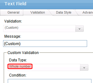
- In the Data Type field, select Whole Number from the drop-down list. This ensures that the user can only enter digits.
- Click the down arrow to the right of the Examples field to see sample logic.
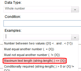
- Click Maximum text length.... This option lets you specify the length of the user’s response.
string-length(.) <= {X}appears in the Condition field. - Because you want the user’s input to equal 10, remove the less than sign (<) from the calculation. Now it looks like this:
string-length(.) = {X}. - Replace the
{X}with 10. Now, it looks like this:string-length(.) = 10. - Move the cursor to the Error Message field and compose a relevant error message. For example:
must be 10 digits. Your screen should look like this. 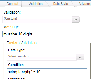
- Click OK and return to the Plain Text field dialog.
- Click OK to save that dialog and test the validation on the phone number field. To do this, switch to Data Entry mode and enter more or fewer than 10 digits, as well as non-digit characters to verify that validation works as expected.