 —Image—
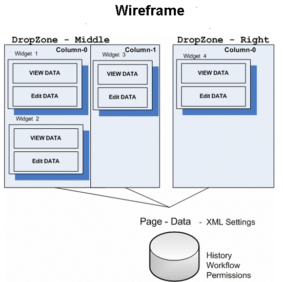
A widgetA mini-application that you place on a Web page using PageBuilder; a widget provides either specific functionality (calculators, search, social bars, and so on) or areas into which you can add content (content blocks, list summaries, collections, and so on). is a mini-application that can provide either specific functionality (search, social bars, and so on) or areas into which you can add Ektron content (content blocks, list summaries, collectionA list of Ektron content links for display on a Web page.s, and so on). You can drag and drop widgets onto a page using a wireframeThe architecture of a Web page containing columns, dropzones, and layout information., dropzoneAn area on a Web page where you can drag and drop a widget.s, and widgets.
The following figure shows the relationship between a wireframe, dropzones, and widgets.
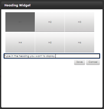
Overview
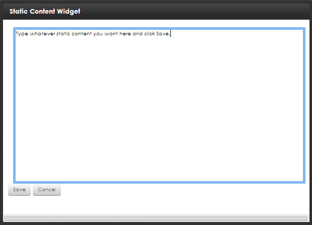
A widget consists of 3 file types.
.ascx. contains a widget’s source code.ascx.cs or .vb. contains widget’s code-behind .ascx.jpg. image that represents a widget in the widget selection toolWhen you create a widget, save the widget files to the siteroot/widgets folder. This folder path is defined in the site root/web.config file, so if you change the folder name or path, you must update the following web.config element:
<add key=”ek_widgetPath” value=”Widgets/" />.NOTE: Your widget might use additional files, such as .css or .js files.You should place these files in a folder within siteroot/widgets, and give the folder the same name as the custom widget.
Ektron stores each page’s data (a serialized XML string) as a type of content in the Ektron Workarea. The string is stored like other content types, such as HTML content and XML Smart FormAn Ektron-defined Web page that contains XML (hidden from the end user) to display content, and receive, verify, and save user input.s.
After you integrate widgets into Ektron, you can add them to a dashboard in your profile page or a community group’s page. You also can drag-and-drop these building blocks onto a PageBuilder page or a Personalized Web page. See also: Creating Web pages with PageBuilder and Personalizing a Web page.
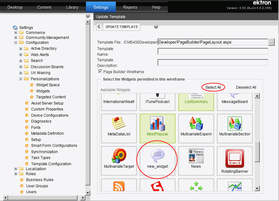
Content authors open the widget bar from the PageBuilder menu by clicking the up/down ( ) or down (
 ) controls.
Widget states on a Pagebuilder page
Widget states on a Pagebuilder page
Widgets placed on a PageBuilder page have 3 possible combinations of states.
In a widget’s user control file, you create an asp:MultiView element that determines available actions when a widget is in View mode and Edit mode.
<%@ Control Language="C#" AutoEventWireup="true" CodeFile="HelloWorld.ascx.cs" Inherits="widgets_HelloWorld" %> <%@ Register Assembly="System.Web.Extensions, Version=1.0.61025.0, Culture=neutral, PublicKeyToken=31bf3856ad364e35" Namespace="System.Web.UI" TagPrefix="asp" %> <asp:MultiView ID="ViewSet" runat="server" ActiveViewIndex="0"> <asp:View ID="View" runat="server"> <!-- You Need To Do .............................. --> <asp:Label ID="HelloTextLabel" runat="server"></asp:Label><br /> <asp:Label ID="CheckBoxLabel" runat="server"></asp:Label> <!-- End To Do .............................. --> </asp:View> <asp:View ID="Edit" runat="server"> <div id="<%=ClientID%>_edit"> <!-- You Need To Do .............................. --> <asp:TextBox ID="HelloTextBox" runat="server" Style="width: 95%"> </asp:TextBox><br /> <asp:CheckBox ID="MyCheckBox" runat="server" Checked="false" /> <br /><br /> <!-- End To Do .............................. --> <asp:Button ID="CancelButton" runat="server" Text="Cancel" OnClick="CancelButton_Click" /> <asp:Button ID="SaveButton" runat="server" Text="Save" OnClick="SaveButton_Click" /> </div> </asp:View> </asp:MultiView>
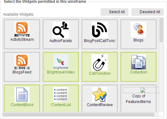
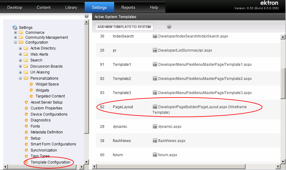
Determining which widgets appear on a wireframe
An administrator can determine which widgets can appear for use on a wireframe.
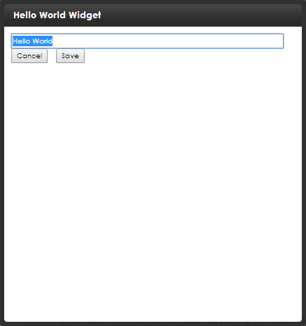
Creating the "Hello World" widget
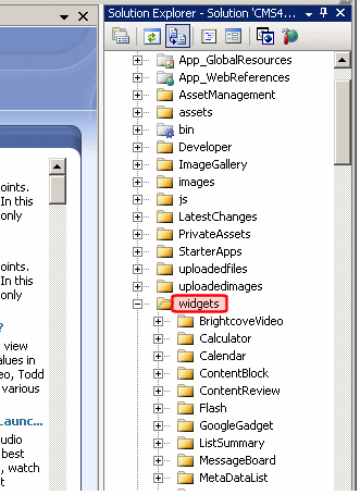
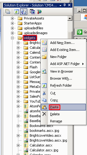
To learn how to create a widget, create a simple widget in the siteroot/widgets folder. This widget is based on the Hello World widget that is installed with the sample site with the following files:
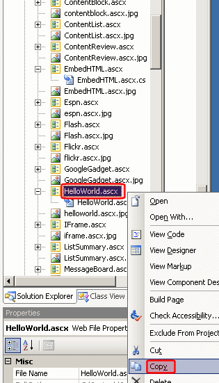
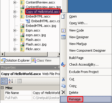
HelloWorld.ascx. user control fileHelloWorld.ascx.cs. user control code-behind fileHelloWorld.ascx.jpg. image that represents this control on the widget menuStep 1: Copy, paste, and rename HelloWorld.ascx and HelloWorld.ascx.jpg
widgets folder.HelloWorld.ascx.widgets folder.Copy of HelloWorld.ascx.new_widget.ascx. Visual Studio automatically renames the code-behind file to new_widget.ascx.cs.helloworld.ascx.jpg file to new_widget.ascx.jpg.The image file is 48 x 48 pixels and 72 dpi. Ektron administrators and content authors drag a widget’s image onto the page.Step 2: Update the class names in the new files
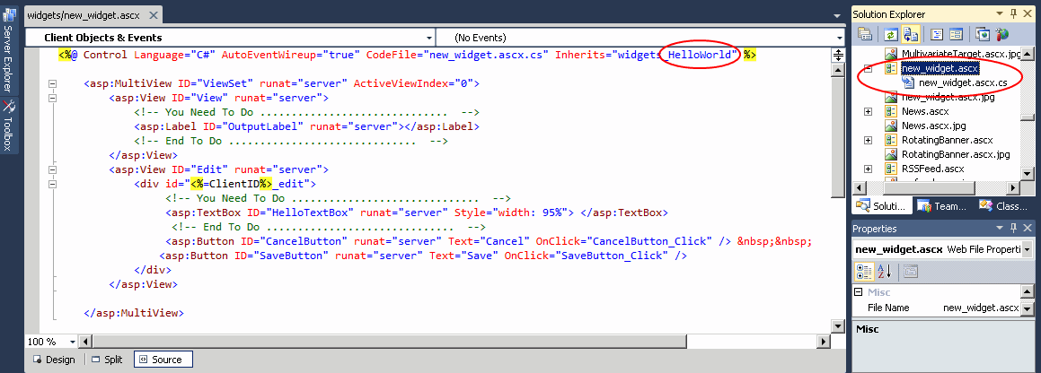
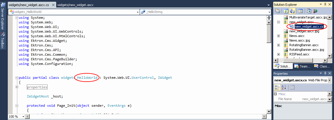
new_widget.ascx to open it.HelloWorld (circled) with new_widget.new_widget.ascx.cs. HelloWorld with new_widget.new_widget.ascx and new_widget.ascx.cs.Step 3: Add the widget to the wireframe template
NOTE: Use this procedure to select (or restrict) any widget that you want to be available to use on a wireframe template. When the template is used, the selected widgets appear in the PageBuilder Widgets menu.
new_widget.ascx, appears in the list.PageLayout.aspx. Or, any wireframeThe architecture of a Web page containing columns, dropzones, and layout information. template that you are using to create a PageBuilder page.After you create a new widget and enable it in the Workarea, you can begin to customize it. For more information about customizing widgets, see Customizing a widget.
Understanding the user control (.ascx) file
Here is the new_widget.ascx file that is the basis of the widget.
<%@ Control Language=”C#” AutoEventWireup=”true”
  CodeFile=”new_widget.ascx.cs” Inherits=”widgets_new_widget” %>
<%@ Register Assembly="System.Web.Extensions,
  Version=1.0.61025.0, Culture=neutral, PublicKeyToken=31bf3856ad364e35"
  Namespace="System.Web.UI" TagPrefix="asp" %>
    <asp:MultiView ID="ViewSet" runat="server" ActiveViewIndex="0">
        <asp:View ID="View" runat="server">
            <!-- You Need To Do ..............................  -->
<asp:Label ID="TextLabel" runat="server"></asp:Label><br />
<asp:Label ID="CheckBoxLabel" runat="server"></asp:Label>
            <!-- End To Do ..............................  -->
        </asp:View>
        <asp:View ID="Edit" runat="server">
            <div id="<%=ClientID%>_edit">
                 <!-- You Need To Do .............................  -->
<asp:TextBox ID="TextTextBox" runat="server" Style="width: 95%">
</asp:TextBox><br />
<asp:CheckBox ID="MyCheckBox" runat="server" Checked="false" />
<br />
                 <!-- End You Need To Do .........................  -->
<asp:Button ID="CancelButton" runat="server" Text="Cancel"
  OnClick="CancelButton_Click" />
<asp:Button ID="SaveButton" runat="server" Text="Save"
  OnClick="SaveButton_Click" />
            </div>
        </asp:View>
</asp:MultiView>
Notice the following elements of the file.
asp:MultiView element declares that the control has 2 possible modes: View and Edit.<asp:MultiView ID="ViewSet" runat="server" ActiveViewIndex="0">
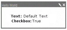
multiview tags is information about the control in view mode. It has 2 fields: one is a text field, and the other is a check box.<asp:View ID="View" runat="server">
<asp:Label ID="HelloTextLabel" runat="server"></asp:Label><br />
<asp:Label ID="CheckBoxLabel" runat="server"></asp:Label>
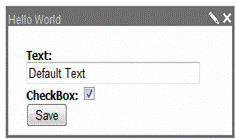
</asp:View>multiview tags is information about the control in edit mode. In edit mode, a text box, a check box, and a Save button appear. The text box and check box collect end-user input, and the Save button saves that input to the database.<asp:View ID="Edit" runat="server">
<div id="<%=ClientID%>_edit">
<!-- You Need To Do .............................. -->
<asp:TextBox ID="HelloTextBox" runat="server" Style="width: 95%">
</asp:TextBox><br />
<asp:CheckBox ID="MyCheckBox" runat="server" Checked="false" /> <br />
<!-- End You Need To Do .............................. -->
<asp:Button ID="CancelButton" runat="server" Text="Cancel"
OnClick="CancelButton_Click" />
<asp:Button ID="SaveButton" runat="server" Text="Save"
OnClick="SaveButton_Click" />Understanding the code-behind (.ascx.cs) file
Review the code-behind file,new_widget.ascx.cs.
using statements are at the top of the file. Notice the Ektron ones in particular:using Ektron.Cms.Widget; using Ektron.Cms;Marketing team using Ektron.Cms.API; using Ektron.Cms.Common; using Ektron.Cms.PageBuilder; using System.Text.RegularExpressions;
system.Web.UI.UserControl and IWidget classes.public partial class widgets_new_widget: System.Web.UI.UserControl, IWidget
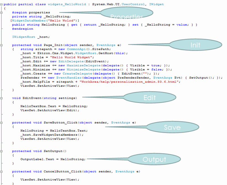
The following figure summarizes the remaining elements of the code-behind file.
#region properties
private string _HelloString;
private bool _CheckBoxBool;
[WidgetDataMember(true)]
public bool CheckBoxBool { get { return _CheckBoxBool; }
  set { _CheckBoxBool = value; } }
[WidgetDataMember("Hello Wolrd")]
public string HelloString { get { return _HelloString; }
  set { _HelloString = value; } }
#endregionprivate IWidgetHost _host;
page_init events.protected void Page_Init(object sender, EventArgs e)
{ _host = Ektron.Cms.Widget.WidgetHost.GetHost(this);
_host.Title = "Hello World Widget";
_host.Edit += new EditDelegate(EditEvent);
_host.Maximize += new MaximizeDelegate(delegate() { Visible = true; });
_host.Minimize += new MinimizeDelegate(delegate() { Visible = false; });
_host.Create += new CreateDelegate(delegate() { EditEvent(""); });
PreRender += new EventHandler(delegate(object PreRenderSender, EventArgs Evt)
{ SetOutput(); });
ViewSet.SetActiveView(View);
}Comments about the page_init code
Comments about the page_init code
gethost method returns a reference to the container widgethost for this widget. This is the case in both Personalization and PageBuilder.Title property is the title of this widget. By setting it in page_init for the widget, we inform the host what text to put in the title bar above the widget. This works in both PageBuilder and Personalization.host.Title are raised by the widgethost. It’s up to the widget to subscribe to them. In all cases, if we don’t subscribe to them, the icons don’t show up. This is a method of attaching widget code to button clicks and other events that occur outside the widget.PreRender: Ektron renders the contents of this widget on pre-render, thus ensuring a single render event. Another option is to call SetOutput on the Load event, but you can only do that if the widget is not in edit mode currently.edit events.void EditEvent(string settings) {
string sitepath = new CommonApi().SitePath;
ScriptManager.RegisterClientScriptInclude(this, this.GetType(),
"widgetjavascript", sitepath + "widgets/widgets.js");
ScriptManager.RegisterOnSubmitStatement(this.Page, this.GetType(),
"gadgetescapehtml", "GadgetEscapeHTML('" + HelloTextBox.ClientID + "');");
HelloTextBox.Text = HelloString;
MyCheckBox.Checked = CheckBoxBool;
ViewSet.SetActiveView(Edit);
}Comments about the edit code
Comments about the edit code
IMPORTANT: You must register JavaScript and cascading style sheet (css) instructions in an external file.
sitepath to ensure that the correct path for included files is used across installations.scriptmanager to include the script. Alternatively, you can use Ektron.Cms.Api.Js.RegisterJSInclude ScriptManager.RegisterOnSubmitStatement(this.Page, this.GetType(), "gadgetescapehtml", "GadgetEscapeHTML('" + HelloTextBox.ClientID + "');");onsubmitstatement is JavaScript that is run when the widget is submitted. It calls escape html, which cleans the submitted text to avoid any XSS.HelloTextBox.Text = HelloString;
MyCheckBox.Checked = CheckBoxBool;
ViewSet.SetActiveView(Edit);
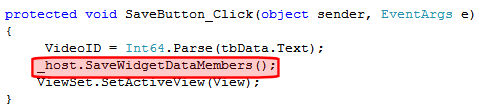
save events.protected void SaveButton_Click(object sender, EventArgs e)
{ HelloString = ReplaceEncodeBrackets(HelloTextBox.Text);
CheckBoxBool = MyCheckBox.Checked;
_host.SaveWidgetDataMembers();
ViewSet.SetActiveView(View);
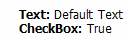
}SetOutput events.protected void SetOutput()
{ HelloTextLabel.Text = HelloString;
// client javascript remove brackets, server side adds back
CheckBoxLabel.Text = CheckBoxBool.ToString();
}Cancel events.protected void CancelButton_Click(object sender, EventArgs e)
{ ViewSet.SetActiveView(View); }protected string ReplaceEncodeBrackets(string encodetext)
{ encodetext = Regex.Replace(encodetext, "<", "<");
encodetext = Regex.Replace(encodetext, ">", ">");
return encodetext; }Customizing a widget
The following topics let you further customize widget behavior.
Working with JavaScript and cascading style sheets
You can use JavaScript or a cascading style sheet to add custom functionality or styling to a widget. To do this, place the JavaScript or cascading style sheet (css) instructions in an external file, then register it in the code-behind file.
Example of including a JavaScript file.
void EditEvent(string settings)
JS.RegisterJSInclude(this, _api.SitePath +
  "widgets/contentblock/jquery.cluetip.js", "EktronJqueryCluetipJS");
Example of including a .css file.
Css.RegisterCss(this, _api.SitePath
  + "widgets/contentblock/CBStyle.css","CBWidgetCSS");
WARNING! You must register JavaScript and .css files in an external file, as shown above. If you do not, the OnSubmit event places HTML in the TextArea field in encoded brackets (< >) and generates a dangerous script error.
The JS.RegisterJSInclude and Css.RegisterCss functions take 3 arguments.
thishttp://localhost/ektrontech and http://ektrontech. For example:_api.SitePath + "widgets/contentblock/jquery.cluetip.js"_api.SitePath + "widgets/contentblock/CBStyle.css""EktronJqueryCluetipJS"NOTE: Widgets use an update panel for partial postbacks. As a result, the ASP.NET tree view and file upload controls do not work with widgets. Ektron has workarounds for these functions. For an example of a tree view, see the content block widget (siteroot/widgets/contentblock.ascx). For an Ajax file uploader, see the flash widget (siteroot/widgets/flash.ascx).
Verifying that a page is a PageBuilder page
Whenever your code is interacting with a widget, you need to verify that it is on a PageBuilder page (as opposed to another Ektron page that hosts widgets, such as personalization).
To check for this, insert the following code:
Ektron.Cms.PageBuilder.PageBuilder p = (Page as PageBuilder);
If(p==null) // then this is not a wireframe
When you want to check the mode, use code like this.
If(p.status == Mode.Edit) // we are in edit mode
Applying global and local properties to a widget
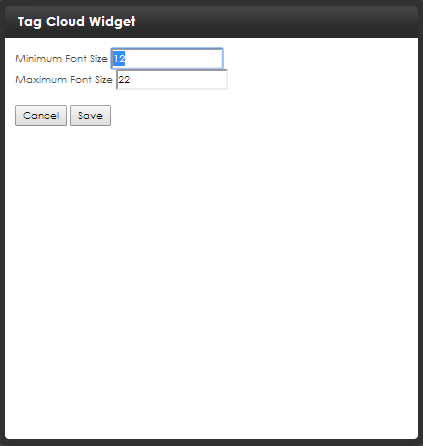
Global and local widget properties reduce your development effort by eliminating settings data classes. While you can still use these classes and manage your own serialization, for the vast majority of types, the built-in engine performs the necessary work.
Global properties apply to every instance of a widget. Local properties apply to one instance. If both local and global values are assigned to a property, local overrides global.
As an example of using a local property to override a global, consider a ListSummary widget. You may want its sort mostly by modified date in descending order, but in certain instances you want to sort by title in ascending order.
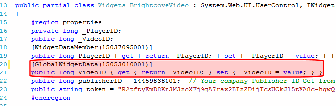
[GlobalWidgetData()]
public string NewWidgetTextData {
get {return _NewWidgetTextData;} set {_NewWidgetTextData = value;
}}[WidgetDataMember()]
public string NewWidgetTextData
{ get { return _NewWidgetTextData; } set { _NewWidgetTextData = value; } }Setting global properties for a widget
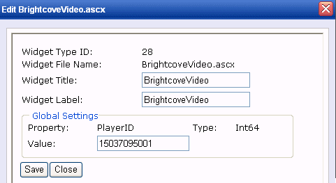
A global property lets an Ektron developer or administrator assign properties and values that apply to all instances of a widget. You apply a global property to the widget’s code-behind page. Administrators could then set or update the property’s value in the Workarea’s Widgets screen.
For example, the Brightcove Video widget requires a player ID. You could insert that in the widget’s code-behind file. Then, an administrator could review and possibly update that information in the Workarea widgets screen. Whenever a user drops a Brightcove Video widget onto a page, the player ID is already assigned.
If the developer does not set a default value in code-behind, an administrator must set one on the Workarea’s Widgets screen.
If the developer does set a default value in code-behind, it will be applied unless changed by an administrator on the Workarea’s Widgets screen.
To set global properties:
siteroot/widgets folder.properties section, insert the GlobalWidgetData attribute (as shown) to set the global property’s name and type.[GlobalWidgetData()]
public string NewWidgetTextData
{ get { return _NewWidgetTextData; } set { _NewWidgetTextData = value; } }The supported types for GlobalWidgetData are:
Setting local properties for a widget
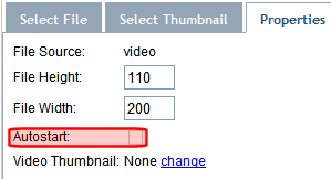
A local property lets an Ektron user assign property values that apply to a particular instance of a widget. For example, the Brightcove Video widget requires a Video ID, which identifies the video that appears where you drop the widget.
To set a local properties:
site root/widgets folder.properties section, insert the WidgetDataMember attribute to set the property.[WidgetDataMember(150530105432)]1
public long VideoID
{ get { return _VideoID; } set { _VideoID = value; } }[WidgetDataMember. In the example above, the value is 150530105432._host.SaveWidgetDataMembers();. Adding a field to a widget
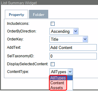
You can add a Content type drop-down to the ListSummary widget. The drop-down lets the person dropping the widget on the page select from these choices.
The drop-down appears as follows after it is implemented.
To add this drop-down to the ListSummary widget:
siteroot/widgets/ListSummary.ascx.DisplaySelectedContent.DisplaySelectedContent, add the following code to create a drop-down list for the ContentType property.
—Image—<tr>
<td>DisplaySelectedContent:</td>
<td>
<asp:CheckBox ID="DisplaySelectedContentCheckBox" runat="server" />
</td>
</tr>
<tr>
<td>ContentType:</td>
<td>
<asp:DropDownList ID="ContentTypeList" runat="server">
<asp:ListItem Value="AllTypes">AllTypes</asp:ListItem>
<asp:ListItem Value="Content">Content</asp:ListItem>
<asp:ListItem Value="Assets">Assets</asp:ListItem>
</asp:DropDownList>
</td>
</tr>ListSummary.ascx file.ListSummary.ascx.cs.ContentType property:private string _ContentType;
AllTypes:[WidgetDataMember("AllTypes")]
public string ContentType { get { return _ContentType; }
set { _ContentType = value; } }EditEvent area, set the select list's value to ContentType:ContentTypeList.SelectedValue = ContentType;
SaveButton_Click event, set ContentType as the select list's value:ContentType = ContentTypeList.SelectedValue;
SetListSummary() function, set the List Summary server control's ContentType to the CMSContentType property:ListSummary1.ContentType = (CMSContentType)Enum.Parse(typeof(CMSContentType), ContentType);
ListSummary.ascx.cs file.Including help for a widget
You can include help for any widget that has the help icon ().
The help icon only appears when a user is editing a PageBuilder page. The icon appears both when a user is viewing a widget and editing its properties. It is not available to a page’s site visitors.
To create a widget’s help file:
You could create a content block within Ektron then switch to source view, copy the content into a word processor (like Notepad), and save it with an HTML extension.
HelpFile property to the code-behind of the page that hosts the widget. protected void Page_Init(object sender, EventArgs e)
{
_host = Ektron.Cms.Widget.WidgetHost.GetHost(this);
_host.HelpFile = "~/widgets/myWidget/help.html";Deleting a widget
If you want to remove a widget, follow these steps. After you do, the widget is removed from the list of widgets, and from the dashboard of users and community groups.
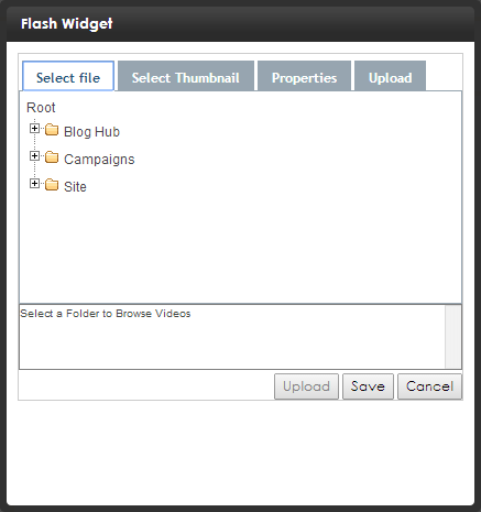
/siteroot/widgets/ folder.Using the Flash widget
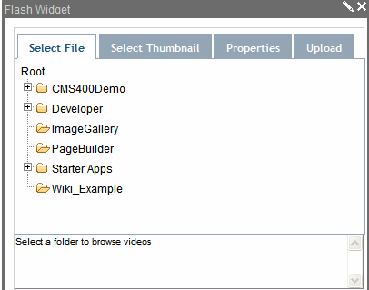
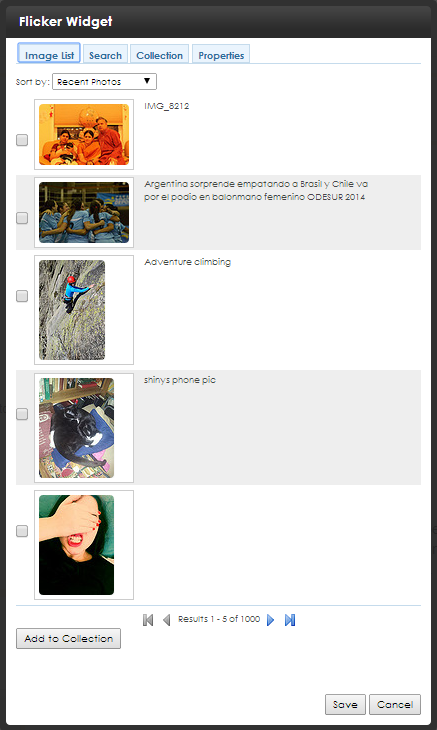
The following conditions cause this image to appear.
Using the Brightcove video widget
IMPORTANT: You need an account on Brightcoveto show videos in the Ektron Brightcove Video widget.
Your Brightcove.comaccount lets you upload, store, and play videos on your Web page with the Ektron Brightcove Video widget.
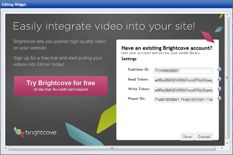
Setting up your account information for the first time
You see the following screen the first time you use a Brightcove Video widget if you have not entered account information in the Workarea. Enter your Brightcove account information here. After you successfully save your account data, this screen does not appear again.
Adding the Brightcove video widget
Follow these steps to play videos with the Brightcove Video widget.
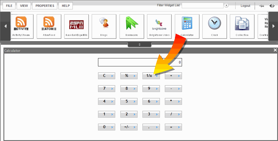
Show how ) next to BrightcoveVideo.ascx to set the properties.
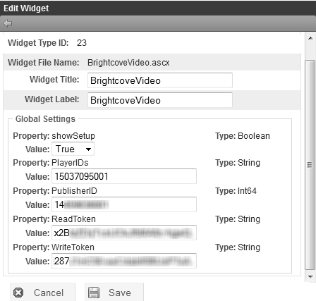
NOTE: Brightcove provides the values for the Global Settings for this widget on your Brightcove Account pages. Log in to Brightcoveand go to Account Settings > API Management.
Show howShow howNOTE: You can upload your video using your Brightcove.com account or follow these steps and upload a video using the Ektron Brightcove Video widget.
 ) on the Brightcove Video widget.
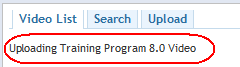
A message on the Edit window shows that the Video is being uploaded. In this example, we are uploading the Training Program 8.0 video.
NOTE: Your video may not be available to view immediately after uploading. Allow time for Brightcove to publish it or check its status on your Brightcove Account page.
) on the Brightcove Video widget. 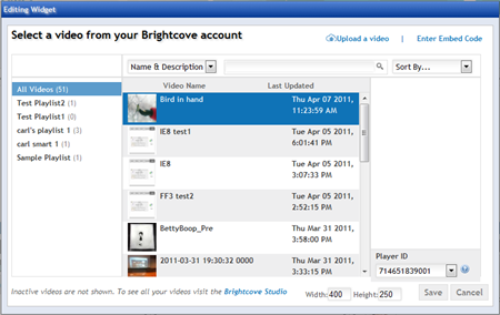
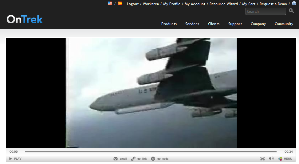
The following image is an example of the Brightcove Video widget on an Ektron OnTrek website page.
Troubleshooting the Brightcove video widget
If your videos do not show in the Brightcove Video widget, check the following topics.
Check the status of your video by logging into your account on Brightcove and looking for it in the Media Library.
According to Brightcove's article Uploading Videos with the Media Module, "Your video files can use most available file formats; if your files are not already encoded as VP6 (FLV—Flash video) or H.264, Brightcove transcodes them into one of those formats."
Check the publisherID setting in the widget Configuration.
Widget reference
Widgets are located in the Ektron webroot/siteroot/widgets/ folder. Ektron assigns standard names to widgets, but Ektron administrators can change a widget's name on the Synchronize Widgets Screen.
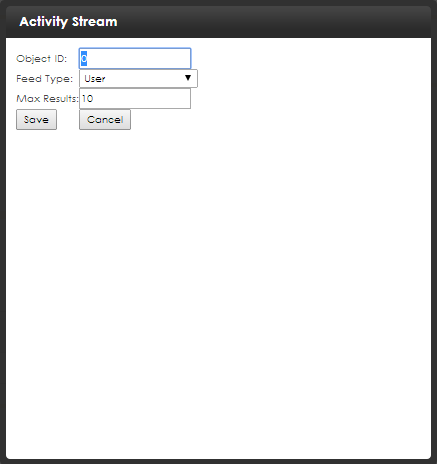
ActivityStream

Displays activities of a user or group, depending on the type of page on which it is placed. See also Using the ActivityStream widget.
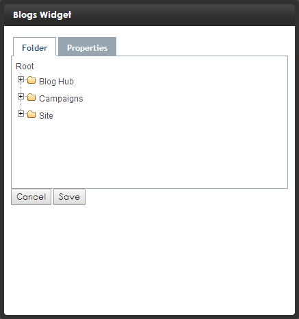
Blogs

After you select a blog ID, displays posts from that blog.
Properties Tab:
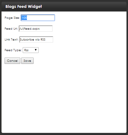
BlogsFeed

BrightcoveVideo

Plays a Brightcove video. You must have a Brightcove account to add a video with the widget.
See Using the Brightcove Video widget for information about using the BrightCove widget.

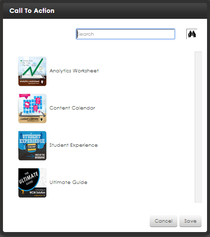
CallToAction

Double click on the CTACall to action; a user interface element that prompts a site visitor to touch or click it to proceed on a path toward conversion from site visitor to customer. For example, links that say "For more information...," "Add to cart," or "Buy now." that you want on the page. If you have a lot of CTAs in the list, enter the name of the CTA you want in the Search box and click Search ( ).
).
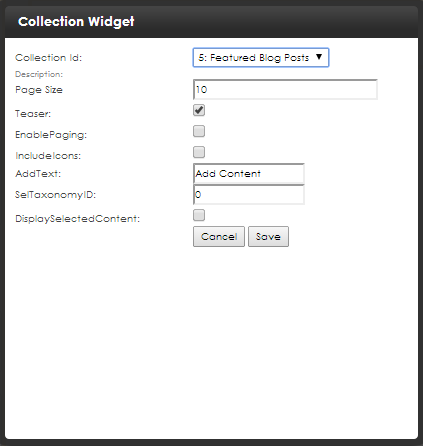
Collection

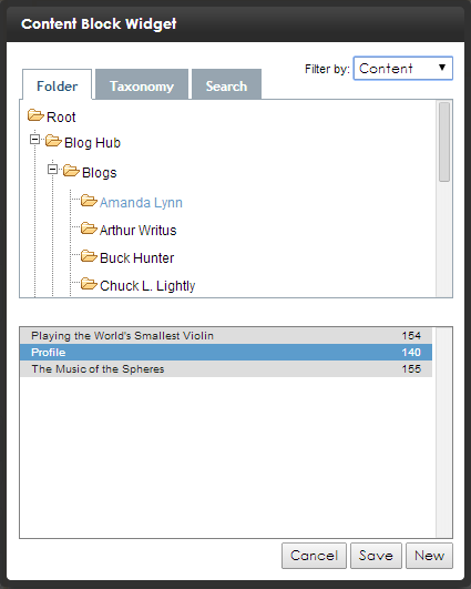
Displays a collection. You select a Collection ID. See Working with collections.
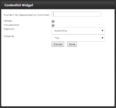
ContentList

Displays a list of content blocks. In contrast to a List Summary, where content must be in a specified folder, the ContentList control displays content from any Ektron folder.
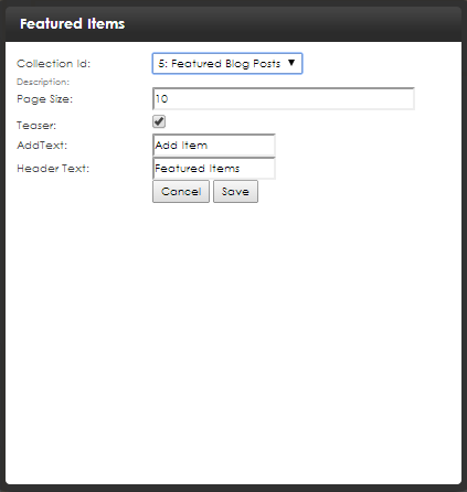
FeaturedItems

Flash

Displays a selected Flash file which resides in Ektron. You can also set the display’s height and width. See Using the Flash widget.
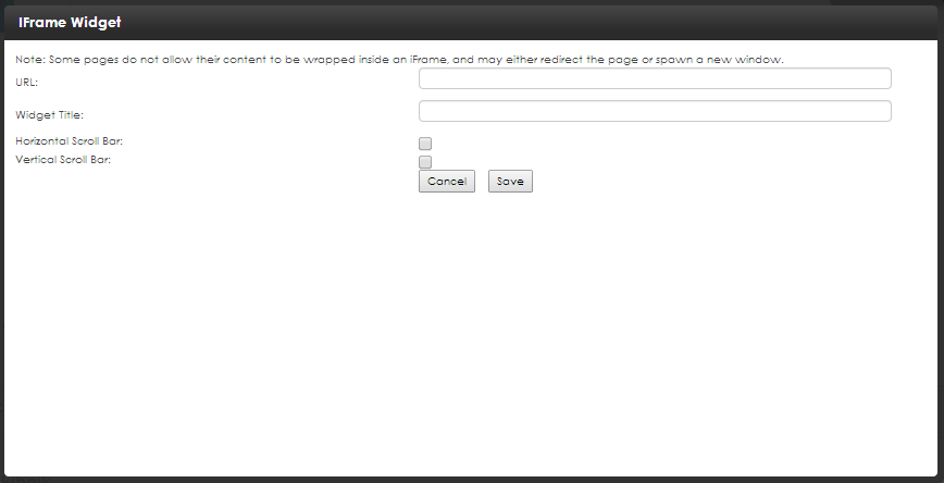
iFrame

Lets you enter a path to a Web page or an item on the Web page.
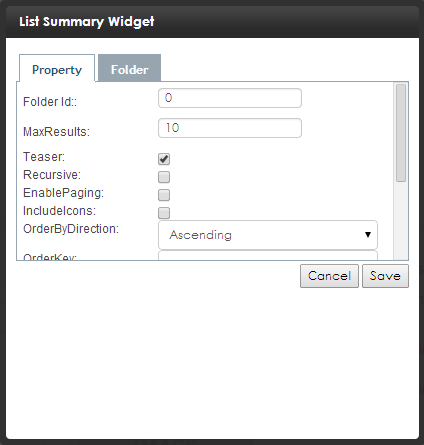
ListSummary

Displays an Ektron List Summary, a list of certain types of content in a selected folder. You can click on the Folder tab and go to the content or click on the Property tab and specify the following fields.
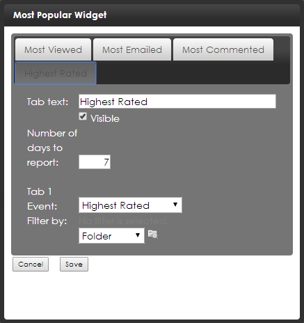
MostPopular

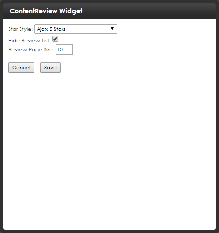
Reports on the following categories of content on your website: Most Viewed, Most Emailed, Most Commented, or Highest Rated. See also the Most popular widget.
NOTE: You can change this to any number you wish. However, the widget can only show data for days for which data is stored in your database.
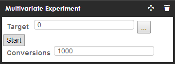
MultivariateExperiment

This controls the experiment. Settings include the target content number, start/stop button and the Report hide/show button. See also Measuring Web experiences with multivariate testing.
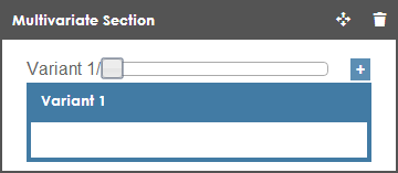
MultivariateSection

Drag any type of content widget into the Multivariate Section widget. These produce the variations used during the experiment. See also Measuring Web experiences with multivariate testing.
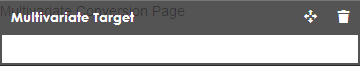
MultivariateTarget

When a page view occurs on a page containing this widget, the conversion count is increased. See also Measuring Web experiences with multivariate testing.
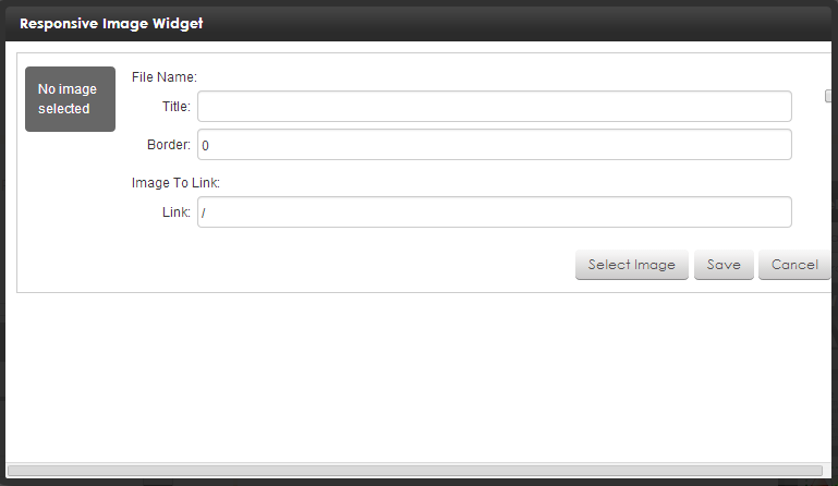
ResponsiveImage

Adds a responsive image to a page. Click Select Image to browse for an image in the Library.
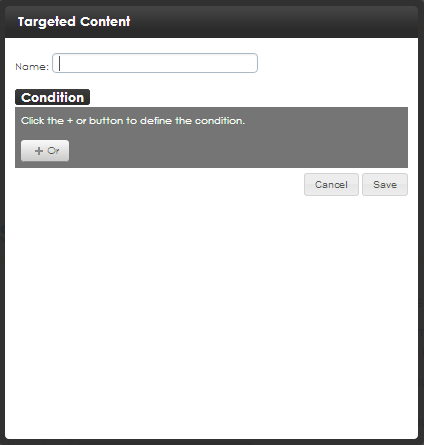
TargetedContent

Lets you create a set of conditions. As soon as any condition evaluates to true, an appropriate widget appears. See Connecting visitors with targeted content for information about the TargetedContent widget.
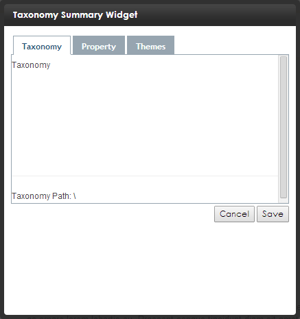
TaxonomySummary

Displays content assigned to a taxonomy category.
See also Organizing content with taxonomies .
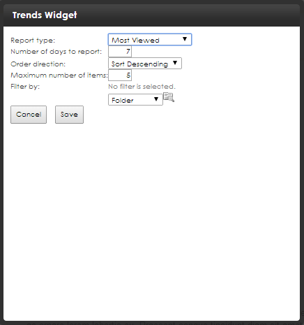
Trends

By default, the Trends widget shows the Most Viewed content on your website. You can edit the widget so it displays any of these content categories instead: Most Emailed, Most Commented, or Highest Rated.
NOTE: You can change to any number you wish. However, the widget only shows data for days for which data is stored in your database.
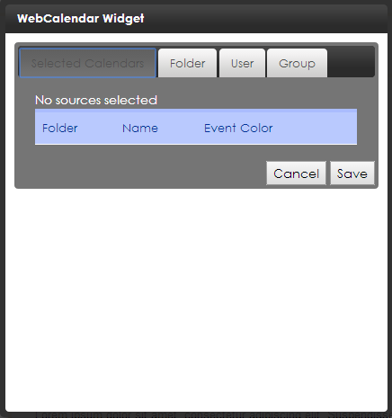
WebCalendar

Provides full calendar functionality, including adding events.
See also Working with calendars.
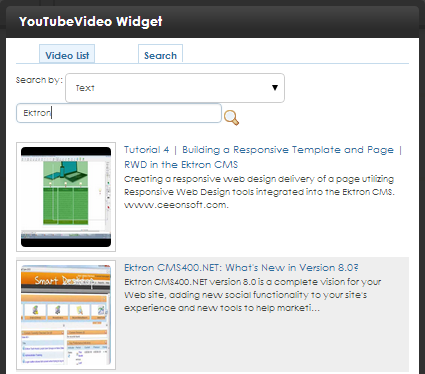
YouTubeVideo

Lets you embed code for any YouTube video.


