 Developing a multi-channel website design
Developing a multi-channel website design
When you design and develop your website, you want to reach as many people as possible. People are using a wide variety of devices to access the Web.
Website strategies
When you evaluate your website, or where you want it to be, consider the following website strategies:
- Foundational. Educate your users about your purpose and products with little interactivity. Enable business users to publish content using content editing and management, approval chainA series of users or user groups who must approve content before it can be published.s, and publishing. Reduce site maintenance for IT and increase the number of visits to your website.
- Tactical. Facilitate content reuse, user-generated content, categorization, and page assembly. Create Smart Forms, taxonomies, online communities. Synchronizemultiple sites. Develop pages, templates, surveys and polls, blogs, search, commenting and threaded discussions.
- Strategic. Embrace multi-channel delivery and support a richer customer experience with eCommerceAs of Ektron version 9.10, Ektron has discontinued new development on its eCommerce module. If you have a license to eCommerce, you will continue to receive support, but if you need to upgrade, contact your account manager for options., multi-channel, multi-site, multi-language, and video.
- Engagement. Continually analyze and customize the customer experience with personaA category of users who fit a targeted demographic, attitude, or behavior. Used for designing experiences, a persona provides a qualitative analysis of user behavior.s, create touch-centric interaction for mobile devices, integrate with marketing automation, use multivariate testing, geolocation, device orientation, and activity streamsto target content for what is relevant and meaningful to your site visitor. Customer Relationship Management systems can personalize the Web experience to drive revenue, deliver better business results, increase your brand awareness, and create customer loyalty.
Consider the following approaches to design.
Separate mobile site design
Separate mobile site design
If you have an existing website that you do not want to redesign, you can separate the content into 2 site architectures: 1 for desktop computers and 1 for mobile devices. You can target your content specifically for mobile devices, avoiding the complexity of developing device-conditional style sheets and manipulating existing content.
However, you will have to maintain 2 sites and ensure that they are synchronized (where applicable). You have to set up device recognition so that mobile device requests for your website are routed to your mobile (m-dot) site instead.
Also, having 2 sites can impact your SEOSearch Engine Optimization; improving the visibility of search results. ranking negatively if content is found on both sites.
Separate mobile template design
Separate mobile template design
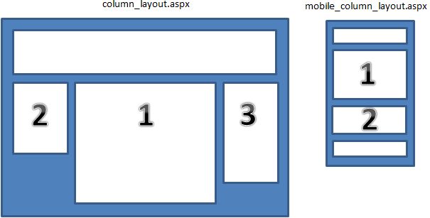
Separate templates, optimized for mobile, get rendered whenever somebody visits your site from a mobile device. This approach lets you define a unique mobile experience, without affecting the desktop experience, and create a mobile experience without having to undergo a complete website redesign. Loading of pages is more streamlined when you use separate templates instead of the responsive design approach because only the mobile content gets retrieved from the server; responsive sites often have extra content that is then hidden by CSS rules based upon the current device.
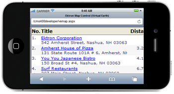
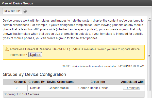
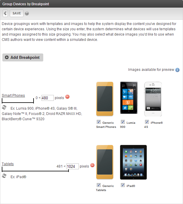
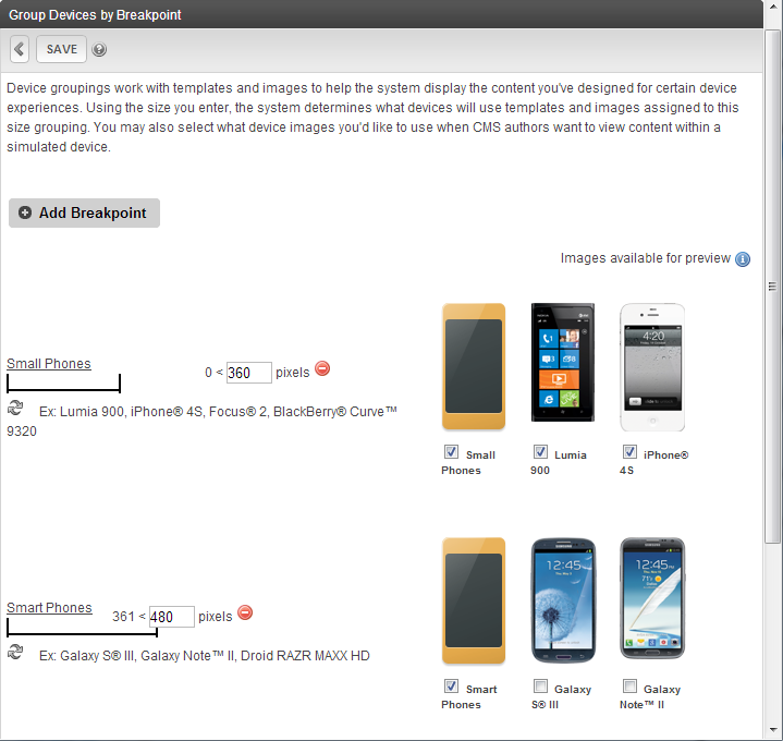
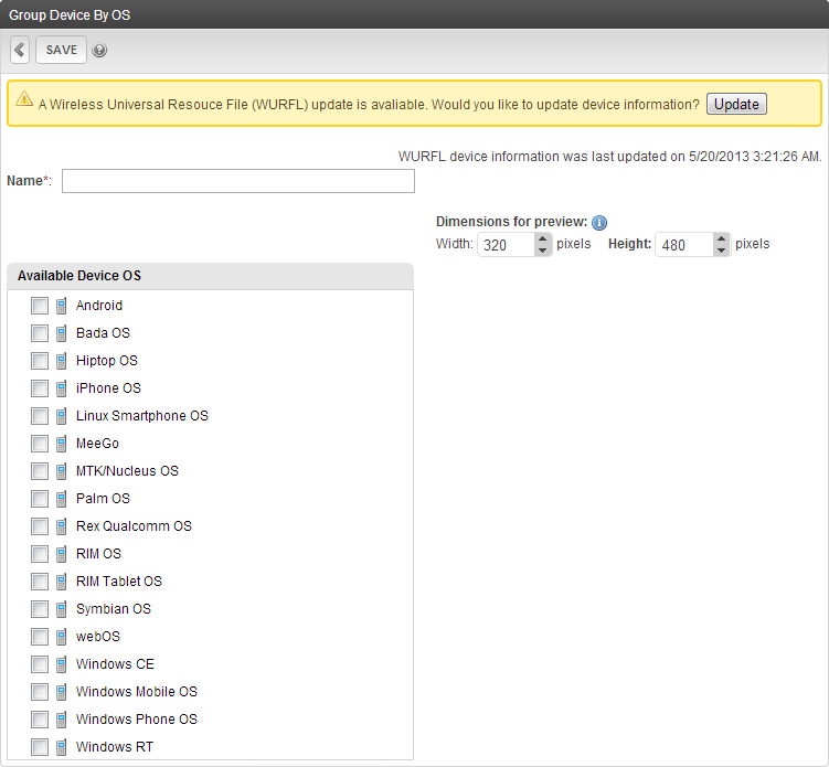
However, you must maintain more than 1 set of templates (for mobile and desktop experiences). Also, the server must detect whether a visitor is using a mobile device before rendering a mobile template, so a list of devices must be kept up-to-date. Fortunately, Ektron is able to keep the device list up to date for you. See Updating the Wireless Universal Resource File.
Responsive Web Design (RWD)
Responsive Web Design
You should consider a Responsive Web Design (RWDResponsive Web Design moves and resizes content objects provides to provide an optimal viewing experience on any viewing device.) when you have a high degree of overlap between the site visitor experience and content on many devices.
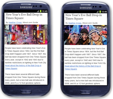
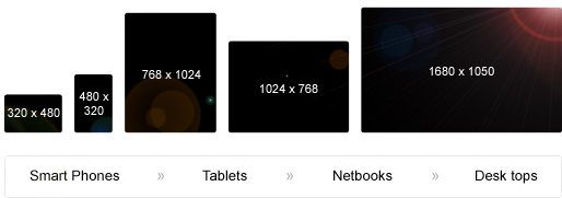
Responsive design provides an optimal viewing experience for devices of any size by adapting the layout of your pages with CSS3 media queries. The elements on your pages (including any images) must use relative units (percentages or ems) for sizing instead of fixed dimensions (pixels). This enables your site to expand and contract to the viewing size of any device.
Responsive design has a single code base, where other approaches require the use of separate mobile-specific templates to display your pages to mobile devices. While you may identify which of your content is "canonical" in a Separate mobile site design, the singular architecture and repository of a responsive design means that you have one authoritative source for SEOSearch Engine Optimization; improving the visibility of search results. leading to higher rankings by search engines. (Multiple websites can dilute your ranking.) It also lets your site visitors use a consistent set of URLUniversal Resource Locators without the issue of directing to the WWW or m(dot) site.
Many traditional websites require a complete redesign and implementation to change to a responsive site. Additionally, a complete redesign may require added time and effort to ensure that the user experience is mobile-friendly. You must weigh the costs of a redesign to gain the benefits of a single code base (long-term maintenance savings, SEO improvements, and so on).
Another issue to consider before creating a responsive website is that entire pages are loaded. If you have a lot of content on a page, it can impact the user experience. By contrast, if your site uses separate mobile templates, you can decide if some of that content should be loaded on certain types of devices.
Using responsive frameworks with PageBuilder shows how to work responsive Web design into your PageBuilder pages.
Responsive Web Design and Server Side Components (RESS)
Responsive Web Design and Server Side Components
Responsive Web Design + Server Side Components (RESSResponsive Web Design + Server Side Components) has the flexibility of responsive design while providing the granularity of device detection to deliver device-specific components.
Ektron supports the use of RESS by providing tools to display content and assets based on groups of devices, which can be added to your responsive pages. Of course, this responsive aspect means that your site needs to be redesigned, but once redesigned, these tools can provide the best of both approaches.
Using responsive frameworks with PageBuilder shows how to work responsive Web design into your PageBuilder pages.
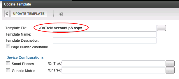
 ) to its right, go to and select the mobile template you created in Step 6.
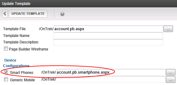
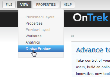
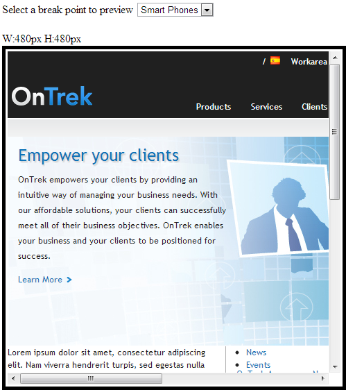
 Click Preview on the toolbar to show your page on a variety of simulated devices (portrait and landscape views). A bar appears with devices that simulate your Web page on those devices. For information about setting these devices, see
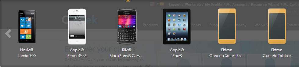


 ).
).

 ). A confirmation dialog box appears.