Ektron's Mobile-Driven Web Experience
Web traffic from mobile devices is accelerating. Making your website available to mobile users is not enough. Your website must deliver the same, consistent level of experience to your mobile visitors as you do for those who visit your website on their desktop to ensure that your consumers are accessing information, products, and services from your website.
Mobile applications require different, more compact navigational aids, and content must fit into a smaller footprint. Mobile websites need "tap to call" options to take advantage of cellular technology, a robust search, flexible menus, and quick access to content. Tables and figures may need to be adjusted or reconfigured to avoid unnecessary "pinching" and scrolling.
 Using mobile templates
Using Mobile Templates
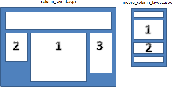
A template is a customized Web page format comprised of objects such as content blocks, list controls, menus, rotating banners, a search object, and videos. How you assemble the objects affects the user experience. Because of the smaller display size, templates for mobile devices may have a single column to eliminate horizontal scrolling, pinching, and zooming. You decide what is practical for each device by creating different templates instead of creating different content. Objects may have to be omitted or replaced with mobile-friendly objects. The following image shows PageBuilder templates for desktop and mobile devices. Note that the mobile template does not include content object 3. See Developing Wireframe Templates for information about creating PageBuilder wireframethe architecture of a Web page containing columns, dropzones, and layout information. templates.
You should use the same dropzonean area on a Web page where you can drag and drop a widget. IDs for both the mobile and desktop templates. Content does not display if a mobile template contains a dropzone ID that the corresponding desktop template does not have.
Ektron can detect specific characteristics of a mobile device, such as the differences between the Android Droid X and Droid 2. These characteristics help you determine how to render the user experience. For example, one device may support Flash technology and another may not.
In any case, you want to ensure that your content on a mobile device is elastic, meaning that it can scale to the various sizes of displays. Use percentages instead of hard-coded pixel sizes for the mobile template. If you set PageBuilder dropzone width to 100%, the normal flow of the objects in the mobile browser cause them to stack from the top to the bottom.
Setting up a mobile template
Setting Up a Mobile Template
- In the site root/web.config file, set ek_EnableDeviceDetection to True.
<add key="ek_EnableDeviceDetection" value="true"> - Identify a template for which you want to create a mobile version, using the Workarea > Settings > Configuration > Template Configuration screen. Click any template to see its folder location relative to your site root.

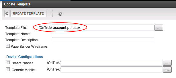
- Open Windows Explorer and locate that template in the site root folder.
- Copy and save a mobile version of the template under a suitable name, for example,
account.pb.smartphone.aspx. - Adapt the template for mobile use by changing column styles, removing unwanted navigation, images, headers, footers, adding components that help mobile users, and so on.
- Create device
- Return to the Template Configuration screen and click the template you identified in Step 2.
- Check every mobile Device
 ) to its right, navigate to and select the mobile template you created in Step 6.
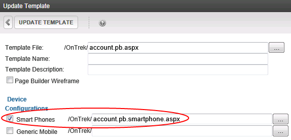
Now, if a mobile device user accesses a page which uses that template, the mobile-enhanced template displays the content.
- To test mobile templates, preview your content within them. See Previewing Content in a Mobile Template.
- Ektron uses the Wireless Universal Resource File (WURFL) file to obtain wireless device information. To learn how to view, update, and customize this file, see Ektron's Mobile-Driven Web Experience .
- To conditionalize Smart Form content based on user device, see Ektron's Mobile-Driven Web Experience .
- To use a mobile site visitor's geographic location to deliver relevant content, see Using Geographic Data from a Mobile Device.
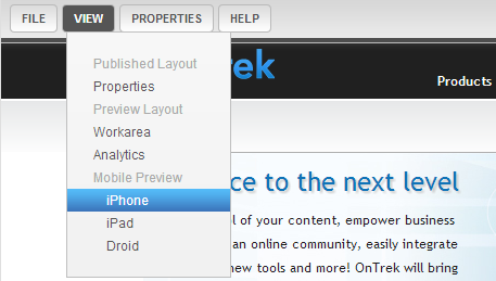
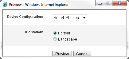
Previewing content in a mobile template
Previewing Content in a Mobile Template
You can preview content in mobile template to ensure the content fits within the screen resolution.

 ).
). Specifying device-specific content with Smart Forms
Specifying Device-Specific Content with Smart Forms
You can set up Smart Forman Ektron-defined Web page that contains XML (hidden from the end user) to display content, and receive, verify, and save user input. configurations to recognize a user's device and, based on that information, display appropriate content. For example, if a user is not using a Smart Phone, show a complex display with rich graphics. If a user is using a Smart Phone, create a simpler presentation of the same fields without graphics. To learn about this capability, see Inserting a Conditional Section.
You can also designate some or all of an HTML form's postback message to be conditional upon a user's device. So, for example, the postback message for Smart Phone users can be much shorter than the message for users who are not using a mobile device. To learn more about this, see Specifying Conditional Text in the Postback Message.
Grouping mobile devices
Grouping Mobile Devices
You can accommodate a variety of mobile devices by grouping characteristics, such as display size. You can group devices for standard presentation and add refinements for specific devices. For example, a device configuration may consist of a Smart Phones group (Apple iPhone®, Samsung Galaxy Note™ II, Motorola® Droid RAZR MAXX HD, and so on) and a Tablets group (Apple iPad®, Google Nexus™ 10, Microsoft® Surface™, and so on).
With Ektron, you can group devices by model or operating system.
Grouping by model gives you more control over specifications, but it is quicker to group by operating system. You may want to first group by operating system, then only define models that do not work properly under an operating system configuration.
IMPORTANT: Because a device may be covered by several configurations, use the Reorder button to determine the order in which devices are checked. See Also: Reordering a Device Configuration
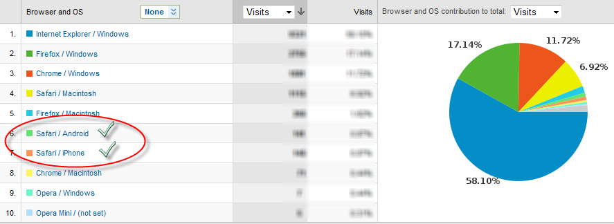
To determine which mobile devices to add to your device configurations, review your Analytics reporting to see which mobile devices are browsing your site. To see the Browser and OS report:
- In the Workarea, select Reports > Traffic Analytics > Visitors > Browser Capabilities > Browsers and OS.
- Modify the time period and rank if needed. For more information, see Viewing Analytics Data.
The following example shows that Android and iPhone mobile devices have browsed pages. You can create templates and device configurations to improve the experience of these visitors.
Adding a device configuration by selecting operating system
Adding a Device Configuration by Selecting Operating System
Each mobile device's definition includes an operating system. To reduce effort, you can create configurations by choosing one or more operating systems. When you do, each device using that OS is automatically included in the list. For example, you create a device configuration for all Android phones.
While defining a mobile device, you decide if the configuration applies to handheld devices, tablets, or both device types. You also specify a resolution (width and height). So, if two devices share an operating system but have different resolutions, create a separate configuration for each one.
Prerequisites
- You are a member of the Administrators group
- Device detection is enabled See Also: Ektron's Mobile-Driven Web Experience
To add a device configuration by selecting an operating system:
- Workarea > Settings > Configuration > Device Configurations.
- Click Add Device Configuration (by OS).
- In the Device Configuration field, enter a name for the configuration.
- Click Add OS.
- Select one or more operating systems for this configuration.
- At the Device Type field, choose whether the configuration applies to handheld devices, tablets, or both device types.
- Set the Width and Height of the device display in pixels.
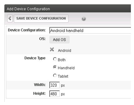
- Click Save Device Configuration.
Adding a device configuration by selecting models
Adding a Device Configuration by Selecting Models
When adding individual devices to a configuration, group devices that share characteristics, such as Flash support and screen resolution. Since you will assign the configuration to a mobile template, make sure that all devices support the template's functionality.
- Workarea >Settings > Configuration > Device Configurations.
- Click Add Device Configuration.
- In the Device Configuration field, enter a name for this configuration.
- Click Add Model. The Selecting an existing model screen appears.
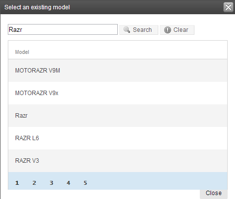
- Type a model in the field and click Search.
- Click on the model you want to add. Repeat this step for as many models that you want to add.
- Set the Width and Height of the device display in pixels.
- Click Save Device Configuration.
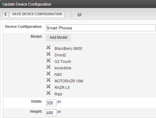
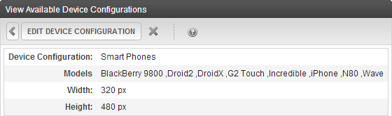
Editing a device configuration
Editing a Device Configuration
- Workarea >Settings > Configuration > Device Configurations.
- Click the configuration that you want to edit.
NOTE: You cannot edit the Generic and Generic Mobile configurations.
- Note that the second line of the display indicates if the configuration was determined by operating system or model. You can only add or remove models or operating systems, depending on that setting.
- Click Edit Device Configuration. The Update Device Configuration screen appears.
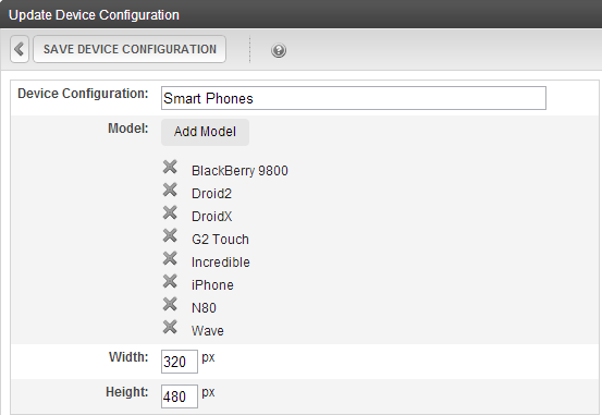
- To remove any model or operating system from this configuration, click X to the left of its name.
- Update the other fields on the screen as needed. For information on the fields, see Ektron's Mobile-Driven Web Experience .
- Click Save Device Configuration.
 ).Reordering a device configuration
Reordering a Device Configuration
You can determine the first acceptable configuration that a device will use. To accomplish this, change the order of the device configurations.
For example, you configured an iPad in the AppleDevices and the Tablet Devices configurations. However, because AppleDevices is set for a small resolution, you want an iPad to use the Tablet Devices configuration (which has a larger screen). Reorder the devices so that Tablet Devices appears above AppleDevices.
- Workarea >Settings > Configuration > Device Configurations.
- Click Reorder Device Configurations (
 ).
). - Click a configuration you want to move.
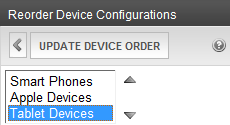
- Click Up/Down (
 ) to arrange the list to the desired order.
 - Click Update Device Order.
Applying adaptive image resizing
Applying Adaptive Image Resizing
Adaptive Image Resizing resizes images and helps you implement a caching strategy to enhance a user's mobile experience on your site. It includes the following features:
- Criteria to determine which images get resized
- A user-defined set of resolutions—Ektron renders the image in a device-appropriate resolution
- A direct access mode that lets a developer set an image to a predefined resolution
Prerequisite
To enable Adaptive Image Resizing settings, set ek_EnableDeviceDetection to True in
siteroot/web.config.<add key="ek_EnableDeviceDetection" value="true" />
Determining which images get resized
Determining Which Images Get Resized
Two criteria determine which images get resized. Images must meet both criteria to be eligible for resizing.
- Minimum File Size—You can specify a minimum file size in KB. The default minimum is 80 KB—smaller files are not resized. To modify it, open the
siteroot/web.configfile and update theImageSizeThresholdKBvalue.<AdaptiveImageProcessorConfig ImageSizeThresholdKB="80" Level1CacheSize="5000" Level2CacheSize="500" Level2CacheItemThresholdKB="256" EnableL2Caching="true" DirectAccessQueryString="targetTypeID"> - Folders—Only images in specified folders and their subfolders can be resized. To do so, open the
siteroot/web.configfile and find the following section. The tilde character (~) represents your site root folder:~/.<IncludePathList> <!--Files in the specified path WILL be processed by resizer. The Include Path includes ALL sub-directories of the specified path--> | <IncludePath Path="~/uploadedimages" /> <IncludePath Path="~/assets" /> </IncludePathList>To include a folder, enter an
IncludePathtag. For itsPathproperty, enter the folder path within your site root folder (as shown in the examples). You only need to specify parent folders to include child folders.
Setting image resolutions
Setting Image Resolutions
By default, web.config contains the following adaptive image resolutions:
<ImageResConfigs>
  <ImageResConfig TypeID="LowRes" MaxWidth="320" MaxHeight="480" />
  <ImageResConfig TypeID="MedRes" MaxWidth="1024" MaxHeight="768" />
</ImageResConfigs>
Ektron uses these settings to reduce images that exceed a device's resolution (as defined in the Device Configurations screen). See Also: Ektron's Mobile-Driven Web Experience . The image gets resized to the resolution of the user's device if the resolution is listed within the <ImageResConfigs> tags. If the device's resolution is not listed, the image gets resized to the next larger one.
For example, if a site visitor uses an iPhone (pixel resolution 320 x 480) and encounters an 706 x 534 image, Ektron resizes it to 320 x 242. If another visitor uses a Samsung Galaxy S (pixel resolution 480 x 800), the visitor sees the full image because the image (706 x 534) is smaller than the next larger breakpoint (1024 x 768); no resizing occurs.
In this example, you may need to identify a new breakpoint (say, between 320 and 1024) to accommodate other devices.
IMPORTANT: Review your site analytics to gain an understanding of the devices that are being used to view your site. To create a third ImageResConfig element to support Samsung Galaxy S. Modify the <ImageResConfigs> tags as shown in the following example.
<ImageResConfigs>
	<ImageResConfig TypeID="LowRes" MaxWidth="320" MaxHeight="480" />
       <ImageResConfig TypeID="SGalaxySRes" MaxWidth="480" MaxHeight="800" />
	<ImageResConfig TypeID="MedRes" MaxWidth="1024" MaxHeight="768" />
</ImageResConfigs>
After you make this change, on a Samsung Galaxy S, the 706 x 534 image is rendered as 480 x 363. You can insert as many ImageResConfig elements as you want to accommodate mobile devices.
Creating image copies in the specified resolution
Creating Image Copies in the Specified Resolution
After you enable device detection in web.config, as new images are added to specified Ektron folders, Ektron automatically creates versions of the image in specified sizes (described in Setting Image Resolutions).
<add key="ek_EnableDeviceDetection" value="true" />
A new image filename consists of ImageResConfig TypeID_original file name.extension. For example, if the original image filename is mytest.png, and it is resized to specifications set in the LowRes ImageResConfig element, the new filename is LowRes_mytest.png.
If a mobile visitor views an image that was in Ektron before device detection was turned on, the image may be resized at that time. Ektron creates resized image versions in the same folder as the original image.
If you later view the image on any device with the same resolution range, the saved version is displayed. This practice enhances the performance of your mobile website. However, creating additional image versions also increases the number of files and storage space needed.
Best Practice
When planning an implementation of Adaptive Image Resizing, consider your future space requirements.
Adaptive image cachingAdaptive Image Caching
Use caching to avoid expensive query storage.
Prerequisites
- You can edit
siteroot/web.configon your Ektron server.- In
siteroot/web.config, set ek_EnableDeviceDetection to true.
To minimize the demand on your Ektron server, the Adaptive Image Resizing feature uses 2 caching strategies.
- Level 1 caching stores only a filename, file size, and resolution. You determine the number of items that may be stored in Level 1 cache in the following
web.configsetting.<AdaptiveImageProcessorConfig ImageSizeThresholdKB="80" Level1CacheSize="5000".....Best Practice
The
Level1CacheSizeshould approximate the number of image files in the included folders. - Level 2 caching stores the file's content as a byte array. A resized file is only saved to Level 2 cache if the resized file size is less than the value of
Level2CacheItemThresholdKB.- To determine the number of items that you can store in Level 2 cache, set
Level2CacheSize. - To enable or disable Level 2 caching, set
EnableL2Caching.
<AdaptiveImageProcessorConfig
  ImageSizeThresholdKB="80"
  Level1CacheSize="5000"
  Level2CacheSize="500"
  Level2CacheItemThresholdKB="256"
  EnableL2Caching="true"
- To determine the number of items that you can store in Level 2 cache, set
Adaptive Image Resizing caching works as follows:
- A user on a mobile device accesses an Ektron Web page that uses Adaptive Image Resizing.
- For every image file request, Ektron looks for it in Level 1 cache to determine if the image size exceeds the threshold.
- If the cached item is found, the cached file information is used.
- If the cached item is not found, Ektron queries the storage device for the file information and caches it.
- For every qualified image request, if level 2 caching is enabled, Ektron searched Level 2 cache for the target file. If the file is found, the cached byte array is sent to the user's device. If the file is not found, Ektron sends the image from storage and caches the byte array (if the size does not exceed the defined limits).
Best Practice
Use the following formula to calculate memory usage for level 2 caching:
total memory used = Level2CacheItemThresholdKB * Level2CacheSizeFor example:
256KB*500=128000KB=128MBof maximum memory used by Level 2 caching.
Resizing an image with direct access mode
Resizing an Image with Direct Access Mode
Prerequisite
You must have 1 or more
<ImageResConfig>tags within the<ImageResConfigs>tag inweb.config.
Direct access mode lets you resize an image to any resolution set in the <ImageResConfigs> tags in web.config. See Also: Setting Image Resolutions. Unlike other Adaptive Image features, direct access mode does not consider the user's device, and ignores the value set by the ek_EnableDeviceDetection setting in web.config.
To apply direct access mode to an image (for example, so that the image displays in a maximum resolution of 320 x 480), use the following syntax:
<img src="uploadedimages/testfile.jpg?targetTypeID=LowRes"/>
The targetTypeID refers to an <ImageResConfig> tag with TypeID=LowRes.
<ImageResConfigs>
  <ImageResConfig TypeID="LowRes" MaxWidth="320" MaxHeight="480" />
  <ImageResConfig TypeID="MedRes" MaxWidth="1024" MaxHeight="768" />
</ImageResConfigs>
Changing the query string parameter name
Changing the Query String Parameter Name
You can change the targetTypeID name. For example, to change the direct access mode query string parameter from targetTypeID to DirectAccessTarget, modify the AdaptiveImageProcessorConfig tag in web.config as follows.
<AdaptiveImageProcessorConfig
  ImageSizeThresholdKB="80"
  Level1CacheSize="5000"
  Level2CacheSize="500"
  Level2CacheItemThresholdKB="256"
  EnableL2Caching="true"
  DirectAccessQueryString="DirectAccessTarget">
After you change the parameter, your syntax is as follows:
<img src="uploadedimages/testfile.jpg?DirectAccessTarget=LowRes"/>
Using geographic data from a mobile device
Using Geographic Data from a Mobile Device
If your site visitor is on a mobile device, the geographic location of your site visitor becomes very important information. For example, if a mobile visitor is accessing your site, you can display nearby stores and special promotions. To create a geographically aware Web experience with Ektron, follow these steps.
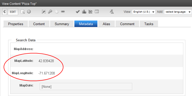
- Create content with MapLatitude and MapLongitude geo-location metadata. This metadata is automatically added when you publish content with a street and city address in the MapAddress field.
- Place the Map server controla server control uses API language to interact with the CMS and Framework UI to display the output. A server control can be dragged and dropped onto a Web form and then modified. in a mobile device template.
- Because of the size of a mobile device, you may want to rearrange the content list, map image, and search components provided by the Map server control. To do this, change the standard map EkMLEktron Markup Language file. See Controlling Output with Ektron Markup Language and the sample file
[siteroot]/workarea/template/map/map.ekml.
To learn more about using geolocation, see the Map server control and Using the Map Server Control.
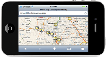
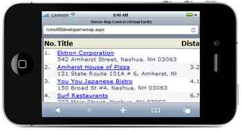
After finishing the previous steps, use your mobile device (if it has GPS capability) to browse to the template that contains the map; it shows your location at the center of the map. For other mobile devices, the center of the map is the Latitude and Longitude coordinates set by the Map server control. Content locations appear as map pins, and the content list is sorted by distance from the current location (with GPS) or map center.
Updating the wireless universal resource file (WURFL)
Updating the Wireless Universal Resource File
NOTE: The commercial license between Ektron Inc. and ScientiaMobile, Inc., the owner of WURFL, expired on April 3rd, 2016. You have the following options:
- Disable the WURFL data repository in your deployment so that you are not using WURFL in an unlicensed manner.
- Contact Scientiamobile, Inc. to obtain a license directly. ScientiaMobile, Inc. has provided a guide to transitioning.
- Replace the WURFL data repository with the 51 Degrees(TM) Lite library by 51Degrees.mobi, which is licensed under an Mozilla Public License open-source license agreement.
When a device requests information from a Web server, HTTP headers are passed to the server along with the image URL. The HTTP headers contain information that identifies the type of device that is doing the request. Because new mobile devices are being created every day, it is important for your website to detect these devices when they are available and present the appropriate experience to visitors who use these devices when they visit your site.
Each time a user clicks on the View All Device Groups folder, Ektron determines whether more recent device information is available.
- Go to Workarea > Settings > Configuration > Mobile Settings > View All Device Groups. If your WURFL file is not up-to-date, you are given the opportunity to update it.
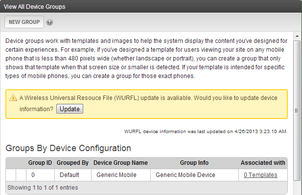
- Click Update.
Additional mobile information
Additional Mobile Information
- Should You Consider an M(dot) Site Strategy for Mobile?
- Mobile-friendly: The mobile web optimization guide
- Mobile HTML5
- The Mobile Revolution: Move Beyond Mobile Friendly and Engage Mobile Visitors
- Mobile First, Last, and Always: 5 Responsive Design Sites on Ektron
- Why Adaptive Imaging is a Big Deal
- Adaptive Images: How They Impact Social Media and SEO
- Breakpoints: Planning for Different Device Sizes
- Why Responsive Design Changes the Game for Website Templates
- The Value of a Responsive Design: Who Really Benefits?
- Which Responsive Framework is Right for You?
- Responsive Web Design: Now for Marketers, Not Just Developers and Designers
- Responsive Web Design or Native Apps? What's the Real Future of Mobile Advertising?
- Building Blocks and Tools for Responsive Web Design: Part 1 - For Developers
- Building Blocks and Tools for Responsive Web Design: Part 2 - For Marketers
- The Broken Mobile Paradox Part 1: The Different Ways to Create a Mobile Strategy
- The Broken Mobile Paradox Part 2: Server-Side Device Detection
- The Broken Mobile Paradox Part 3: Responsive Web Design
- The Broken Mobile Paradox Part 4: RESS
- What the Mobile Web Means for Marketers Part 1: RWD
- What the Mobile Web Means for Marketers Part 2: Adaptive Images