 Content Dashboard
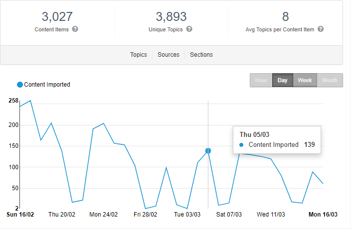
The Content Dashboard shows an overview of the following:
- the number of Content items Content Recommendations: A web page that has an identifier associated with it. that Content Recommendations processed
- the number of unique topics (generated by NLP Natural language processing. A subfield of linguistics, computer science, information engineering, and artificial intelligence concerned with the interactions between computers and human (natural) languages, in particular how to program computers to process and analyze large amounts of natural language data. - Source: Wikipedia)
- the average number of topics per content item
The graph shows when content was imported and ingested The process of gathering topics for analysis. For example, if a new URL is added to your website where Content Recommendations is implemented, that content is ingested into the system. If content changes after it was ingested, you can reprocess the content..

Date labels are in dd/mm format.
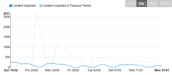
Click Compare to compare data to the previous period for which data was gathered. A dotted plot line is overlaid on the current data, and you can see whether there is an increase or decrease in activity.

Filtering lets you analyze your content repository in different ways so you can determine whether content is driving conversions and encouraging prospects further down the sales process. For filtering examples, see Filtering Content Recommendations.

The following scenarios describe several uses for the Content Dashboard.
- A content editor wants to know which other topics are mentioned along with a particular topic of interest.
- A content editor wants to reduce the amount of content being created and keep it more focused.
- A content editor wants to group content in a clear and concise way.
- A content creator wants to see which topics were extracted from a content item.
- A website owner wants to know what are the most talked about topics across all content.
- A website owner wants to know where the majority of their content is across multiple locations. A content creator wants to see what topics they covered in a content item they just created.
In each scenario, you want to know which topics are published more and how content volume against each topic changes over time.
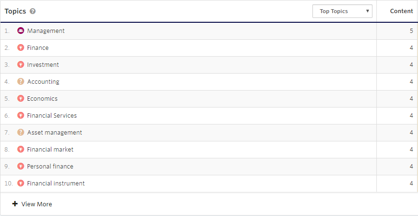
- The Topics view shows how often a topic Content Recommendations: An indexed subject, such as finance, insurance, hamburgers, rocks, or a brand name. appears in the processed content. In the following example, Investment appears four times in the content.

- The Sources view shows how much of the content appears from each source. The example, shows that six content items came from moseycapital.epi-uk.net. For more details about Sources, go to Content > Sources. See also Sources.

- The Sections view shows the categories into which the content fits, such as Mosey Capital. For more details about Sections Content recommendations: Groups of content based on flow rules. For example, a Europe section may include blog posts about London, Amsterdam, or Paris; while an Asia section may include blog posts about Shanghai, Hong Kong, or Tokyo., go to Content > Sections. See also Sections.
